React Suite DateRangePicker Show One Calendar
Last Updated :
29 Jul, 2022
React Suite is a front-end UI framework that has a set of React components that developers can use in their react app to fasten the development process. It supports all the major browsers like Chrome, Safari, Firefox, Brave, etc. In this example, we will see React Suite DateRangePicker Show One Calendar.
The DateRangePicker component is used to take the input of the date range from the users. By default, it shows two calendars when opened to select starting date and end date but we can use the showOneCalendar property to show only one calendar which can be used to select both starting and ending date.
React Suite DateRangePicker Show One Calendar Components:
- DateRangePicker: This component is used to take the input of the date range from the user.
React Suite DateRangePicker Show One Calendar Attributes/Props:
- showOneCalendar: This is a boolean property used to show only one calendar when opening the DateRangePicker.
- size: This attribute is used on the DateRangePicker component to specify its size. It takes four values: “lg“, “md“, “sm” and “xs“.
Syntax:
<DateRangePicker showOneCalendar/>
Creating React Application and Installing React Suite in the Project:
Step 1: Create the React application using the npx command:
npx create-react-app foldername
Step 2: After creating the project folder, move to it using the cd command:
cd foldername
Step 3: After creating the ReactJS application, Install the rsuite module so that we can use the DateRangePicker component using the following command:
npm install rsuite
Project Structure: After following the above steps, the project structure will look like this:
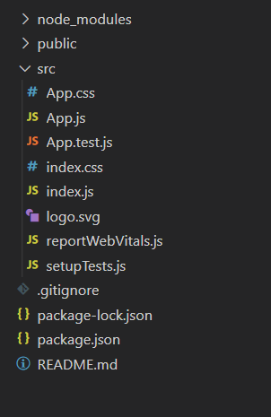
Project Structure
Let’s see some examples to understand how to use the React Suite DateRangePicker showOneCalendar attribute/prop.
Example 1: Now replace the code in the App.js file with the code below. In this example, we used the showOneCalendar property of the DateRangePicker component to show only one calendar.
App.js
import "rsuite/dist/rsuite.min.css";
import React from "react";
import { DateRangePicker } from "rsuite";
function App() {
return (
<div className="App" style={{
display: "flex",
alignItems: "center",
flexDirection: "column"
}}>
<header style={{
textAlign: "center", display: "block",
marginBottom: "30px"
}}>
<h3 style={{ color: "green" }}>
GeeksforGeeks
</h3>
<h5>
React Suite DateRangePicker
Show One Calendar
</h5>
</header>
<DateRangePicker showOneCalendar />
</div>
);
}
export default App;
|
Run the Application: Run your app using the following command from the root directory of the project.
npm start
Output: Go to http://localhost:3000/ in your browser to see the output.
Example 2: In the example below we used the showOneCalendar property of the DateRangePicker along with the size property to show variation in the sizes of the component.
App.js
import "rsuite/dist/rsuite.min.css";
import React from "react";
import { DateRangePicker } from "rsuite";
function App() {
const pickerStyle = {
marginTop: "10px",
marginBottom: "25px"
};
return (
<div className="App" style={{
display: "flex",
alignItems: "center",
flexDirection: "column"
}}>
<header style={{
textAlign: "center",
display: "block",
marginBottom: "30px"
}}>
<h3 style={{ color: "green" }}>
GeeksforGeeks
</h3>
<h5>
React Suite DateRangePicker
Show One Calendar
</h5>
</header>
<DateRangePicker showOneCalendar
size="xs" style={pickerStyle} />
<DateRangePicker showOneCalendar
size="sm" style={pickerStyle} />
<DateRangePicker showOneCalendar
size="md" style={pickerStyle} />
<DateRangePicker showOneCalendar
size="lg" style={pickerStyle} />
</div>
);
}
export default App;
|
Output:
Reference: https://rsuitejs.com/components/date-range-picker/#show-one-calendar
Like Article
Suggest improvement
Share your thoughts in the comments
Please Login to comment...