React Suite DateRangePicker Props
Last Updated :
17 Aug, 2022
React Suite is a library of React components, sensible UI design, and a friendly development experience. It is supported in all major browsers. It provides pre-built components of React which can be used easily in any web application. In this article, we’ll learn about React suite DateRangePicker Prop.
DateRangePicker Component is used to quickly select a date range. The different DateRangePicker Props are given below with their descriptions.
DateRangePicker Props:
- appearance: It is used for component appearance.
- block: It is used to block an entire row.
- caretAs: It is used to set a custom component for the caret icon.
- character: This property is used to set the separating character between the dates.
- cleanable: It is used to indicate whether the option can be emptied or not.
- container: It is used to set the rendering container.
- defaultCalendarValue: It is used to denote the default calendar panel date.
- defaultOpen: It is used to denote the default value of the open property.
- defaultValue: It is used to denote the default value.
- disabled: It is used to indicate whether the component is disabled or not.
- disabledDate: It is used to disable the date.
- format: This property is used to define the format in which the selected date will appear.
- hoverRange: It is used to select the date range when you click on the date.
- isoWeek: It is a boolean value denoting the ISO 8601 standard set or not.
- limitEndYear: It is used to set the lower limit of the available year relative to the currently selected date.
- locale: It is used to set the Calendar locale text.
- onChange: It is a callback function that is triggered when the value changes.
- onClean: It is a callback function that is triggered when the value is clean.
- onClose: It is a callback function that is triggered on a close event.
- onEnter: It is a callback function that is triggered before the overlay transitions in.
- onEntered: It is a callback function that is triggered after the overlay finishes transitioning in.
- onEntering: It is a callback function that is triggered as the overlay begins to transition in.
- onExit: It is a callback function that is triggered right before the overlay transitions out.
- onExited: It is a callback function that is triggered after the overlay finishes transitioning out.
- onExiting: It is a callback function that is triggered as the overlay begins to transition out.
- onOk: It is a callback function that is triggered on click ok the Ok button.
- onOpen: It is a callback function that is triggered on open of the component.
- onSelect: It is a callback function that is triggered on the selection of date or time.
- oneTap: It is used to indicate whether to enable One-click to complete the selection date or not.
- open: It is used to indicate whether open the component or not.
- placeholder: It is used to denote the placeholder.
- placement: It is used for the placement of the component.
- preventOverflow: It is used to prevent floating element overflow.
- ranges: It is used for the shortcut configuration.
- renderTitle: This property is used to define a custom render for the month’s title.
- renderValue: It is used for the custom render selected date range.
- showOneCalendar: It is used to indicate whether to show only one calendar or not.
- showWeekNumbers: It is used to indicate whether to show week numbers or not.
- size: It is used to denote the picker size.
- toggleAs: It can be used for the custom element for this component.
- value: It is used to denote the value (Controlled).
Syntax:
<DateRangePicker
     placeholder="Select Date Range"
     oneTap
     showOneCalendar
     appearance="subtle"
     ...
/>
Creating React Application And Installing Module:
Step 1: Create a React application using the given command:
npm create-react-app projectname
Step 2: After creating your project, move to it using the given command:
cd projectname
Step 3: Now Install the rsuite node package using the given command:
npm install rsuite
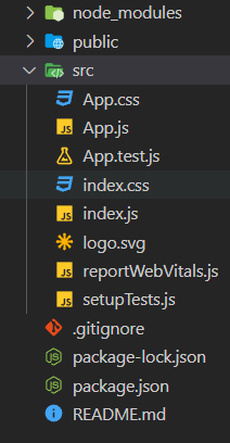
Project Structure: Now your project structure should look like the following:

Project Structure
Example 1: The below example demonstrates the size and appearance props of the daterangepicker component.
Javascript
import "rsuite/dist/rsuite.min.css";
import { DateRangePicker } from "rsuite";
export default function App() {
return (
<div>
<div style={{ textAlign: "center" }}>
<h2>GeeksforGeeks</h2>
<h4 style={{ color: "green" }}>
React Suite DateRangePicker Prop
</h4>
</div>
<div
style={{
padding: 20,
textAlign: "center"
}}>
<div>
<DateRangePicker
appearance="subtle"
size="lg"
/>
</div>
</div>
</div>
);
}
|
Output:
Example 2: Another example demonstrating the showOneCalender, placeholder, and oneTap props of the daterangepicker component.
Javascript
import "rsuite/dist/rsuite.min.css";
import { DateRangePicker } from "rsuite";
export default function App() {
return (
<div>
<div style={{ textAlign: "center" }}>
<h2>GeeksforGeeks</h2>
<h4
style={{ color: "green" }}>
React Suite DateRangePicker Prop
</h4>
</div>
<div
style={{
padding: 20,
textAlign: "center"
}}>
<div>
<DateRangePicker
placeholder="Select Date Range"
oneTap
showOneCalendar
/>
</div>
</div>
</div>
);
}
|
Output:
Reference: https://rsuitejs.com/components/date-range-picker/#code-lt-date-range-picker-gt-code
Like Article
Suggest improvement
Share your thoughts in the comments
Please Login to comment...