React Suite DatePicker Usage Custom short options
Last Updated :
28 Jun, 2022
React Suite is a front-end UI framework that has a set of React components that developers can use in their react app to fasten the development process. It supports all the major browsers like Chrome, Safari, Firefox, Brave, etc. In this example, we will be seeing React Suite DatePicker Usage Custom Shortcut Options.
The DatePicker component is used to take the input of the date/time from the users. The custom shortcut options in the DatePicker component are used for the user experience so that the users can select the most frequent options with just one click. The custom shortcut option can be added using the ranges property of the DatePicker component.
React Suite DatePicker Usage Custom Shortcut Options Components:
- DatePicker: This component is used to take the input of date/time from the user.
React Suite DatePicker Usage Custom Shortcut Options Attributes/Props:
- ranges: This property is used to set the custom short options to the DatePicker. It accepts an Object array with each object having a label and value as its properties.
Syntax:
<DatePicker
    ranges={[
         {
              label: 'Yesterday',
              value: addDays(new Date(), - 1)
         },
         {
             label:'Today',
             value: new Date()
         }
    ]}
/>
Creating The React Application And Installing React Suite in the Project:
Step 1: Create the React application using the npx command:
npx create-react-app foldername
Step 2: After creating the project folder, move to it using the cd command:
cd foldername
Step 3: After creating the ReactJS application, Install the rsuite module so that we can use the DatePicker component and the date-fns module for using the addDays function using the following command:
npm install rsuite date-fns
Project Structure: After following the above steps, the project structure will look like this:
Let’s see some examples to understand how to use the React Suite DatePicker ranges attribute/prop.
Example 1: Now replace the code in the App.js file with the code below. In this example, we used the ranges attribute of the DatePicker component to set three custom shortcut options For Today, 7 Days Later, and the 15 Days Later.
App.js
import "rsuite/dist/rsuite.min.css";
import React from "react";
import { DatePicker } from "rsuite";
import addDays from "date-fns/addDays";
function App() {
return (
<div className="App" style={{
display: "flex",
alignItems: "center",
flexDirection: "column"
}}>
<header style={{
textAlign: "center",
display: "block",
marginBottom: "30px"
}}>
<h3 style={{ color: "green" }}>
GeeksforGeeks
</h3>
<h5>
React Suite DatePicker Custom Short Options
</h5>
</header>
<DatePicker
ranges={[
{
label: 'Today',
value: new Date()
},
{
label: '7 days later',
value: addDays(new Date(), 7)
},
{
label: '15 days later',
value: addDays(new Date(), 15)
},
]}
/>
</div>
);
}
export default App;
|
Run the Application: Run your app using the following command from the root directory of the project.
npm start
Output: Go to http://localhost:3000/ in your browser to see the below output.

React Suite DatePicker Custom Short OptionsReact Suite DatePicker Custom Short OptionsReact Suite DatePicker Custom Short OptionsReact Suite DatePicker Custom Short Options
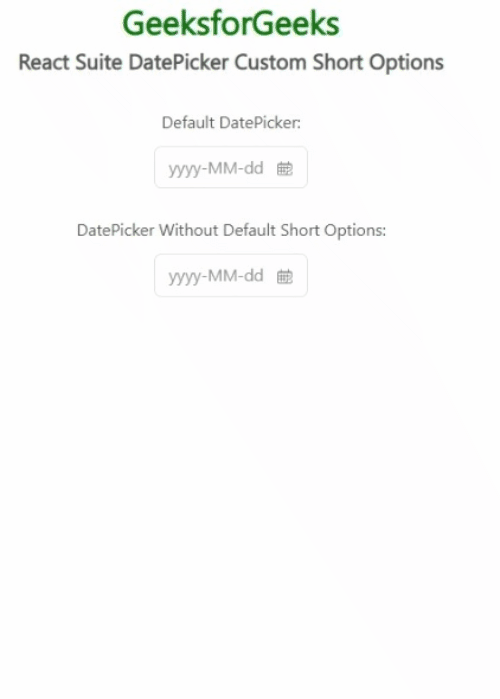
Example 2: The DatePicker component comes with default short options. In order to remove those short options, we can set the ranges property to an empty array. This example illustrates the same.
App.js
import "rsuite/dist/rsuite.min.css";
import React from "react";
import { DatePicker } from "rsuite";
function App() {
const pickerStyle = {
marginBottom: "25px",
marginTop: "10px"
};
return (
<div className="App" style={{
display: "flex",
alignItems: "center",
flexDirection: "column"
}}>
<header style={{
textAlign: "center",
display: "block",
marginBottom: "30px"
}}>
<h3 style={{ color: "green" }}>
GeeksforGeeks
</h3>
<h5>
React Suite DatePicker Custom Short Options
</h5>
</header>
<p>Default DatePicker:</p>
<DatePicker style={pickerStyle}/>
<p>DatePicker Without Default Short Options:</p>
<DatePicker ranges={[]} style={pickerStyle} />
</div>
);
}
export default App;
|
Output:
React Suite DatePicker Custom Short Options
Reference: https://rsuitejs.com/components/date-picker/#custom-short-options
Like Article
Suggest improvement
Share your thoughts in the comments
Please Login to comment...