React Suite Button Block
Last Updated :
28 Jun, 2022
React Suite is a front-end JavaScript library built with ReactJS. It consists of a lot of ready-made React component that makes it easier for us to create stunning interfaces. In this article, we will be seeing React Suite Button Block. The block style button takes up the full width available of the parent component. This style is generally applied to full rows at the top and bottom of a container.
React Suite Button Block Components:
- Button: This is a basic component used to show a simple button.
React Suite Button Block Props:
- block: This is a boolean property used to make the Button a block button that takes up all the available width.
- color: This property of the Button component is used to change the color of the button. The color property can have any one of seven values: red, orange, yellow, green, cyan, blue, or violet.
Syntax:
<Button block > ... </Button>
Creating React Application And Installing Module:
Step 1: Create a React application using the following command:
npx create-react-app foldername
Step 2: Move to the newly created project folder using the following command:
cd foldername
Step 3: After creating the ReactJS application. Install the required module ( rsuite in this case ) using the following command:
npm install rsuite
Project Structure: After completing the above steps, the project structure will look like the following:
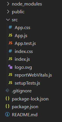
Project Structure
Example 1: Now write down the following code in the App.js file. Here, App is our default component. In the following example, we used the block property of the button component to make it take up all the available width.
Javascript
import React from "react";
import { ButtonGroup, Button } from "rsuite";
import "rsuite/dist/rsuite.min.css";
function App() {
return (
<div className="App" style={{ textAlign: "center",
padding: "0 30px" }}>
<header style={{ display: "block",
marginBottom: "20px" }}>
<h3 style={{ color: "green" }}>
GeeksforGeeks</h3>
<h5>React Suite Button Block</h5>
</header>
{}
<Button block>Block Button 1</Button>
<Button block>Block Button 2</Button>
</div>
);
}
export default App;
|
Step to Run Application: Run the application using the following command from the root directory of the project:
npm start
Output: Now open your browser and go to http://localhost:3000/, you will see the following output:
Example 2: In this example, we used the color property of the Button component along the block property to change the colors of the block Buttons.
Javascript
import React from "react";
import { ButtonGroup, Button } from "rsuite";
import "rsuite/dist/rsuite.min.css";
function App() {
return (
<div className="App" style={{ textAlign: "center",
padding: "0 30px" }}>
<header style={{ display: "block",
marginBottom: "20px" }}>
<h3 style={{ color: "green" }}>
GeeksforGeeks</h3>
<h5>React Suite Button Block - Color Variation</h5>
</header>
{}
<Button block color="red" appearance="primary">
Red Block Button</Button>
<Button block color="violet" appearance="primary">
Violet Block Button</Button>
<Button block color="green" appearance="primary">
Green Block Button</Button>
<Button block color="yellow" appearance="primary">
Yellow Block Button</Button>
<Button block color="orange" appearance="primary">
Orange Block Button</Button>
<Button block color="blue" appearance="primary">
Blue Block Button</Button>
<Button block color="cyan" appearance="primary">
Cyan Block Button</Button>
</div>
);
}
export default App;
|
Output:
Reference: https://rsuitejs.com/components/button/#block
Share your thoughts in the comments
Please Login to comment...