React MUI Dark mode
Last Updated :
28 Dec, 2022
Material UI is an open-source UI component library that implements Google’s Material design. It helps in making the design process easy which comes with a comprehensive collection of prebuild and customizable components that can be used straight away. One of the features that users want to have on their Mobile and Web applications is Dark Mode. In this article let’s discuss how to add the dark mode using React Material UI.
Material UI allows us to switch between light and dark themes based on user preference by using the ThemeProvider component and a toggle switch or you can directly make the dark mode as default regardless of the user preference.
Syntax:
<ThemeProvider theme={darkTheme}>
    ...
</ThemeProvider>
Basic Setup: Follow the below steps to create the application:
Step 1: Create a folder called appbar-react. Open your command prompt and navigate to the appbar-react folder. Now type in the following command.
npx create-react-app
Step 2: Create a folder called component inside the src folder. Inside that component, creates a file called Main.js once that is done your project structure will look something like this.
cd src
mkdir component
touch Main.js
Step 2: Again, in the same folder, open the command prompt and type in the following command.
npm install @mui/material @emotion/react @emotion/styled
Project Structure: Once the installation is complete, you will have all the modules required. Your folder structure should look something like this.
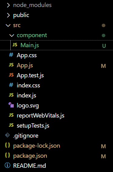
Updated project structure
Example 1: In this example, we will see how to provide the user with a facility to switch between dark and light themes:
Javascript
import { useState } from 'react';
import './App.css';
import Main from './component/Main'
import { ThemeProvider, createTheme } from '@mui/material/styles'
import { Switch } from '@mui/material';
import CssBaseline from '@mui/material/CssBaseline'
function App() {
const [theme, settheme] = useState(false);
const darkTheme = createTheme({
palette: {
mode: theme ? 'dark' : 'light',
},
});
const handleChange = (event) => {
settheme(event.target.checked);
}
return (
<div className="App">
<ThemeProvider theme={darkTheme}>
<CssBaseline />
<Main></Main>
<label>Dark Mode</label>
<Switch
checked={theme}
color='success'
onChange={handleChange} />
</ThemeProvider>
</div>
);
}
export default App;
|
Javascript
import React from 'react'
const main = () => {
return (
<div
className="head"
style={{
width: "fit-content",
margin: "auto",
}}
>
<h1
style={{
color: "green",
}}
>
GeeksforGeeks
</h1>
<strong>React MUI Dark/Light mode</strong>
</div>
)
}
export default main
|
Step to run the application: Open your command prompt in the same folder, and type in the following command.
npm start
Output:
.gif)
Dark/Light theme
Example 2: In this example, we will look at how to enable dark/light themes based on the system preference that the user has set through their operating system–either systemwide, or for a single user agent.
Javascript
import * as React from 'react'
import useMediaQuery from '@mui/material/useMediaQuery'
import { createTheme, ThemeProvider } from '@mui/material/styles'
import CssBaseline from '@mui/material/CssBaseline'
import Main from './component/Main'
function App() {
const preferedMode = useMediaQuery('(prefers-color-scheme: dark)');
const theme = React.useMemo(
() =>
createTheme({
palette: {
mode: preferedMode ? 'dark' : 'light',
},
}),
[preferedMode],
);
return (
<ThemeProvider theme={theme}>
<CssBaseline />
<Main />
</ThemeProvider>
);
}
export default App
|
Javascript
import React from 'react'
const main = () => {
return (
<div>
<div
className="head"
style={{
width: "fit-content",
margin: "auto",
}}
>
<h1
style={{
color: "green",
}}
>
GeeksforGeeks
</h1>
</div>
<h4>Steps to enable Dark Mode in Window</h4>
<p>To enable dark mode, navigate
to Settings >> Personalization >> Colors,
then open the drop-down menu for
"Choose your color" and pick Dark.
Dark (and Light) mode change the look of
the Windows Start menu and built-in apps.</p>
<h4>Steps to enable Dark Mode in Mac</h4>
<p>In macOS Ventura or later, choose Apple menu >
System Settings, then click Appearance
in the sidebar. And choose the theme
of your choice</p>
</div>
)
}
export default main
|
Output:
Reference: https://mui.com/material-ui/customization/dark-mode/
Like Article
Suggest improvement
Share your thoughts in the comments
Please Login to comment...