React MUI Autocomplete Input
Last Updated :
07 Nov, 2022
In React, we have an MUI ( Material UI) library which is one of the most famous libraries for react. In MUI, we have autocomplete input component which helps to use the input box with the feature of having an autocomplete option. It also contains suggestions for different customized options.
This component varies with two different kinds of use-case or variations:
1. Combo box: The value to be given in the textbox must be selected from a predefined set of allowed values, These predefined sets of values provide an accuracy that the input is always valid.
Syntax:
<Autocomplete
   disablePortal
   id="combo-box-demo"
   options={top10Food()}
   sx={{ width: 300 }}
   renderInput={(params) => <TextField {...params} label="Movie" />}
/>
2. Free solo: The value in the textbox may contain any random value, but it is very useful to suggest possible values to the user.
Syntax:
<Autocomplete
   id="free-solo-demo"
   freeSolo
   options={top10Food().map((option) => option.title)}
   renderInput={(params) => <TextField {...params} label="freeSolo" />}
/>
Creating React Application:
Step 1: Create a React application using the following command:
npx create-react-app example
Step 2: After creating your project folder i.e. example, move to it using the following command:
cd example
Step 3: MUI installation, now from the root directory of your project in the terminal, run the following command
npm install @mui/material @emotion/react @emotion/styled
Project Structure: It will look like this.
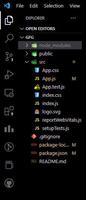
Folder structure
Example 1: In this example, we are going to see the combo box type of auto-complete in which we have a list of predefined values. Which will come as suggestion on typing the value. We will be only able to choose the one which is there in a predefined list of values. Other than that we cannot choose any other values.
Filename: App.js
Javascript
import logo from './logo.svg';
import './App.css';
import TextField from '@mui/material/TextField';
import Autocomplete from '@mui/material/Autocomplete';
const topFilms = () => [
{ label: 'The Shawshank Redemption', year: 1994 },
{ label: 'The Godfather', year: 1972 },
{ label: 'The Godfather: Part II', year: 1974 },
{ label: 'The Dark Knight', year: 2008 },
{ label: '12 Angry Men', year: 1957 },
{ label: "Schindler's List", year: 1993 },
{ label: 'Pulp Fiction', year: 1994 },
{
label: 'The Lord of the Rings: The Return of the King',
year: 2003,
},
{ label: 'The Good, the Bad and the Ugly', year: 1966 }
];
function App() {
return (
<div className="App">
<p>The autocomplete example 1 :
with predefined set of inputs</p>
<Autocomplete
disablePortal
id="combo-box-demo"
options={topFilms()}
sx={{ width: 400 }}
renderInput={(params) =>
<TextField {...params} label="Movie" />}
/>
</div>
);
}
export default App;
|
Step to run the application: Use the following command to run the application.
npm start
Output:
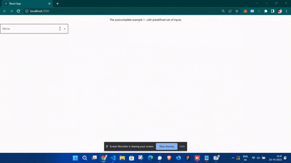
Output 1
Example 2: In this example, we are going to see the solo type of auto-complete in which we have a list of predefined suggestion values. Which will come as a suggestion on typing the value. We will be able to choose that one or our word both.
Filename: App.js
Javascript
import logo from './logo.svg';
import './App.css';
import TextField from '@mui/material/TextField';
import Autocomplete from '@mui/material/Autocomplete';
const topFilms = () => [
{ label: 'The Shawshank Redemption', year: 1994 },
{ label: 'The Godfather', year: 1972 },
{ label: 'The Godfather: Part II', year: 1974 },
{ label: 'The Dark Knight', year: 2008 },
{ label: '12 Angry Men', year: 1957 },
{ label: "Schindler's List", year: 1993 },
{ label: 'Pulp Fiction', year: 1994 },
{
label: 'The Lord of the Rings: The Return of the King',
year: 2003,
},
{ label: 'The Good, the Bad and the Ugly', year: 1966 }
];
function App() {
return (
<div className="App">
<p>The autocomplete example 2 :
with suggestion only input</p>
<Autocomplete
id="free-solo-demo"
freeSolo
options={topFilms().map((option) => option.label)}
sx={{ width: 400 }}
renderInput={(params) => <TextField {...params}
label="freeSolo input" />}
/>
</div>
);
}
export default App;
|
Output:
Reference: https://mui.com/material-ui/react-autocomplete/
Like Article
Suggest improvement
Share your thoughts in the comments
Please Login to comment...