React MUI AppBar API
Last Updated :
10 Oct, 2022
This article will teach you how to use the AppBar API offered by React MUI. MUI stands for Material UI. It is a framework that provides Component APIs that you can use to make your website more attractive. Let us take a look at the AppBar API.
The React MUI AppBar API is a Component API offered by MUI. These AppBars are similar to Navigation bars and you will mostly observe them, at the top of a webpage. The AppBar generally contains elements such as Menus, Dropdown lists, Login Buttons, Profile icons, and more. You will understand better once we implement the API.
Syntax:
<AppBar>
    {/* Components that you want to render on the AppBar */}
</AppBar>
Props: The props available for this component are as follows
- classes: It is used to extend the CSS applied to the component. Through classes, we can apply different CSS Classes to the component, to make it more attractive.
- color: It is used to apply a color to our AppBar. We can apply a default as well as a custom color.
- enableColorOnDark: It is used to apply a darker shade of color to our AppBar.
- position: This is the same as the positioning in normal CSS. For example: if we set the positioning prop to fixed, then our AppBar will be fixed at the top of the page, and won’t be visible once you scroll down the page considerably.
- sx: With this prop, we can write our custom CSS and apply to the props instead of their default values. We can also write additional CSS that we want to apply to our AppBar.
Let’s understand with examples.
Step 1: Create a folder called appbar-react. Open your command prompt and navigate to the appbar-react folder. Now type in the following command.
npx create-react-app
Step 2: Again, in the same folder, open the command prompt and type in the following command.
npm install @mui/material @emotion/react @emotion/styled
Project Structure: Once the installation is complete, you should have the necessary starter files. Your folder structure should look something like this.

Folder Structure
Now, inside the src folder, create a new folder called components. Inside the components folder, create two files namely AppBarNavbarComponent.js and AppbarToggleComponent.js. Your updated folder structure should look like this.

Updated Folder Structure
Example 1: In this example, we will create a simple navbar inside our AppBar component.
AppBarNavbarComponent.js
Javascript
import { AppBar } from '@mui/material';
import React from 'react';
const AppBarNavbarComponent = () => {
return (
<>
<AppBar>
<ul id="nav-list">
<li>Home</li>
<li>About</li>
<li>Learn More</li>
<li>Contact Us</li>
</ul>
</AppBar>
</>
)
}
export default AppBarNavbarComponent
|
Now we will add some CSS for the above component. The CSS is given below. Just inside your src folder, open App.css and type the following code.
App.css
CSS
#nav-list {
display: flex;
}
#nav-list li {
list-style-type: none;
padding: 20px;
border-radius: 10px;
transition: background 1s;
}
#nav-list li:hover {
cursor: pointer;
background-color: rgb(49 49 217);
font-weight: 600;
}
.theme {
padding: 13px;
margin: 13px;
border: none;
border-radius: 10px;
font-weight: 600;
}
#normal {
background-color: #fff;
}
#dark {
background-color: #000;
color: #fff;
}
.theme:hover {
cursor: pointer;
}
|
Now open your App.js inside the src folder. In App.js, we are simply importing the AppBarNavbarComponent and rendering it inside the return statement.
App.js
Javascript
import './App.css';
import AppBarNavbarComponent from
'./components/AppBarNavbarComponent';
function App() {
return (
<>
<AppBarNavbarComponent />
</>
);
}
export default App;
|
Step to run the application: Open you command prompt in the same folder, and type in the following command.
npm start
Output:
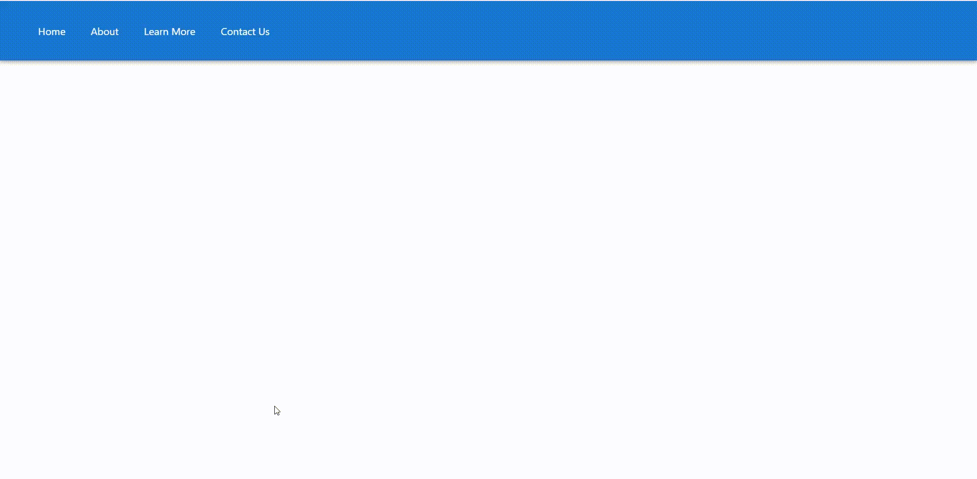
Output for AppBarNavbarComponent
Example 2: In this example, we will create two buttons that change the color of our AppBar. We will toggle to do the switch between normal and dark mode.
AppBarToggleComponent.js
Javascript
import { AppBar } from '@mui/material'
import React, { useState } from 'react'
const AppBarToggleComponent = () => {
const [theme, setTheme] = useState('transparent');
const handleChange = () => {
setTheme('primary');
}
const handleReset = () => {
setTheme('transparent');
}
return (
<>
<AppBar color={theme}>
<div>
<button className="theme" id="normal"
onClick={handleReset}>
Transparent Theme
</button>
<button className="theme" id="dark"
onClick={handleChange}>
Primary Theme
</button>
</div>
</AppBar>
</>
)
}
export default AppBarToggleComponent
|
Now, open App.js inside the src folder. In App.js, we are simply importing the AppBarToggleComponent and rendering it inside the return statement. Also, we are importing the App.css file. The same CSS file is used for both the examples.
App.js
Javascript
import './App.css';
import AppBarToggleComponent from
'./components/AppBarToggleComponent';
function App() {
return (
<>
<AppBarToggleComponent />
</>
);
}
export default App;
|
Step to run the application: Open your command prompt and type in the following command.
npm start
Output:
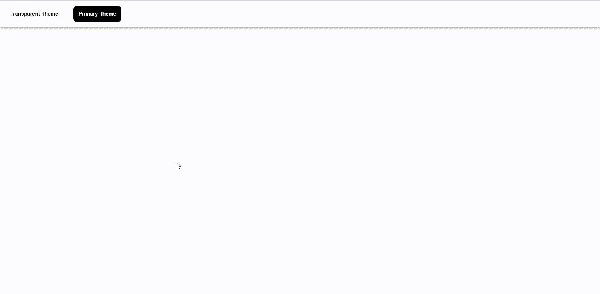
AppBarToggleComponent
Reference: https://mui.com/material-ui/api/app-bar/
Share your thoughts in the comments
Please Login to comment...