React MUI API Design Approach
Last Updated :
01 Feb, 2023
React MUI is a UI library that provides fully-loaded components, bringing our own design system to our production-ready components. MUI is a user interface library that provides predefined and customizable React components for faster and easy web development, these Material-UI components are based on top of Material Design by Google.
In this article, we’ll be discussing React MUI API Design Approach. The API design approach is based on the principles of Material Design and provides a set of pre-built UI components that are easy to use and customize. The main goal of the MUI API design approach is to provide a comprehensive and consistent set of UI components that can be easily integrated into a React-based application, while also providing a high degree of flexibility and customization. This allows developers to quickly create visually appealing and functional user interfaces without having to spend a lot of time on design and styling.
API Design Approach Contents:
- Composition: It refers to the combination of several components to create a more complex and reusable UI element. It allows developers to break down a user interface into smaller, more manageable parts, making it easier to maintain and customize the overall design.
- Rules: The API design approach follow some rules like Spreading, Native properties, CSS classes, Nested Components, Prop naming, Controlled components, and Boolean vs Enum.
- Glossary: It refers to a comprehensive list of terms and definitions used in the design language. It provides a common vocabulary and helps to ensure consistent use of language and terminology across design and development teams.
Creating React Project:
Step 1: Create React app by writing the below code in any command line.
npx create-react-app app_name
Step 2: Then, we have to move into the folder we will be working on.
cd project_name
Step 3: We will be installing the @mui/material library for working on our project.
npm install @mui/material @emotion/react @emotion/styled
Project Structure:
Folder Structure
Steps to run the application: Write the below code in the terminal to run the server:
npm start
Example 1: Below is the code for API design using Spread and Prop Naming rules.
Javascript
import React from 'react';
import { Box, Button, Typography } from '@mui/material';
const styledButton = {
margin: '10px'
}
const styledBox = {
boxShadow: 2,
margin: '10px',
display: 'flex',
justifyContent: 'center',
alignItems: 'center',
flexDirection: 'column'
}
const Example = () => {
return (
<Box sx={styledBox}>
<Typography sx={{ pt: 4, color: "green",
fontSize: 20 }}>
GeeksforGeeks
</Typography>
<Typography>API design using spread and
prop naming rules</Typography>
<div>
<Button variant="contained" color="primary"
sx={styledButton}>Normal Button</Button>
<Button variant="contained" color="primary"
disabled sx={styledButton}>Disabled Button</Button>
<Button variant="contained" color="primary"
disableRipple sx={styledButton}>
Ripple Disabled Button
</Button>
</div>
</Box>
);
}
export default Example;
|
Output:
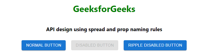
API design using spread and prop naming rules
Example 2: Below is the code for API design using CSS classes and Controlled components.
Javascript
import React, { useState } from 'react';
import { Box, Button, TextField, Typography } from '@mui/material';
import { red } from '@mui/material/colors';
const ColorButton = {
color: red[500],
fontWeight: 600,
backgroundColor: '#ffffff',
margin: '10px',
height: '35px',
'&:hover': {
backgroundColor: red[500],
color: '#ffffff'
},
};
const styledBox = {
boxShadow: 2,
margin: '10px',
display: 'flex',
alignItems: 'center',
flexDirection: 'column'
}
const Example = () => {
const [name, setName] = useState();
const [text, setText] = useState(true);
const handleChange = (event) => {
setName(event.target.value);
}
const handleClick = () => {
setText(false);
}
return (
<Box sx={styledBox}>
<Typography sx={{ pt: 4, color: "green",
fontSize: 20 }}>
GeeksforGeeks
</Typography>
<Typography>API design using CSS classes and
Controlled components</Typography>
<div style={{ margin: '10px' }}>
<TextField variant='outlined' label='Enter name'
onChange={handleChange} />
<Button variant="contained" onClick={handleClick}
sx={ColorButton}>Sign Up</Button>
</div>
<div hidden={text} style={{ margin: '10px', fontSize: '20px',
fontWeight: 600 }}>
Hello {name}
</div>
</Box>
);
}
export default Example;
|
Output:
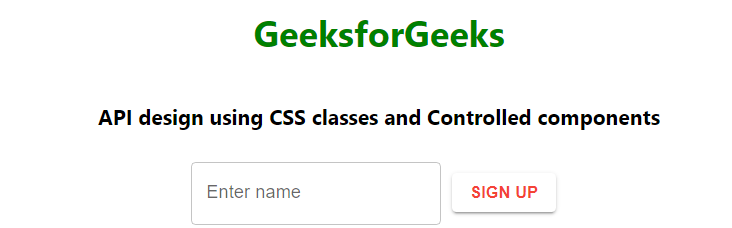
API design using CSS classes and Controlled components
Reference: https://mui.com/material-ui/guides/api/
Like Article
Suggest improvement
Share your thoughts in the comments
Please Login to comment...