React.js Blueprint Icon Component Usage
Last Updated :
17 Aug, 2022
BlueprintJS is a React-based UI toolkit for the web. This library is very optimized and popular for building interfaces that are complex data-dense for desktop applications. In this article, we will discuss React.js BluePrint Icon Component Usage.
Icon component is used to easily render SVG icons in Our React App. The @blueprintjs/icons package gives us access to 300+ SVG icons to use in our app. The icon property of the Icon component tells which icon to use and the size of the icon is decided by the size property.
React.js BluePrint Icon Component Usage Properties:
- icon: The icon property of the Icon component tells which icon to render.
- size: The size property decides the size of the icon.
- intent: This property defines the intent of the icon.
Syntax:
<Icon icon="..." size={...} intent={...} />
Creating React Application And Installing Modules:
Step 1: Create a React application using the following command:
npx create-react-app myApp
Step 2: After creating your project folder i.e. myApp, move to it using the following command:
cd myApp
Step 3: After creating the ReactJS application, Install the required modules using the following command:
npm install @blueprintjs/core @blueprintjs/icons
Project Structure: After following the above steps, the project structure will look as below:
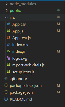
Project Structure
Example 1: Now write down the following code in the App.js file. In this example, we used the icon and the size property to render different-sized icons.
app.js
import React from 'react'
import '@blueprintjs/core/lib/css/blueprint.css';
import { Icon } from "@blueprintjs/core";
function App() {
const iconStyle = { marginLeft: "30px" };
const divStyle = {
display: 'block', width: 500,
padding: 30, textAlign: "center"
};
return (
<div style={divStyle}>
<h2
style={{ color: "green" }}>
GeeksforGeeks
</h2>
<h4>
ReactJS Blueprint Icon Component Usage
</h4>
<Icon iconSize={10}
icon="duplicate" style={iconStyle} />
<Icon iconSize={20}
icon="edit" style={iconStyle} />
<Icon iconSize={30}
icon="filter" style={iconStyle} />
<Icon iconSize={40}
icon="history" style={iconStyle} />
</div>
);
}
export default App;
|
Steps to run the app:
Execute the following command from your project folder to run the app.
npm start
Output:
Example 2: In this example, we used the intent property of the Icon component to change the color of the icons.
app.js
import React from 'react'
import '@blueprintjs/core/lib/css/blueprint.css';
import { Icon, Intent } from "@blueprintjs/core";
function App() {
const iconStyle = { marginLeft: "30px" };
const divStyle = {
display: 'block', width: 500,
padding: 30, textAlign: "center"
};
return (
<div style={divStyle}>
<h2 style={{ color: "green" }}>GeeksforGeeks</h2>
<h4>ReactJS Blueprint Icon Component Usage</h4>
<Icon iconSize={10} icon="duplicate"
style={iconStyle} intent={Intent.DANGER} />
<Icon iconSize={20} icon="edit"
style={iconStyle} intent={Intent.PRIMARY} />
<Icon iconSize={30} icon="filter"
style={iconStyle} intent={Intent.SUCCESS} />
<Icon iconSize={40} icon="history"
style={iconStyle} intent={Intent.WARNING} />
</div>
);
}
export default App;
|
Output:
Reference: https://blueprintjs.com/docs/#core/components/icon.usage
Like Article
Suggest improvement
Share your thoughts in the comments
Please Login to comment...