React.js Blueprint Editable text Component Props
Last Updated :
25 Aug, 2022
BlueprintJS is an open-source UI toolkit for React applications. It is used for making complex and data-heavy web applications. In this article, we will be discussing the Props of the Editable Text Component of the BluePrintJS library.
The Editable Text Component is similar to the Text component but it changes into an input field when it comes into focus. The Editable Text component inherits all the font styling from its ancestors.
React.js BluePrint Editable Text Component Properties:
- alwaysRenderInput: When it is set to true, the component will always render the input whether it is in focus or not. It accepts boolean values.
- className: It is a space-separated list of class names to be applied to the child element.
- confirmOnEnterKey: If this property is set to true, then in multiline mode, pressing the enter key will trigger the onConfirm event. It accepts boolean values
- contentId: It is used to pass an ID for the element wrapping the text of the Editable Text component. It accepts a string value.
- defaultValue: It is used to pass a default text value for the uncontrolled input. It accepts a string value.
- disabled: This is a boolean property used to disable the component. The text of the EditableText component cannot be edited if it is disabled.
- intent: It is used to set the intent of the Editable Text.
- isEditing: This property tells whether the text is being edited or not.
- maxLength: It is used to define the maximum character length that the EditableText can have.
- maxLines: It is used to define the maximum lines when scrolling starts in EditableText input when it is set to multiline mode.
- minLines: It is used to define the minimum lines in EditableText input when it is set to multiline mode.
- minWidth: It is used to set the minimum width in pixels for the input. It works only when the component is not in multiline mode.
- multiline: This is a boolean property. It is used to enable or disable the multiline mode for the EditableText component.
- onCancel: This callback method is invoked when the user cancels the input with the ESC key.
- onChange: This callback method is invoked when the input is changed in any way by the user.
- onConfirm: This callback method is called when the users confirm the input value by pressing the enter key or by removing the focus from the input.
- onEdit: This callback method is called when the user enters the edit mode on an EditableText component.
- placeholder: This parameter accepts a string value which is used as the placeholder for the EditableText component.
- selectAllOnFocus: If this property is set to true, the input will be selected on focus. This property works only with text, search, URL, tel, and password input types.
- type: It defines the type of input that will be rendered when the component is not in multiline mode.
- value: This property is used to set the value of the controlled input.
Syntax:
<EditableText
    multiline={true/false}
    disabled={true/false}
    minLines={...}
    maxLines={...}
    placeholder="..."
    intent="..."
    ...
/>
Creating React Application And Installing Modules:
Step 1: Create a React application using the following command:
npx create-react-app myApp
Step 2: After creating your project folder i.e. myApp, move to it using the following command:
cd myApp
Step 3: After creating the ReactJS application, Install the required modules using the following command:
npm install @blueprintjs/core @blueprintjs/icons
Project Structure: After following the above steps, the project structure will look as below:
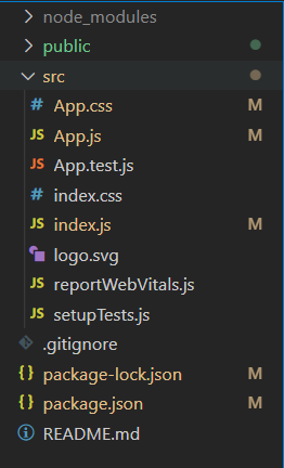
Project Structure
Example 1: Now write down the following code in the App.js file. This example shows the use of the above-listed props of the Editable Text component.
app.js
import React from 'react'
import '@blueprintjs/core/lib/css/blueprint.css';
import '@blueprintjs/icons/lib/css/blueprint-icons.css'
import { EditableText } from '@blueprintjs/core';
function App() {
const divStyle = {
display: 'block', width: 450,
padding: 30
};
return (
<div style={divStyle}>
<h2
style={{ color: "green" }}>
GeeksforGeeks
</h2>
<h3>
React.js BluePrint
Editable Text Component Props
</h3>
<EditableText
multiline={true}
minLines={3}
maxLines={12}
intent="primary"
placeholder="Edit the Paragraph..."
/>
</div>
);
}
export default App;
|
Steps to run the app: Execute the following command from your project folder to run the app.
npm start
Output:
Example 2: This is another example that shows the use of Editable Text Component props.
app.js
import React from 'react'
import '@blueprintjs/core/lib/css/blueprint.css';
import '@blueprintjs/icons/lib/css/blueprint-icons.css'
import { EditableText } from '@blueprintjs/core';
function App() {
const divStyle = {
display: 'block', width: 450,
padding: 30
};
return (
<div style={divStyle}>
<h2
style={{ color: "green" }}>
GeeksforGeeks
</h2>
<h3>
React.js BluePrint
Editable Text Component Props
</h3>
<h2>
<EditableText
multiline={false}
minLines={1}
intent="success"
placeholder="Edit the Heading..."
/>
</h2>
<h2>
<EditableText
multiline={false}
minLines={1}
intent="danger"
disabled={true}
placeholder=
"Disabled Heading. Cannot be Edited"
/>
</h2>
</div>
);
}
export default App;
|
Output:
Reference: https://blueprintjs.com/docs/#core/components/editable-text.props
Like Article
Suggest improvement
Share your thoughts in the comments
Please Login to comment...