R – Waffle Chart
Last Updated :
17 May, 2020
A waffle chart shows progress towards a target or a completion percentage. Waffle Charts are a great way of visualizing data in relation to a whole, to highlight progress against a given threshold, or when dealing with populations too varied for pie charts. A lot of times, these are used as an alternative to the pie charts. It also has a niche for showing parts-to-whole contribution. It doesn’t misrepresent or distort a data point (which a pie chart is sometimes guilty of doing).
Waffle Charts are mainly used when composing parts of a whole, or when comparing progress against a goal. These charts usually follow other kinds of data visualization for helping the understanding of the audience. For example, you might want a Waffle Chart when plotting how the expenses of a company are composed by each type of expense, or when classifying percentages of a population at a given moment. Waffle charts are also known as Squared Pie Charts. The individual values will be summed up and each that will be the total number of squares in the grid.
Implementation in R
ggplot2
ggplot2 is a specialized library made to create visually pleasing data visualizations. The ggplot2 package has the capability to plot simple as well as complex graphs based on the problem statement.
To install ggplot2 package in R Studio use the following command:
install.packages("ggplot2")
RStudio will execute the command and return the following output in the Console:
Waffle plot
Waffle is a ggplot2 extension designed to create Waffle charts with a simple syntax.
To install waffle package in R Studio use the following command:
install.packages("waffle")
RStudio will execute the command and return the following output in the Console:
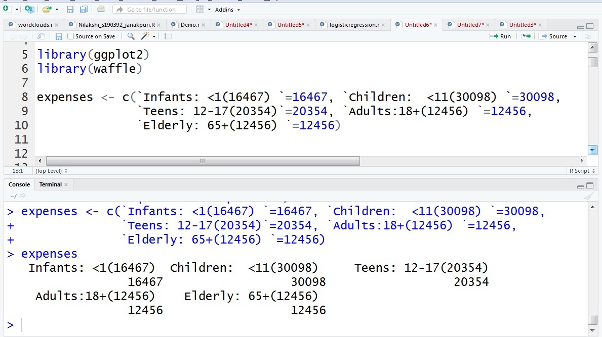
Load the libraries in R Studio:
library(ggplot2)
library(waffle)
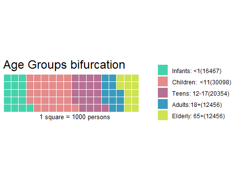
Let’s take the dataset of 91822 persons categorized as:
Infants <1 = 16467
Children <11 = 30098
Teens 12-17 = 20354
Adults 18+ = 12456
Elderly 65+ = 12456
Create a vector of data:
expenses <- c(`Infants: <1(16467) `=16467, `Children: <11(30098) `=30098,
`Teens: 12-17(20354)`=20354, `Adults:18+(12456) `=12456,
`Elderly: 65+(12456) `=12456)
|
Here we have created a vector with name expenses
We will get the following output after the execution of this command in R Studio.
Now let’s plot our waffle chart. Our parameters are the following:
Plot the waffle chart:
waffle(expenses/1000, rows=5, size=0.6,
colors=c("#44D2AC", "#E48B8B", "#B67093",
"#3A9ABD", "#CFE252"),
title="Age Groups bifurcation",
xlab="1 square = 1000 persons")
|
This code will generate the following waffle chart-
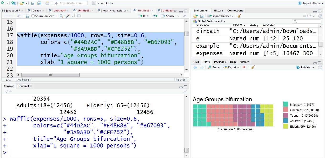
The waffle chart created by the following code is-

Like Article
Suggest improvement
Share your thoughts in the comments
Please Login to comment...