R – Charts and Graphs
Last Updated :
09 Dec, 2021
R language is mostly used for statistics and data analytics purposes to represent the data graphically in the software. To represent those data graphically, charts and graphs are used in R.
R – graphs
There are hundreds of charts and graphs present in R. For example, bar plot, box plot, mosaic plot, dot chart, coplot, histogram, pie chart, scatter graph, etc.
Types of R – Charts
- Bar Plot or Bar Chart
- Pie Diagram or Pie Chart
- Histogram
- Scatter Plot
- Box Plot
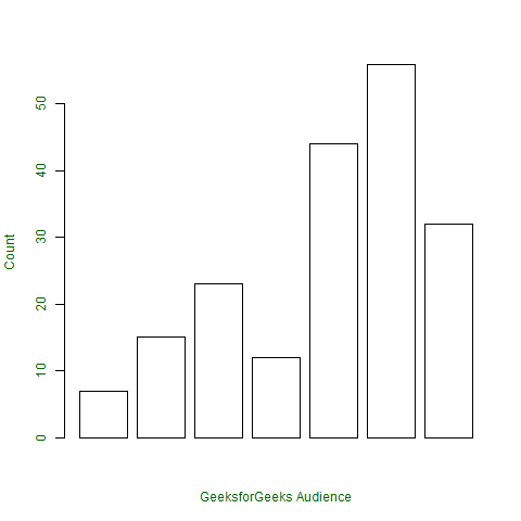
Bar Plot or Bar Chart
Bar plot or Bar Chart in R is used to represent the values in data vector as height of the bars. The data vector passed to the function is represented over y-axis of the graph. Bar chart can behave like histogram by using table() function instead of data vector.
Syntax: barplot(data, xlab, ylab)
where:
- data is the data vector to be represented on y-axis
- xlab is the label given to x-axis
- ylab is the label given to y-axis
Note: To know about more optional parameters in barplot() function, use the below command in R console:
help("barplot")
Example:
R
x <- c(7, 15, 23, 12, 44, 56, 32)
png(file = "barplot.png")
barplot(x, xlab = "GeeksforGeeks Audience",
ylab = "Count", col = "white",
col.axis = "darkgreen",
col.lab = "darkgreen")
dev.off()
|
Output:
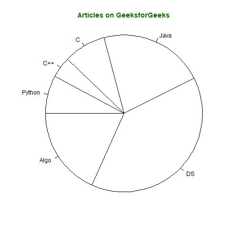
Pie Diagram or Pie Chart
Pie chart is a circular chart divided into different segments according to the ratio of data provided. The total value of the pie is 100 and the segments tell the fraction of the whole pie. It is another method to represent statistical data in graphical form and pie() function is used to perform the same.
Syntax: pie(x, labels, col, main, radius)
where,
- x is data vector
- labels shows names given to slices
- col fills the color in the slices as given parameter
- main shows title name of the pie chart
- radius indicates radius of the pie chart. It can be between -1 to +1
Note: To know about more optional parameters in pie() function, use the below command in the R console:
help("pie")
Example:
Assume, vector x indicates the number of articles present on the GeeksforGeeks portal in categories names(x)
R
x <- c(210, 450, 250, 100, 50, 90)
names(x) <- c("Algo", "DS", "Java", "C", "C++", "Python")
png(file = "piechart.png")
pie(x, labels = names(x), col = "white",
main = "Articles on GeeksforGeeks", radius = -1,
col.main = "darkgreen")
dev.off()
|
Output:
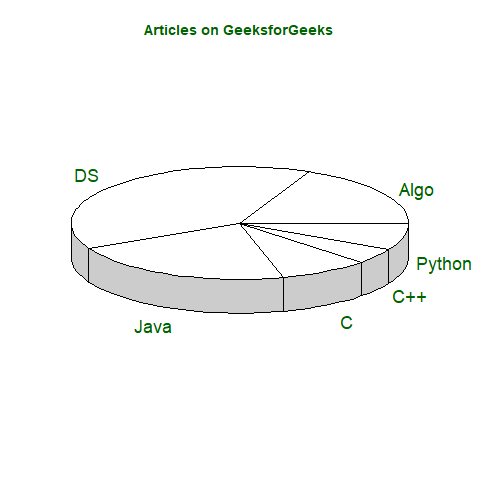
Pie chart in 3D can also be created in R by using following syntax but requires plotrix library.
Syntax: pie3D(x, labels, radius, main)
Note: To know about more optional parameters in pie3D() function, use below command in R console:
help("pie3D")
Example:
R
library(plotrix)
x <- c(210, 450, 250, 100, 50, 90)
names(x) <- c("Algo", "DS", "Java", "C", "C++", "Python")
png(file = "piechart3d.png")
pie3D(x, labels = names(x), col = "white",
main = "Articles on GeeksforGeeks",
labelcol = "darkgreen", col.main = "darkgreen")
dev.off()
|
Output:
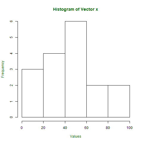
Histogram
Histogram is a graphical representation used to create a graph with bars representing the frequency of grouped data in vector. Histogram is same as bar chart but only difference between them is histogram represents frequency of grouped data rather than data itself.
Syntax: hist(x, col, border, main, xlab, ylab)
where:
- x is data vector
- col specifies the color of the bars to be filled
- border specifies the color of border of bars
- main specifies the title name of histogram
- xlab specifies the x-axis label
- ylab specifies the y-axis label
Note: To know about more optional parameters in hist() function, use below command in R console:
help("hist")
Example:
R
x <- c(21, 23, 56, 90, 20, 7, 94, 12,
57, 76, 69, 45, 34, 32, 49, 55, 57)
png(file = "hist.png")
xlab = "Values",
col.lab = "darkgreen",
col.main = "darkgreen")
dev.off()
|
Output:
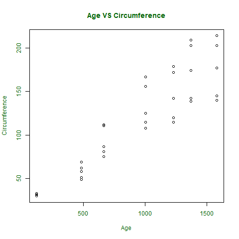
Scatter Plot
A Scatter plot is another type of graphical representation used to plot the points to show relationship between two data vectors. One of the data vectors is represented on x-axis and another on y-axis.
Syntax: plot(x, y, type, xlab, ylab, main)
Where,
- x is the data vector represented on x-axis
- y is the data vector represented on y-axis
- type specifies the type of plot to be drawn. For example, “l” for lines, “p” for points, “s” for stair steps, etc.
- xlab specifies the label for x-axis
- ylab specifies the label for y-axis
- main specifies the title name of the graph
Note: To know about more optional parameters in plot() function, use the below command in R console:
help("plot")
Example:
R
orange <- Orange[, c('age', 'circumference')]
png(file = "plot.png")
plot(x = orange$age, y = orange$circumference, xlab = "Age",
ylab = "Circumference", main = "Age VS Circumference",
col.lab = "darkgreen", col.main = "darkgreen",
col.axis = "darkgreen")
dev.off()
|
Output:
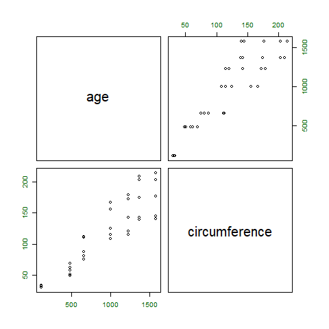
If a scatter plot has to be drawn to show the relation between 2 or more vectors or to plot the scatter plot matrix between the vectors, then pairs() function is used to satisfy the criteria.
Syntax: pairs(~formula, data)
where,
- ~formula is the mathematical formula such as ~a+b+c
- data is the dataset form where data is taken in formula
Note: To know about more optional parameters in pairs() function, use the below command in R console:
help("pairs")
Example :
R
png(file = "plotmatrix.png")
pairs(~age + circumference, data = Orange,
col.axis = "darkgreen")
dev.off()
|
Output:
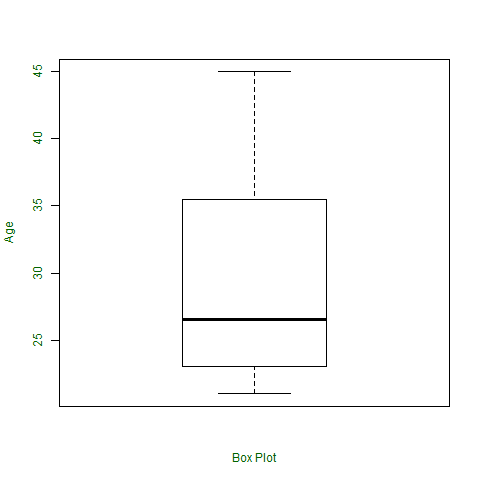
Box Plot
Box plot shows how the data is distributed in the data vector. It represents five values in the graph i.e., minimum, first quartile, second quartile(median), third quartile, the maximum value of the data vector.
Syntax: boxplot(x, xlab, ylab, notch)
where,
- x specifies the data vector
- xlab specifies the label for x-axis
- ylab specifies the label for y-axis
- notch, if TRUE then creates notch on both the sides of the box
Note: To know about more optional parameters in boxplot() function, use the below command in R console:
help("boxplot")
Example:
R
x <- c(42, 21, 22, 24, 25, 30, 29, 22,
23, 23, 24, 28, 32, 45, 39, 40)
png(file = "boxplot.png")
boxplot(x, xlab = "Box Plot", ylab = "Age",
col.axis = "darkgreen", col.lab = "darkgreen")
dev.off()
|
Output:
Like Article
Suggest improvement
Share your thoughts in the comments
Please Login to comment...