R – Bar Charts
Last Updated :
29 Feb, 2024
Bar charts are a popular and effective way to visually represent categorical data in a structured manner. R stands out as a powerful programming language for data analysis and visualization. In this article, we’ll look at how to make visually appealing bar charts in R.
Bar Charts using R
A bar chart also known as bar graph is a pictorial representation of data that presents categorical data with rectangular bars with heights or lengths proportional to the values that they represent. In other words, it is the pictorial representation of the dataset. These data sets contain the numerical values of variables that represent the length or height.
R uses the barplot() function to create bar charts. Here, both vertical and Horizontal bars can be drawn.
Syntax:
barplot(H, xlab, ylab, main, names.arg, col)
Parameters:
- H: This parameter is a vector or matrix containing numeric values which are used in bar chart.
- xlab: This parameter is the label for x axis in bar chart.
- ylab: This parameter is the label for y axis in bar chart.
- main: This parameter is the title of the bar chart.
- names.arg: This parameter is a vector of names appearing under each bar in bar chart.
- col: This parameter is used to give colors to the bars in the graph.
Creating a Simple Bar Chart in R
In order to create a Bar Chart:
- A vector (H <- c(Values…)) is taken which contains numeral values to be used.
- This vector H is plot using barplot().
R
A <- c(17, 32, 8, 53, 1)
barplot(A, xlab = "X-axis", ylab = "Y-axis", main ="Bar-Chart")
|
Output:

R – Bar Charts
Creating a Horizontal Bar Chart in R
To create a horizontal bar chart:
- Take all parameters which are required to make a simple bar chart.
- Now to make it horizontal new parameter is added.
barplot(A, horiz=TRUE )
Creating a horizontal bar chart
R
A <- c(17, 32, 8, 53, 1)
barplot(A, horiz = TRUE, xlab = "X-axis",
ylab = "Y-axis", main ="Horizontal Bar Chart"
)
|
Output:

Horizontal Bar Chart
Adding Label, Title and Color in the BarChart
Label, title and colors are some properties in the bar chart which can be added to the bar by adding and passing an argument.
- To add the title in bar chart.
barplot( A, main = title_name )
- X-axis and Y-axis can be labeled in bar chart. To add the label in bar chart.
barplot( A, xlab= x_label_name, ylab= y_label_name)
- To add the color in bar chart.
barplot( A, col=color_name)
Implementations
R
A <- c(17, 2, 8, 13, 1, 22)
B <- c("Jan", "feb", "Mar", "Apr", "May", "Jun")
barplot(A, names.arg = B, xlab ="Month",
ylab ="Articles", col ="green",
main ="GeeksforGeeks-Article chart")
|
Output:
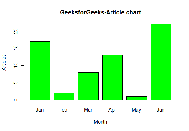
R – GeeksforGeeks-Article chart
Add Data Values on the Bar
R
A <- c(17, 2, 8, 13, 1, 22)
B <- c("Jan", "Feb", "Mar", "Apr", "May", "Jun")
barplot(A, names.arg = B, xlab = "Month",
ylab = "Articles", col = "steelblue",
main = "GeeksforGeeks - Article Chart",
cex.main = 1.5, cex.lab = 1.2, cex.axis = 1.1)
text(
x = barplot(A, names.arg = B, col = "steelblue", ylim = c(0, max(A) * 1.2)),
y = A + 1, labels = A, pos = 3, cex = 1.2, col = "black"
)
|
Output:

GeeksforGeeks – Article Chart
cex.main, cex.lab, and cex.axis: These arguments control the font size of the chart title, x-axis label, and y-axis label, respectively. They are set to 1.5, 1.2, and 1.1 to increase the font size for better readability.text(): We use the text() function to add data labels on top of each bar. The x argument specifies the x-coordinates of the labels (same as the barplot() x-coordinates), the y argument adds a value of 1 to the corresponding bar heights (A + 1) to position the labels just above the bars.
Creating Stacked and Grouped Bar Chart in R
The bar chart can be represented in two form group of bars and stacked.
- Take a vector value and make it matrix M which to be grouped or stacked. Making of matrix can be done by.
M <- matrix(c(values...), nrow = no_of_rows, ncol = no_of_column, byrow = TRUE)
- To display the bar explicitly we can use the beside parameter.
barplot( beside=TRUE )
Grouped Bar Chart:
R
colors = c("green", "orange", "brown")
months <- c("Mar", "Apr", "May", "Jun", "Jul")
regions <- c("East", "West", "North")
Values <- matrix(c(2, 9, 3, 11, 9, 4, 8, 7, 3, 12, 5, 2, 8, 10, 11),
nrow = 3, ncol = 5, byrow = TRUE)
barplot(Values, main = "Total Revenue", names.arg = months,
xlab = "Month", ylab = "Revenue",
col = colors, beside = TRUE)
legend("topleft", regions, cex = 0.7, fill = colors)
|
Output:
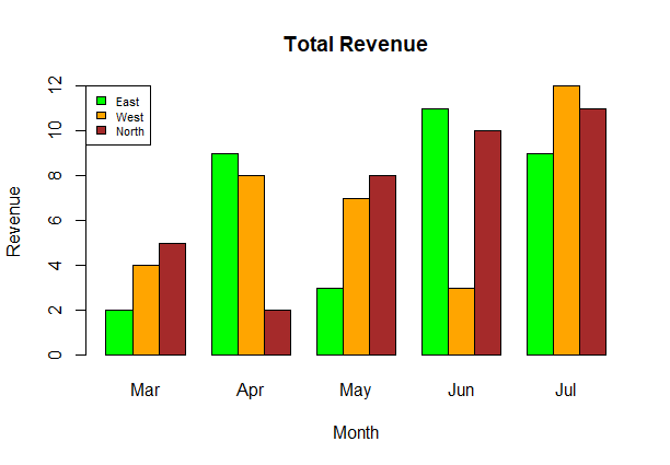
R – Total Revenue
Stacked Bar Chart:
R
colors = c("green", "orange", "brown")
months <- c("Mar", "Apr", "May", "Jun", "Jul")
regions <- c("East", "West", "North")
Values <- matrix(c(2, 9, 3, 11, 9, 4, 8, 7, 3, 12, 5, 2, 8, 10, 11),
nrow = 3, ncol = 5, byrow = TRUE)
barplot(Values, main = "Total Revenue", names.arg = months,
xlab = "Month", ylab = "Revenue", col = colors)
legend("topleft", regions, cex = 0.7, fill = colors)
|
Output:

R – Bar Charts
Like Article
Suggest improvement
Share your thoughts in the comments
Please Login to comment...