Quantile Quantile plots
Last Updated :
11 Feb, 2024
The quantile-quantile( q-q plot) plot is a graphical method for determining if a dataset follows a certain probability distribution or whether two samples of data came from the same population or not. Q-Q plots are particularly useful for assessing whether a dataset is normally distributed or if it follows some other known distribution. They are commonly used in statistics, data analysis, and quality control to check assumptions and identify departures from expected distributions.
Quantiles And Percentiles
Quantiles are points in a dataset that divide the data into intervals containing equal probabilities or proportions of the total distribution. They are often used to describe the spread or distribution of a dataset. The most common quantiles are:
- Median (50th percentile): The median is the middle value of a dataset when it is ordered from smallest to largest. It divides the dataset into two equal halves.
- Quartiles (25th, 50th, and 75th percentiles): Quartiles divide the dataset into four equal parts. The first quartile (Q1) is the value below which 25% of the data falls, the second quartile (Q2) is the median, and the third quartile (Q3) is the value below which 75% of the data falls.
- Percentiles: Percentiles are similar to quartiles but divide the dataset into 100 equal parts. For example, the 90th percentile is the value below which 90% of the data falls.
Note:
- A q-q plot is a plot of the quantiles of the first data set against the quantiles of the second data set.
- For reference purposes, a 45% line is also plotted; For if the samples are from the same population then the points are along this line.
Normal Distribution:
The normal distribution (aka Gaussian distribution Bell curve) is a continuous probability distribution representing distribution obtained from the randomly generated real values.
.

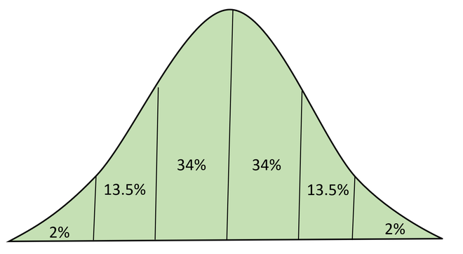
Normal Distribution with Area Under CUrve
How to Draw Q-Q plot?
To draw a Quantile-Quantile (Q-Q) plot, you can follow these steps:
- Collect the Data: Gather the dataset for which you want to create the Q-Q plot. Ensure that the data are numerical and represent a random sample from the population of interest.
- Sort the Data: Arrange the data in either ascending or descending order. This step is essential for computing quantiles accurately.
- Choose a Theoretical Distribution: Determine the theoretical distribution against which you want to compare your dataset. Common choices include the normal distribution, exponential distribution, or any other distribution that fits your data well.
- Calculate Theoretical Quantiles: Compute the quantiles for the chosen theoretical distribution. For example, if you’re comparing against a normal distribution, you would use the inverse cumulative distribution function (CDF) of the normal distribution to find the expected quantiles.
- Plotting:
- Plot the sorted dataset values on the x-axis.
- Plot the corresponding theoretical quantiles on the y-axis.
- Each data point (x, y) represents a pair of observed and expected values.
- Connect the data points to visually inspect the relationship between the dataset and the theoretical distribution.
Interpretation of Q-Q plot
- If the points on the plot fall approximately along a straight line, it suggests that your dataset follows the assumed distribution.
- Deviations from the straight line indicate departures from the assumed distribution, requiring further investigation.
Exploring Distribution Similarity with Q-Q Plots
Exploring distribution similarity using Q-Q plots is a fundamental task in statistics. Comparing two datasets to determine if they originate from the same distribution is vital for various analytical purposes. When the assumption of a common distribution holds, merging datasets can improve parameter estimation accuracy, such as for location and scale. Q-Q plots, short for quantile-quantile plots, offer a visual method for assessing distribution similarity. In these plots, quantiles from one dataset are plotted against quantiles from another. If the points closely align along a diagonal line, it suggests similarity between the distributions. Deviations from this diagonal line indicate differences in distribution characteristics.
While tests like the chi-square and Kolmogorov-Smirnov tests can evaluate overall distribution differences, Q-Q plots provide a nuanced perspective by directly comparing quantiles. This enables analysts to discern specific differences, such as shifts in location or changes in scale, which may not be evident from formal statistical tests alone.
Python Implementation Of Q-Q Plot
Python3
import numpy as np
import matplotlib.pyplot as plt
import scipy.stats as stats
np.random.seed(0)
data = np.random.normal(loc=0, scale=1, size=1000)
stats.probplot(data, dist="norm", plot=plt)
plt.title('Normal Q-Q plot')
plt.xlabel('Theoretical quantiles')
plt.ylabel('Ordered Values')
plt.grid(True)
plt.show()
|
Output:
.webp)
Q-Q plot
Here, as the data points approximately follow a straight line in the Q-Q plot, it suggests that the dataset is consistent with the assumed theoretical distribution, which in this case we assumed to be the normal distribution.
Advantages of Q-Q plot
- Flexible Comparison: Q-Q plots can compare datasets of different sizes without requiring equal sample sizes.
- Dimensionless Analysis: They are dimensionless, making them suitable for comparing datasets with different units or scales.
- Visual Interpretation: Provides a clear visual representation of data distribution compared to a theoretical distribution.
- Sensitive to Deviations: Easily detects departures from assumed distributions, aiding in identifying data discrepancies.
- Diagnostic Tool: Helps in assessing distributional assumptions, identifying outliers, and understanding data patterns.
Applications Of Quantile-Quantile Plot
The Quantile-Quantile plot is used for the following purpose:
- Assessing Distributional Assumptions: Q-Q plots are frequently used to visually inspect whether a dataset follows a specific probability distribution, such as the normal distribution. By comparing the quantiles of the observed data to the quantiles of the assumed distribution, deviations from the assumed distribution can be detected. This is crucial in many statistical analyses, where the validity of distributional assumptions impacts the accuracy of statistical inferences.
- Detecting Outliers: Outliers are data points that deviate significantly from the rest of the dataset. Q-Q plots can help identify outliers by revealing data points that fall far from the expected pattern of the distribution. Outliers may appear as points that deviate from the expected straight line in the plot.
- Comparing Distributions: Q-Q plots can be used to compare two datasets to see if they come from the same distribution. This is achieved by plotting the quantiles of one dataset against the quantiles of another dataset. If the points fall approximately along a straight line, it suggests that the two datasets are drawn from the same distribution.
- Assessing Normality: Q-Q plots are particularly useful for assessing the normality of a dataset. If the data points in the plot closely follow a straight line, it indicates that the dataset is approximately normally distributed. Deviations from the line suggest departures from normality, which may require further investigation or non-parametric statistical techniques.
- Model Validation: In fields like econometrics and machine learning, Q-Q plots are used to validate predictive models. By comparing the quantiles of observed responses with the quantiles predicted by a model, one can assess how well the model fits the data. Deviations from the expected pattern may indicate areas where the model needs improvement.
- Quality Control: Q-Q plots are employed in quality control processes to monitor the distribution of measured or observed values over time or across different batches. Departures from expected patterns in the plot may signal changes in the underlying processes, prompting further investigation.
Types of Q-Q plots
There are several types of Q-Q plots commonly used in statistics and data analysis, each suited to different scenarios or purposes:
- Normal Distribution: A symmetric distribution where the Q-Q plot would show points approximately along a diagonal line if the data adheres to a normal distribution.
- Right-skewed Distribution: A distribution where the Q-Q plot would display a pattern where the observed quantiles deviate from the straight line towards the upper end, indicating a longer tail on the right side.
- Left-skewed Distribution: A distribution where the Q-Q plot would exhibit a pattern where the observed quantiles deviate from the straight line towards the lower end, indicating a longer tail on the left side.
- Under-dispersed Distribution: A distribution where the Q-Q plot would show observed quantiles clustered more tightly around the diagonal line compared to the theoretical quantiles, suggesting lower variance.
- Over-dispersed Distribution: A distribution where the Q-Q plot would display observed quantiles more spread out or deviating from the diagonal line, indicating higher variance or dispersion compared to the theoretical distribution.
Python3
import numpy as np
import matplotlib.pyplot as plt
import scipy.stats as stats
normal_data = np.random.normal(loc=0, scale=1, size=1000)
right_skewed_data = np.random.exponential(scale=1, size=1000)
left_skewed_data = -np.random.exponential(scale=1, size=1000)
under_dispersed_data = np.random.normal(loc=0, scale=0.5, size=1000)
under_dispersed_data = under_dispersed_data[(under_dispersed_data > -1) & (under_dispersed_data < 1)]
over_dispersed_data = np.concatenate((np.random.normal(loc=-2, scale=1, size=500),
np.random.normal(loc=2, scale=1, size=500)))
plt.figure(figsize=(15, 10))
plt.subplot(2, 3, 1)
stats.probplot(normal_data, dist="norm", plot=plt)
plt.title('Q-Q Plot - Normal Distribution')
plt.subplot(2, 3, 2)
stats.probplot(right_skewed_data, dist="expon", plot=plt)
plt.title('Q-Q Plot - Right-skewed Distribution')
plt.subplot(2, 3, 3)
stats.probplot(left_skewed_data, dist="expon", plot=plt)
plt.title('Q-Q Plot - Left-skewed Distribution')
plt.subplot(2, 3, 4)
stats.probplot(under_dispersed_data, dist="norm", plot=plt)
plt.title('Q-Q Plot - Under-dispersed Distribution')
plt.subplot(2, 3, 5)
stats.probplot(over_dispersed_data, dist="norm", plot=plt)
plt.title('Q-Q Plot - Over-dispersed Distribution')
plt.tight_layout()
plt.show()
|
Output:
.webp)
Q-Q plot for different distributions
Like Article
Suggest improvement
Share your thoughts in the comments
Please Login to comment...