Python | Plotting Doughnut charts in excel sheet using XlsxWriter module
Last Updated :
19 Dec, 2018
Prerequisite: Create and Write on an excel sheet
XlsxWriter is a Python library using which one can perform multiple operations on excel files like creating, writing, arithmetic operations and plotting graphs. Let’s see how to plot different variety of doughnut charts using realtime data.
Charts are composed of at least one series of one or more data points. Series themselves are comprised of references to cell ranges. For plotting the charts on an excel sheet, firstly, create chart object of specific chart type( i.e Doughnut chart etc.). After creating chart objects, insert data in it and lastly, add that chart object in the sheet object.
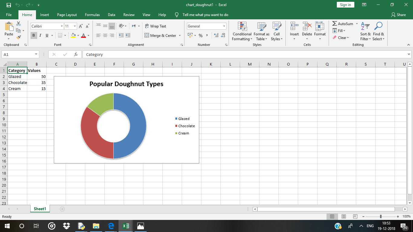
Code #1 : Plot the simple Doughnut Chart.
For plotting the simple Pie chart on an excel sheet, use add_chart() method with type ‘doughnut’ keyword argument of a workbook object.
import xlsxwriter
workbook = xlsxwriter.Workbook('chart_doughnut1.xlsx')
worksheet = workbook.add_worksheet()
bold = workbook.add_format({'bold': 1})
headings = ['Category', 'Values']
data = [
['Glazed', 'Chocolate', 'Cream'],
[50, 35, 15],
]
worksheet.write_row('A1', headings, bold)
worksheet.write_column('A2', data[0])
worksheet.write_column('B2', data[1])
chart1 = workbook.add_chart({'type': 'doughnut'})
chart1.add_series({
'name': 'Doughnut sales data',
'categories': ['Sheet1', 1, 0, 3, 0],
'values': ['Sheet1', 1, 1, 3, 1],
})
chart1.set_title({'name': 'Popular Doughnut Types'})
chart1.set_style(10)
worksheet.insert_chart('C2', chart1, {'x_offset': 25, 'y_offset': 10})
workbook.close()
|
Output :
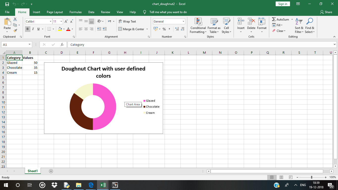
Code #2 : Plot a Doughnut chart with user defined segment colors.
For plotting the pie chart with user defined segment colours on an excel sheet, use add_series() method with points keyword argument of a chart object.
import xlsxwriter
workbook = xlsxwriter.Workbook('chart_doughnut2.xlsx')
worksheet = workbook.add_worksheet()
bold = workbook.add_format({'bold': 1})
headings = ['Category', 'Values']
data = [
['Glazed', 'Chocolate', 'Cream'],
[50, 35, 15],
]
worksheet.write_row('A1', headings, bold)
worksheet.write_column('A2', data[0])
worksheet.write_column('B2', data[1])
chart2 = workbook.add_chart({'type': 'doughnut'})
chart2.add_series({
'name': 'Doughnut sales data',
'categories': '= Sheet1 !$A$2:$A$4',
'values': '= Sheet1 !$B$2:$B$4',
'points': [
{'fill': {'color': '# FA58D0'}},
{'fill': {'color': '# 61210B'}},
{'fill': {'color': '# F5F6CE'}},
],
})
chart2.set_title({'name': 'Doughnut Chart with user defined colors'})
worksheet.insert_chart('C2', chart2, {'x_offset': 25, 'y_offset': 10})
workbook.close()
|
Output :
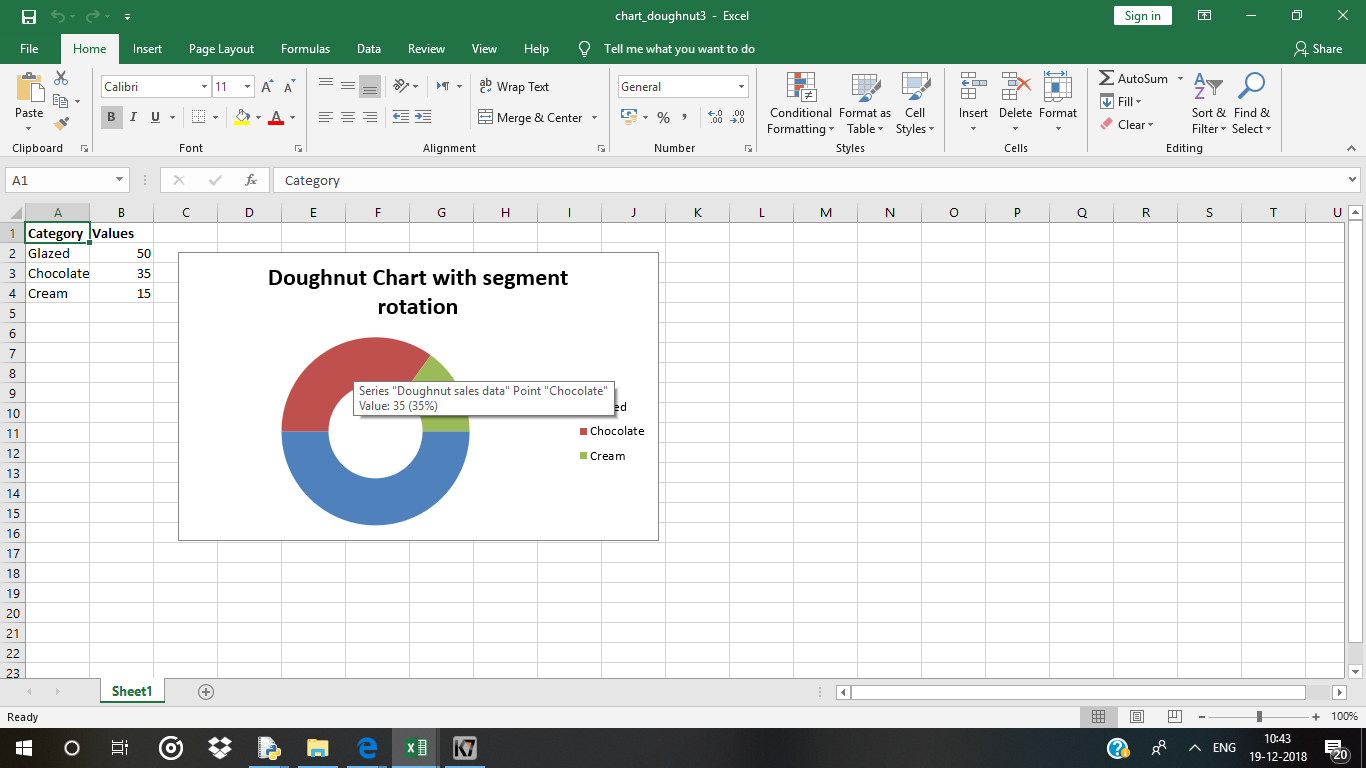
Code #3 : Plot a Doughnut chart with rotation of the segments.
For plotting a pie chart with rotation of the segments on an excel sheet, use set_rotation() method with definite angle argument of the chart object.
import xlsxwriter
workbook = xlsxwriter.Workbook('chart_doughnut3.xlsx')
worksheet = workbook.add_worksheet()
bold = workbook.add_format({'bold': 1})
headings = ['Category', 'Values']
data = [
['Glazed', 'Chocolate', 'Cream'],
[50, 35, 15],
]
worksheet.write_row('A1', headings, bold)
worksheet.write_column('A2', data[0])
worksheet.write_column('B2', data[1])
chart3 = workbook.add_chart({'type': 'doughnut'})
chart3.add_series({
'name': 'Doughnut sales data',
'categories': '= Sheet1 !$A$2:$A$4',
'values': '= Sheet1 !$B$2:$B$4',
})
chart3.set_title({'name': 'Doughnut Chart with segment rotation'})
chart3.set_rotation(90)
worksheet.insert_chart('C2', chart3, {'x_offset': 25, 'y_offset': 10})
workbook.close()
|
Output :
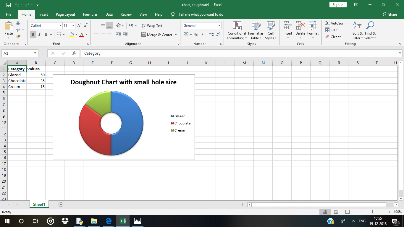
Code #4 : Plot a Doughnut chart with user defined hole size.
For plotting a pie chart with user defined hole size on an excel sheet, use set_hole_size() method with definite value(radius) argument of the chart object.
import xlsxwriter
workbook = xlsxwriter.Workbook('chart_doughnut4.xlsx')
worksheet = workbook.add_worksheet()
bold = workbook.add_format({'bold': 1})
headings = ['Category', 'Values']
data = [
['Glazed', 'Chocolate', 'Cream'],
[50, 35, 15],
]
worksheet.write_row('A1', headings, bold)
worksheet.write_column('A2', data[0])
worksheet.write_column('B2', data[1])
chart4 = workbook.add_chart({'type': 'doughnut'})
chart4.add_series({
'name': 'Doughnut sales data',
'categories': '= Sheet1 !$A$2:$A$4',
'values': '= Sheet1 !$B$2:$B$4',
})
chart4.set_style(26)
chart4.set_title({'name': 'Doughnut Chart with small hole size'})
chart4.set_hole_size(33)
worksheet.insert_chart('C2', chart4, {'x_offset': 25, 'y_offset': 10})
workbook.close()
|
Output :
Like Article
Suggest improvement
Share your thoughts in the comments
Please Login to comment...