Plotting graphs using Python’s plotly and cufflinks module
Last Updated :
06 Sep, 2021
plotly is a Python library which is used to design graphs, especially interactive graphs. It can plot various graphs and charts like histogram, barplot, boxplot, spreadplot and many more. It is mainly used in data analysis as well as financial analysis. plotly is an interactive visualization library.
cufflink connects plotly with pandas to create graphs and charts of dataframes directly. choropleth is used to describe geographical plotting of USA. choropleth is used in the plotting of world maps and many more.
Let’s plot different types of plots like boxplot, spreadplot, etc. using plotly and cufflinks.
Command to install plotly:
pip install plotly
Command to install cufflink:
pip install cufflink
Code #1: Show dataframe
import pandas as pd
import numpy as np
% matplotlib inline
from plotly import __version__
import cufflinks as cf
from plotly.offline import download_plotlyjs, init_notebook_mode, plot, iplot
init_notebook_mode(connected = True)
cf.go_offline()
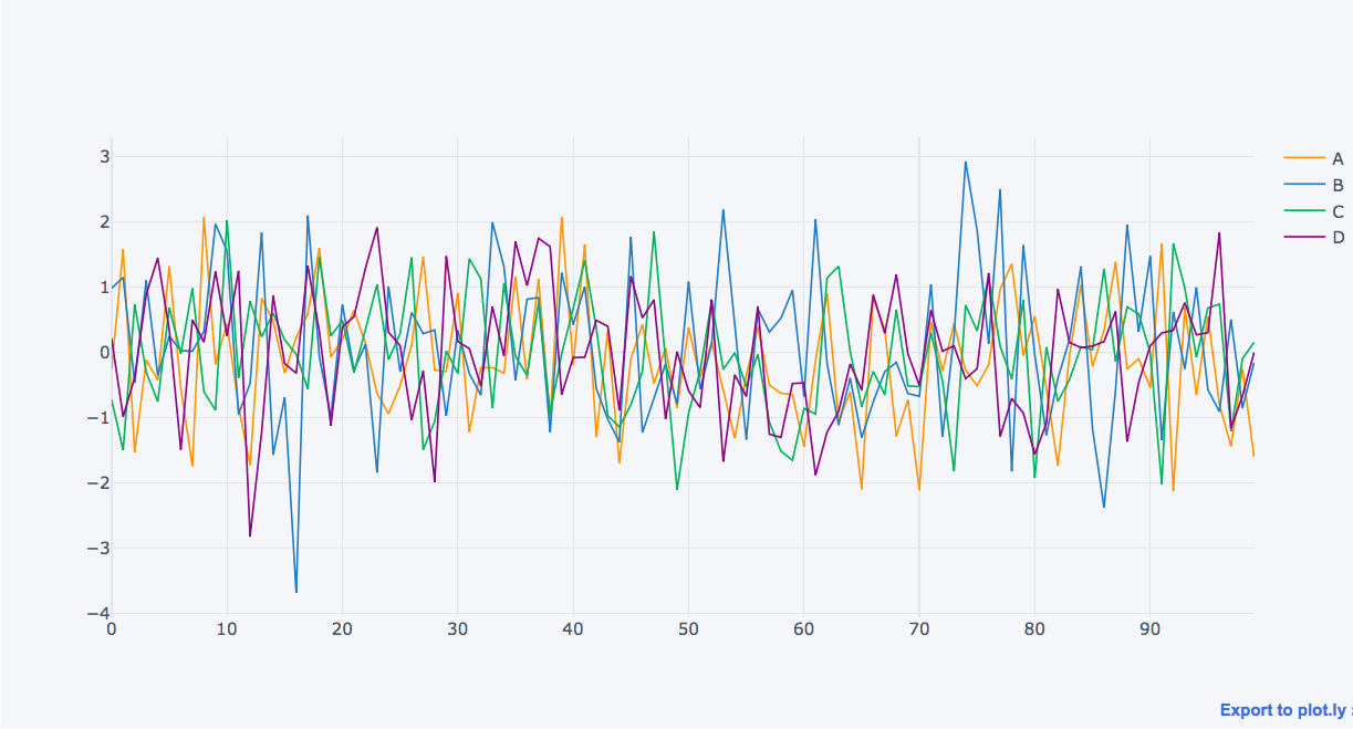
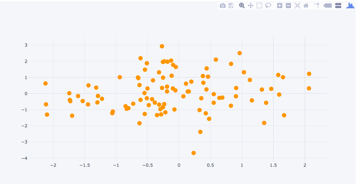
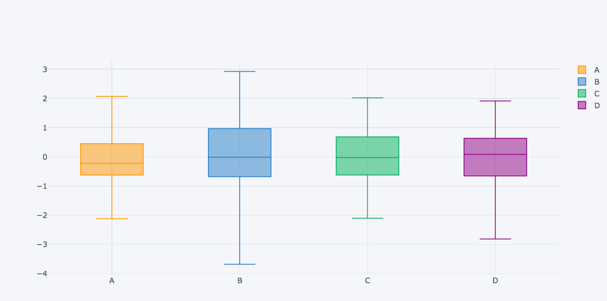
df = pd.DataFrame(np.random.randn(100, 4), columns ='A B C D'.split())
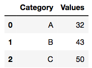
df2 = pd.DataFrame({'Category':['A', 'B', 'C'], 'Values':[32, 43, 50]})
df2.head()
|
Output:
Code #2: Normal Plot
Output:
Code #3: Scatter Plot
df.iplot(kind ='scatter', x ='A', y ='B', mode ='markers')
|
Output:
Code #4: Box Plot
Output:
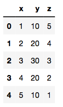
Code #5: Plot dataframes
df3 = pd.DataFrame({'x':[1, 2, 3, 4, 5],
'y':[10, 20, 30, 20, 10],
'z':[5, 4, 3, 2, 1]})
|
Output:
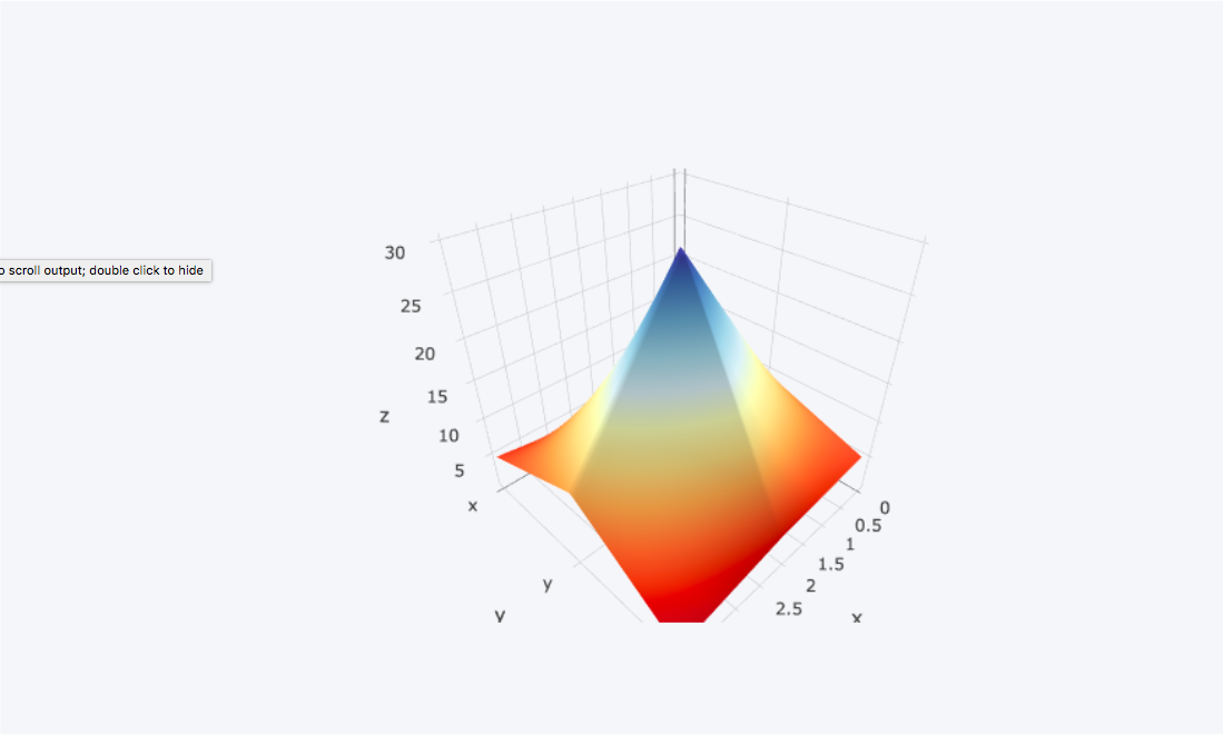
Code #6: Surface plot
df3.iplot(kind ='surface', colorscale ='rdylbu')
|
Output:
Like Article
Suggest improvement
Share your thoughts in the comments
Please Login to comment...