In this article, we will learn about how to get started with Python Matplotlib and different plotting techniques, from basics to advanced, with the help of a huge dataset containing information about different types of plots and their customizations.
Getting Started with Matplotlib
Matplotlib is easy to use and an amazing visualizing library in Python. It is built on NumPy arrays and designed to work with the broader SciPy stack and consists of several plots like line, bar, scatter, histogram, etc. Before we start learning about Matplotlib we first have to set up the environment and will also see how to use Matplotlib with Jupyter Notebook
Features of Matplotlib
- Wide Range of Plot Types: Matplotlib supports various plot types, including line plots, scatter plots, bar charts, histograms, pie charts, and more. This versatility enables users to visualize different types of data effectively.
- Customization: Matplotlib offers extensive customization options, allowing users to control every aspect of their plots, including colors, markers, line styles, fonts, labels, and annotations. This level of customization ensures that plots can be tailored to specific requirements and aesthetics.
- Support for Multiple Backends: Matplotlib supports multiple rendering backends, including interactive backends for use in graphical user interfaces (GUIs) and non-interactive backends for generating static images or PDF files.
Advantages of Matplotlib in Python
- Ease of Use: Matplotlib is easy to learn and use, making it accessible to beginners and experienced users alike. Its intuitive interface and extensive documentation make it a popular choice for data visualization tasks.
- Community Support: Matplotlib has a large and active community of users and developers who contribute to its development, provide support, and share resources such as tutorials, examples, and plugins. This community-driven approach ensures that users have access to a wealth of resources and expertise.
- Cross-Platform Compatibility: Matplotlib is cross-platform and runs on various operating systems, including Windows, macOS, and Linux. This compatibility ensures that users can create and share plots across different platforms without compatibility issues.
- Scalability: Matplotlib is highly scalable and can handle large datasets efficiently. Its efficient rendering engine and support for various plot types allow users to visualize datasets of any size with minimal performance overhead.
- Integration with Scientific Libraries: Matplotlib integrates seamlessly with other scientific computing libraries in the Python ecosystem, such as NumPy, SciPy, and Pandas. This integration enables users to combine data manipulation, analysis, and visualization tasks in a single Python environment, streamlining the workflow.
Exploring Different Plot Styles with Matplotlib
Matplotlib’s versatile styling capabilities empower you to craft visualizations that captivate and inform your audience. Join us as we embark on a journey to unlock the full potential of Matplotlib’s plot styles and elevate your data visualization endeavors to new heights.
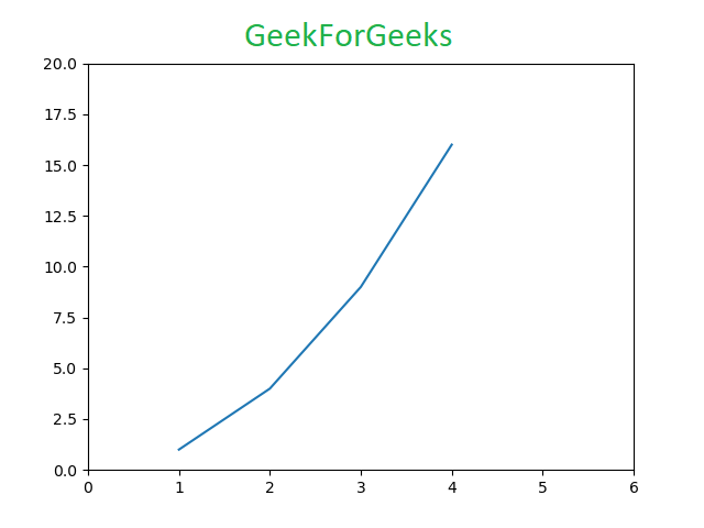
1. Python Pyplot Class
Pyplot is a Matplotlib module that provides a MATLAB-like interface. Pyplot provides functions that interact with the figure i.e. creates a figure, decorates the plot with labels, and creates a plotting area in a figure.
Syntax: matplotlib.pyplot.plot(*args, scalex=True, scaley=True, data=None, **kwargs)
Example
Python3
# Python program to show pyplot module
import matplotlib.pyplot as plt
plt.plot([1, 2, 3, 4], [1, 4, 9, 16])
plt.axis([0, 6, 0, 20])
plt.show()
Output
Matplotlib take care of the creation of inbuilt defaults like Figure and Axes. Don’t worry about these terms we will study them in detail in the below section but let’s take a brief about these terms.
Figure class is the top-level container that contains one or more axes. It is the overall window or page on which everything is drawn.
Syntax:
class matplotlib.figure.Figure(
                      figsize=None,
                      dpi=None,
                      facecolor=None,
                      edgecolor=None,
                      linewidth=0.0,
                      frameon=None,
                      subplotpars=None,
                      tight_layout=None,
                      constrained_layout=None)
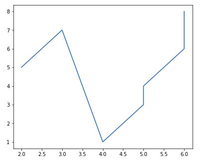
Example 1: Creating Single Plot
Python3
# Python program to show pyplot module
import matplotlib.pyplot as plt
from matplotlib.figure import Figure

# Creating a new figure with width = 5 inches
# and height = 4 inches
fig = plt.figure(figsize =(5, 4))

# Creating a new axes for the figure
ax = fig.add_axes([1, 1, 1, 1])

# Adding the data to be plotted
ax.plot([2, 3, 4, 5, 5, 6, 6],
        [5, 7, 1, 3, 4, 6 ,8])
plt.show()
Output
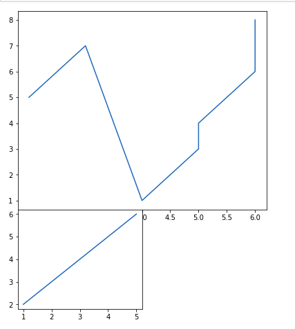
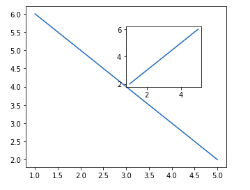
Example 2: Creating multiple plots
Python3
# Python program to show pyplot module
import matplotlib.pyplot as plt
from matplotlib.figure import Figure

# Creating a new figure with width = 5 inches
# and height = 4 inches
fig = plt.figure(figsize =(5, 4))

# Creating first axes for the figure
ax1 = fig.add_axes([1, 1, 1, 1])

# Creating second axes for the figure
ax2 = fig.add_axes([1, 0.5, 0.5, 0.5])

# Adding the data to be plotted
ax1.plot([2, 3, 4, 5, 5, 6, 6],
         [5, 7, 1, 3, 4, 6 ,8])
ax2.plot([1, 2, 3, 4, 5],
         [2, 3, 4, 5, 6])

plt.show()
Output
Refer to the below articles to get detailed information about the Figure class and functions associated with it.
>>> More Functions in Figure Class
3. Matplotlib Axes Class
Axes class is the most basic and flexible unit for creating sub-plots. A given figure may contain many axes, but a given axes can only be present in one figure. The axes() function creates the axes object. Let’s see the below example.
Syntax: matplotlib.pyplot.axis(*args, emit=True, **kwargs)
Example 1: Creating Only Axes
Python3
# Python program to show pyplot module
import matplotlib.pyplot as plt
from matplotlib.figure import Figure
# Creating the axes object with argument as
# [left, bottom, width, height]
ax = plt.axes([1, 1, 1, 1])
Output
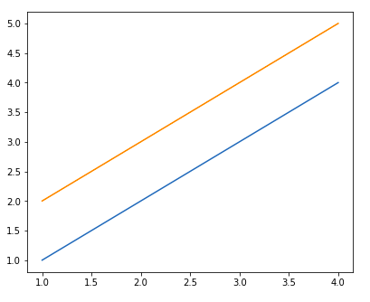
Example 2: Craeting Axes with line Chart
Python3
# Python program to show pyplot module
import matplotlib.pyplot as plt
from matplotlib.figure import Figure
fig = plt.figure(figsize = (5, 4))

# Adding the axes to the figure
ax = fig.add_axes([1, 1, 1, 1])

# plotting 1st dataset to the figure
ax1 = ax.plot([1, 2, 3, 4], [1, 2, 3, 4])

# plotting 2nd dataset to the figure
ax2 = ax.plot([1, 2, 3, 4], [2, 3, 4, 5])
plt.show()
Output
Refer to the below articles to get detailed information about the axes class and functions associated with it.
>>> More Functions on Axes Class
4. Set Colors in Matplotlib
Color plays a vital role in data visualization, conveying information, highlighting patterns, and making plots visually appealing. Matplotlib, a powerful plotting library in Python, offers extensive options for customizing colors in plots.
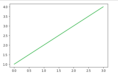
Example 1: Using Color attribute in Matplotlib
Python3
import matplotlib.pyplot as plt

# Define the Color
color = 'green'
plt.plot([1, 2, 3, 4], color=color)

plt.show()
Output
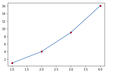
Example 2: Use of marker in Matplotlib
Python3
import matplotlib.pyplot as plt

x = [1, 2, 3, 4]
y = [1, 4, 9, 16]

plt.plot(x, y, marker='o', markerfacecolor='r')

plt.show()
Output
Refere
5. Add Text, Font and Grid lines in Matplotlib
Adding text annotations and grid lines in Matplotlib enhances the readability and clarity of plots. Here’s how you can incorporate text annotations and grid lines into your Matplotlib plots.
Example: Creating Grid Lines with Chart Title in Matplotlib
Python3
# Importing the library
import matplotlib.pyplot as plt

# Define X and Y data points
X = [12, 34, 23, 45, 67, 89]
Y = [1, 3, 67, 78, 7, 5]

# Plot the graph using matplotlib
plt.plot(X, Y)

# Add gridlines to the plot
plt.grid(color = 'green', linestyle = '--', linewidth = 0.5)
# `plt.grid()` also works

# displaying the title
plt.title(label='Number of Users of a particular Language',
        fontweight=10,
        pad='2.0')

# Function to view the plot
plt.show()
Output
.png)
Refere
6. Custom Legends with Matplotlib
A legend is an area describing the elements of the graph. In simple terms, it reflects the data displayed in the graph’s Y-axis. It generally appears as the box containing a small sample of each color on the graph and a small description of what this data means.
A Legend can be created using the legend() method. The attribute Loc in the legend() is used to specify the location of the legend. The default value of loc is loc=”best” (upper left). The strings ‘upper left’, ‘upper right’, ‘lower left’, ‘lower right’ place the legend at the corresponding corner of the axes/figure.
Syntax: matplotlib.pyplot.legend([“blue”, “green”], bbox_to_anchor=(0.75, 1.15), ncol=2)
Example: The attribute bbox_to_anchor=(x, y) of legend() function is used to specify the coordinates of the legend, and the attribute ncol represents the number of columns that the legend has. Its default value is 1.
Python3
import matplotlib.pyplot as plt

# data to display on plots
x = [3, 1, 3]
y = [3, 2, 1]
plt.plot(x, y)
plt.plot(y, x)

# Adding the legends
plt.legend(["blue", "orange"])
plt.show()
Output
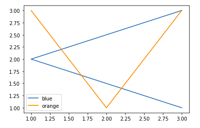
Refer to the below articles to get detailed information about the legend –
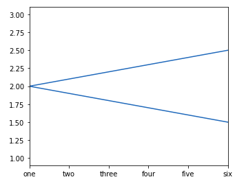
7. Matplotlib Ticks and Tick Labels
You might have seen that Matplotlib automatically sets the values and the markers(points) of the x and y axis, however, it is possible to set the limit and markers manually. set_xlim() and set_ylim() functions are used to set the limits of the x-axis and y-axis respectively. Similarly, set_xticklabels() and set_yticklabels() functions are used to set tick labels.
Python3
# Python program to show pyplot module
import matplotlib.pyplot as plt
from matplotlib.figure import Figure
x = [3, 1, 3]
y = [3, 2, 1]

# Creating a new figure with width = 5 inches
# and height = 4 inches
fig = plt.figure(figsize =(5, 4))

# Creating first axes for the figure
ax = fig.add_axes([0.1, 0.1, 0.8, 0.8])

# Adding the data to be plotted
ax.plot(x, y)
ax.set_xlim(1, 2)
ax.set_xticklabels((
  "one", "two", "three", "four", "five", "six"))
plt.show()
Output
Refer to the below articles to get detailed information about the legend:
8. Style Plots using Matplotlib
Matplotlib styles allow you to change the overall appearance of your plots, including colors, fonts, gridlines, and more. By applying different styles, you can tailor your visualizations to match your preferences or the requirements of your audience. Matplotlib provides a variety of built-in styles to choose from, each offering a unique look and feel.
Python3
# importing all the necessary packages
import numpy as np
import matplotlib.pyplot as plt

# importing the style package
from matplotlib import style

# creating an array of data for plot
data = np.random.randn(50)

# using the style for the plot
plt.style.use('Solarize_Light2')

# creating a plot
plt.plot(data)

# show plot
plt.show()
Output
.png)
9. Create Multiple Subplots in Matplotlib
Till now you must have got a basic idea about Matplotlib and plotting some simple plots, now what if you want to plot multiple plots in the same figure. This can be done using multiple ways. One way was discussed above using the add_axes() method of the figure class. Let’s see various ways multiple plots can be added with the help of examples.
Method 1: Using the add_axes() method
The add_axes() method figure module of matplotlib library is used to add an axes to the figure.
Syntax: add_axes(self, *args, **kwargs)
Python3
# Python program to show pyplot module
import matplotlib.pyplot as plt
from matplotlib.figure import Figure

# Creating a new figure with width = 5 inches
# and height = 4 inches
fig = plt.figure(figsize =(5, 4))

# Creating first axes for the figure
ax1 = fig.add_axes([0.1, 0.1, 0.8, 0.8])

# Creating second axes for the figure
ax2 = fig.add_axes([0.5, 0.5, 0.3, 0.3])

# Adding the data to be plotted
ax1.plot([5, 4, 3, 2, 1], [2, 3, 4, 5, 6])
ax2.plot([1, 2, 3, 4, 5], [2, 3, 4, 5, 6])
plt.show()
Output
The add_axes() method adds the plot in the same figure by creating another axes object.
Method 2: Using subplot() method
This method adds another plot to the current figure at the specified grid position.
Syntax: subplot(nrows, ncols, index, **kwargs)
subplot(pos, **kwargs)
subplot(ax)
Python3
import matplotlib.pyplot as plt
# data to display on plots
x = [3, 1, 3]
y = [3, 2, 1]
z = [1, 3, 1]

# Creating figure object
plt.figure()

# adding first subplot
plt.subplot(121)
plt.plot(x, y)

# adding second subplot
plt.subplot(122)
plt.plot(z, y)
Output
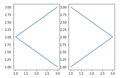
Note: Subplot() function have the following disadvantages –
- It does not allow adding multiple subplots at the same time.
- It deletes the preexisting plot of the figure.
Method 3: Using subplots() method
This function is used to create figure and multiple subplots at the same time.
Syntax matplotlib.pyplot.subplots(nrows=1, ncols=1, sharex=False, sharey=False, squeeze=True, subplot_kw=None, gridspec_kw=None, **fig_kw)
Python3
import matplotlib.pyplot as plt

# Creating the figure and subplots
# according the argument passed
fig, axes = plt.subplots(1, 2)

# plotting the data in the 1st subplot
axes[0].plot([1, 2, 3, 4], [1, 2, 3, 4])

# plotting the data in the 1st subplot only
axes[0].plot([1, 2, 3, 4], [4, 3, 2, 1])

# plotting the data in the 2nd subplot only
axes[1].plot([1, 2, 3, 4], [1, 1, 1, 1])
Output
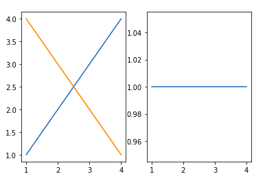
This function give additional flexibility in creating axes object at a specified location inside a grid. It also helps in spanning the axes object across multiple rows or columns. In simpler words, this function is used to create multiple charts within the same figure.
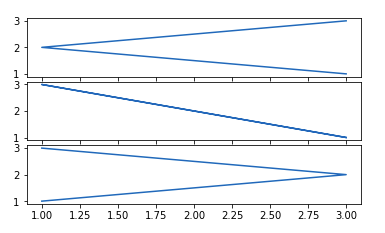
Syntax: plt.subplot2grid(shape, location, rowspan, colspan)
Python3
import matplotlib.pyplot as plt
# data to display on plots
x = [3, 1, 3]
y = [3, 2, 1]
z = [1, 3, 1]

# adding the subplots
axes1 = plt.subplot2grid (
  (7, 1), (0, 0), rowspan = 2,  colspan = 1)
axes2 = plt.subplot2grid (
  (7, 1), (2, 0), rowspan = 2, colspan = 1)
axes3 = plt.subplot2grid (
  (7, 1), (4, 0), rowspan = 2, colspan = 1)

# plotting the data
axes1.plot(x, y)
axes2.plot(x, z)
axes3.plot(z, y)
Output:
10. Working With Images In Matplotlib
The image module in matplotlib library is used for working with images in Python. The image module also includes two useful methods which are imread which is used to read images and imshow which is used to display the image.
Python3
# importing required libraries
import matplotlib.pyplot as plt
import matplotlib.image as img
# reading the image
testImage = img.imread('g4g.png')
# displaying the image
plt.imshow(testImage)
Output:
Refer to the below articles to get detailed information while working with Images:
Like Article
Suggest improvement
Share your thoughts in the comments
Please Login to comment...