Python – Create Graph from Text File
Last Updated :
25 Feb, 2021
Matplotlib library in Python is a very popular data visualization library. Different graphs can be plotted from this library such as bar plot, pie plot, histogram, scatter plot, line plot, etc. The source of data can be any file like CSV(Comma Separated File), text file, etc. In this article, Graphs are created based on the data taken from a text file. Before using Matplotlib library in our program make sure that it is installed in the system.
Steps needed:
- Create a text file with a .txt extension
- Use the same name of the text file in the program
- Save and Run the program to obtain a graph
Example1: Creating a bar chart.
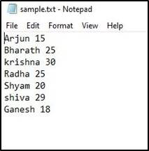
This is the ‘sample.txt’ file containing student data with student names and their marks in a subject.
Approach:
- Import matplotlib.pyplot module for visualization.
- Open file in read mode ‘r’ with open( ) function.
- Iterate through each line in the file using a for loop.
- Append each row in the file into list as required for our visualization.
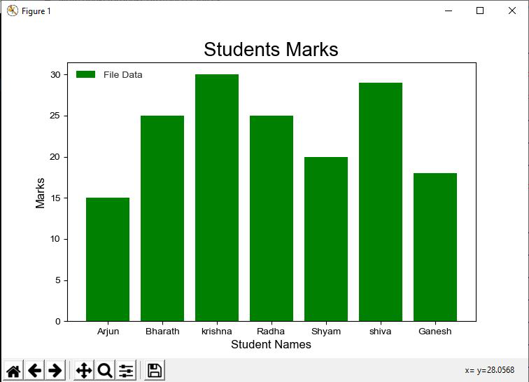
- Using plt.bar( ) function plot Student Names on X-axis and Marks of students on Y-axis.
Below is the implementation:
Python3
import matplotlib.pyplot as plt
names = []
marks = []
f = open('sample.txt','r')
for row in f:
row = row.split(' ')
names.append(row[0])
marks.append(int(row[1]))
plt.bar(names, marks, color = 'g', label = 'File Data')
plt.xlabel('Student Names', fontsize = 12)
plt.ylabel('Marks', fontsize = 12)
plt.title('Students Marks', fontsize = 20)
plt.legend()
plt.show()
|
Output :
Example 2: Creating pie chart.
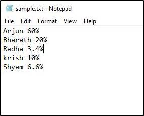
Let’s take another text file(sample.txt) which consists of the amount of work done by employees of a company in a project.
Program Approach:
- Import matplotlib.pyplot module for visualization.
- Open sample.txt file in read mode ‘r’ with file open( ) function.
- Iterate through each line in the file using a for a loop.
- Append each row in the file into the list as required for our visualization.
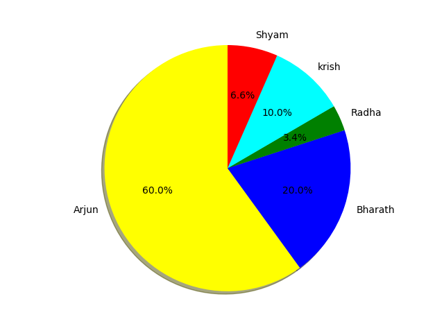
- Using plt.pie( ) function, plotting a pie chart of work done by employees of a company in a project.
Below is the implementation:
Python3
import matplotlib.pyplot as plt
names = []
work = []
for line in open('sample.txt', 'r'):
Data = [i for i in line.split()]
names.append(Data[0])
New_Data= [ j for j in Data[1].split('%')]
work.append(New_Data[0])
colors = ['yellow', 'b', 'green', 'cyan','red']
plt.pie(work, labels = names, colors = colors, startangle = 90,
shadow = True, radius = 1.2, autopct = '%1.1f%%')
plt.show()
|
Output :
Example 3 :
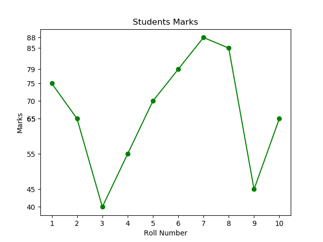
This example consists of a text file containing Student Roll Numbers and their marks in a subject.
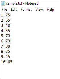
Program Approach :
- Import matplotlib.pyplot module for visualization.
- Open file in read mode ‘r’ with file open( ) function.
- Iterate through each line in the file using a for a loop.
- Append each line in the file into lists as required for our visualization.
- Using plt.plot( ) function, plot Student Roll number on X-axis and Marks of students on Y-axis.
- plt.yticks( ) is used for getting all the Y-axis ticks.
- Finally, the line plot for the text file containing Student Roll Numbers and their marks in a subject is plotted.
Below is the implementation:
Python3
import matplotlib.pyplot as plt
x = []
y = []
for line in open('sample.txt', 'r'):
lines = [i for i in line.split()]
x.append(lines[0])
y.append(int(lines[1]))
plt.title("Students Marks")
plt.xlabel('Roll Number')
plt.ylabel('Marks')
plt.yticks(y)
plt.plot(x, y, marker = 'o', c = 'g')
plt.show()
|
Output :
Like Article
Suggest improvement
Share your thoughts in the comments
Please Login to comment...