Pulsing Heart Animation Effect Using HTML & CSS
Last Updated :
10 Mar, 2021
This article will teach you about widely fascinated and used HTML & CSS animation i.e. Pulsating Heart Animation. In this article, basically we will learn two methods to implement the animation. This animation is beneficial while making footer of the most website with some common text like Made with Love. So, Let’s have a look on the animation first :
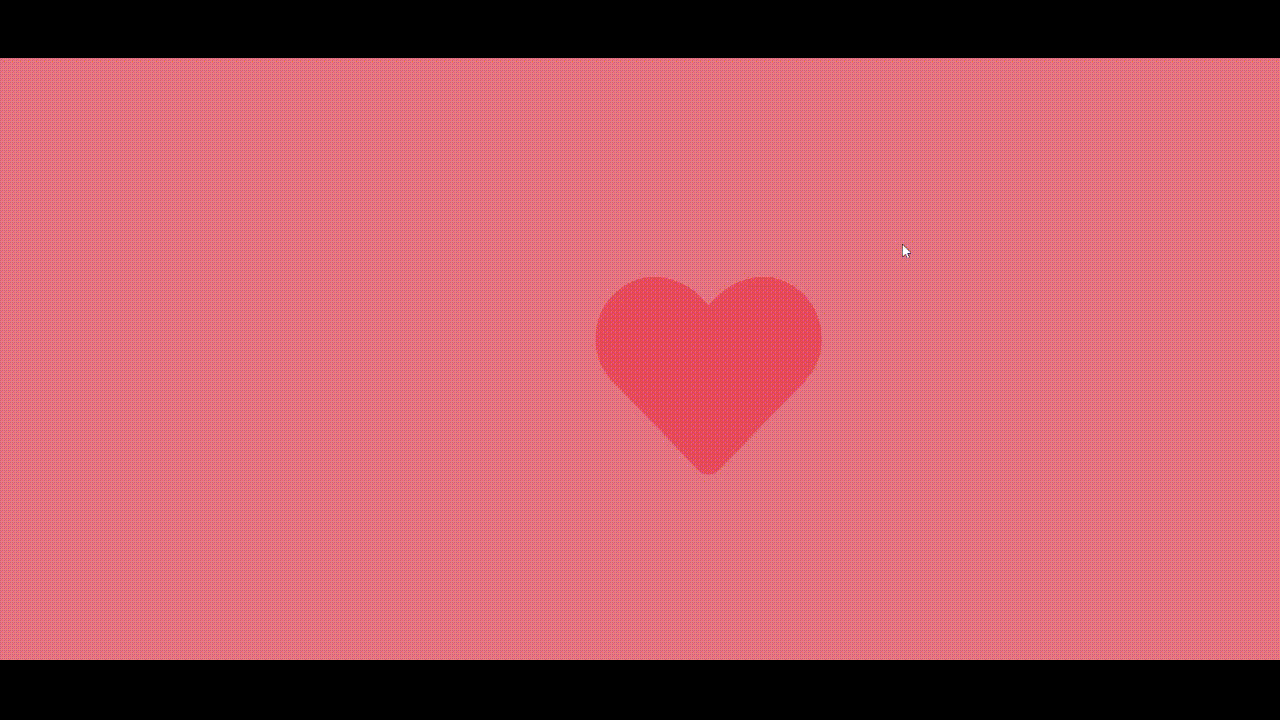
Pulsating Heart Animation
Method 1 (from Scratch): In this method, we will accomplish this animation in two steps:
- Building the heart
- Animating the heart pulse
1. Building the heart: Given below is the basic structural HTML file.
HTML
<!DOCTYPE html>
<html lang="en">
<head>
<link rel = "stylesheet" href = "style.css">
</head>
<body>
<div class = "heart"></div>
</body>
</html>
|
Given below is the CSS file named as style.css for styling & animation.
style.css
body {
display:flex;
align-items: center;
justify-content: center;
min-height:100vh;
margin: 0;
background-color: lightcoral;
}
.heart {
background: red;
position: relative;
height: 100px;
width:100px;
transform: rotate(-45deg) scale(1);
animation: pulse 2s linear infinite;
}
.heart::after {
background:inherit;
border-radius: 50%;
content:'';
position:absolute;
top: -50%;
left:0;
height: 100px;
width:100px;
}
.heart::before {
background:inherit;
border-radius: 50%;
content:'';
position:absolute;
top:0;
right:-50%;
height: 100px;
width:100px;
}
@keyframes pulse{
0% {
transform: rotate(-45deg) scale(1);
opacity: 0;
}
50% {
transform: rotate(-45deg) scale(1.3);
opacity: 1;
}
100% {
transform: rotate(-45deg) scale(1);
opacity: 1;
}
}
|
Note: After combining and successfully running the code, it will give the desired result.
Explanation: First we have created a division in body of webpage with class heart. Then in style.css file, we did some general body and class styling to take all the content in the center of the body. Now basically let’s understand how we will make the heart. We will make a heart with the help of the block we have created through basic styling before then through before and after effects as well as the absolute & relative position concept. We will create two circles, for better understanding you can change colors as blue and green respectively in after and before effects of heart class without transforming it. It will look like the below figures :

After positioning circles and block before rotating

Before positioning circles and block
So as you can see after positioning, it is something that looks to be heart but just in a tilted manner though. Please note that keep the color same of the block and both circles to get the required effect. These colors were only chosen for better understanding. Now again so, what to do with a tilted heart, lets make it straight by transforming & rotating it in a clockwise direction at -45 degrees. There you get a straight red heart with a pinkish background.
2. Animating the heart pulse: Let’s go to our second step now. Let’s introduce a pulse animation in heart class of some duration about 1-2 seconds with linear infinite iterations. Then we will apply certain keyframes to make the required animated pulsating heart with a change in transformation scale as well as opacity too.
Concepts Used:
1. Related to Positioning:
- absolute: An element is positioned relative to the nearest positioned parent element. One uses the positioning attributes top, left, bottom, and right to set the location.
- relative: An element is positioned relative to its normal position. If you set position: relative; of an element but no other positioning attributes (top, left, bottom or right), it will have no effect on it’s positioning at all. But if one give it some other positioning attribute, say, right: 20px;, it will shift its position 20 pixels left from where it would be normally.
2. After and Before Effects: The ::before and ::after are the pseudo-elements in CSS allows you to insert content onto a page without it needing to be in the HTML.
3. About Animating & Inheritance:
Syntax:
animation: <animation name> <animation duration>
  <animation-timing function> <animation-iteration-count>
There are many other sub-properties in which we can use the animation effect. The animation property in CSS can be used to animate many other CSS properties such as borders, shapes, background-color, height, or width. Each animation needs to be defined with the @keyframes or mechanism how animation will work and what properties to follow.
We have also used inheritance property in background color in our example as heart class is parent and heart::after & heart::before are child classes which have inherited the background color used in parent one.
4. About Keyframes:
Syntax:
@keyframes <animation name>
Each @keyframes at-rule defines what should happen at specific moments during the animation. For example, 0% is the beginning of the animation, 50 % is the middle of the animation duration and 100% is the end of the animation.
5. About Rotating, Scaling & Opacity:
Syntax:
transform: rotate (<angle>) scale(<value>)
The amount of rotation created by rotate() function is specified by an <angle>. If positive, the movement will be clockwise else it will be counter-clockwise. A rotation by 180° is called point reflection. In our example, we have rotated that tilted heart around y=x line in anticlockwise manner to make it straight.
The scale() function is specified with either one or two values, which represent the amount of scaling to be applied in each direction.
Syntax:
scale(x, y). Default value is 1
The opacity property in CSS specifies how transparent an element is. Default value is 1, it means that element is opaque at that duration and visible too. Values range from 0 to 1 representing the opacity of the element.
Method 2: In this method, we will follow two steps that we followed in Method-1 that are building the heart and thus animating it with pulse then.
1. Building the heart: We will not build the heart from scratch. You just have to take icon’s HTML & CSS code from different free websites out there. We will recommend Bootstrap Font Awesome icons. Then you just have to apply that code in HTML part of our animation like this:
HTML
<!DOCTYPE html>
<html lang="en">
<head>
<link rel = "stylesheet" href = "style.css">
<link rel="stylesheet" href=
integrity=
"sha512-+4zCK9k+qNFUR5X+cKL9EIR+ZOhtIloNl9GIKS57V1MyNsYpYcUrUeQc9vNfzsWfV28IaLL3i96P9sdNyeRssA=="
crossorigin="anonymous" />
</head>
<body>
<div>
<i class="fas fa-heart" aria-hidden="true"></i>
</div>
</body>
</html>
|
You can apply CSS in the following manner with name of file as style.css:
style.css
body {
display:flex;
align-items: center;
justify-content: center;
min-height:100vh;
margin: 0;
background: lightcoral;
}
.fa-heart {
color: red;
font-size: 250px;
height: 100px;
width:100px;
animation: pulse 1s linear infinite;
}
@keyframes pulse {
0%{
transform: scale(1);
opacity: 0;
}
50%{
transform: scale(1.3);
opacity:1;
}
100%{
transform: scale(1);
opacity:0;
}
}
|
Note: After combining and successfully running the code, it will give the desired result.
After just general styling of body and icon’s class, you will get a heart at the center of the body of a webpage.
2. Animating the heart: Please take note of it that here we don’t need pseudo CSS elements’ (after and before) as we have structured the heart with the help of free icons & classes available. Now let’s move to the second step, there you go with the same animation we did in Method – 1. You will get the required animation. Generally, Method – 2 is given more preference while building large websites, Again, creativity has no limits. You can apply this animation wherever you find it needful as well you can build a new animation from your own by inspiring from it.
Like Article
Suggest improvement
Share your thoughts in the comments
Please Login to comment...