Primer CSS Utilities
Last Updated :
15 Nov, 2022
Primer CSS Utilities gives the structure blocks to design and deal with a reach of normal use cases that assist us with trying not to compose custom styles. At the point when we really want to add some edge or cushioning, instead of adding another selector intended for that utilization case, we can utilize utilities. This assists us with diminishing the number of novel property-estimation coordinates and assists us with keeping more reliable styles across the site.
Primer CSS Utilities:
- Animations: Animations are the most common things on the web. Animations in sense of motions that can be used on buttons, forms, or any other components. So Primer CSS Provides us with animation classes that you can use to emphasize an element.
- Borders: Primer CSS Borders is a utility class that applies borders to a div container of HTML by simply applying the provided class. We can even customize the border’s style.
- Box shadow: Primer CSS Box shadow applies shadow to a box container. It helps to make the content elevated so that the user pays attention to the content inside the container box. In Primer CSS, we can add different types of box shadows – small, medium, large, and extra-large.
- Colors: Primer color utility classes to set the color of the text, background, and border.
- Details:Primer CSS Details Classes are made in order to improve the behavior of the default HTML Details component.
- Flexbox: Primer CSS is much more responsive and mobile-friendly. It is easy to position child elements and the main container.
- Grid: The Grid contains 12 columns and is percentage-based. The responsive layouts can be designed with a number of columns a container spans that can be adjusted across breakpoints.
- Layout: Primer CSS Layout is used to change the document layout with the help of classes that provide inline, block, table, etc. which can customize the document.
- Margin: Primer CSS Margin allows the users to reduce the amount of custom CSS that shares the same properties and allows them to achieve many different page layouts using the same styles.
- Padding: Padding is used to create space around the element, inside any defined border. We can set different padding for individual sides(top, right, bottom, left). It is important to add border properties to implement padding properties.
- Typography: Typography utilities in Primer CSS are designed so that it works in combination with line-height utilities to make them much more sensible and useful to use. Typography utilities also exist as variables that we can use in components or Custom CSS.
Note: There are 11 utilities in Primer CSS all of them have individual articles for understanding, how to use them and where to use them.
Below examples illustrates Primer CSS Utilities:
Example 1: In this example, we will use the Primer CSS Animation utility.
HTML
<!DOCTYPE html>
<html>
<head>
<title> Primer CSS Animations </title>
<link rel="stylesheet"
href=
</head>
<body>
<div class="text-center">
<h1 class="color-fg-success"> GeeksforGeeks </h1>
<strong>Primer CSS Animations Utility</strong>
</div>
<div class="m-2 p-2 Box">
<span class="anim-fade-in">
<svg width="12"
height="16"
viewBox="0 0 12 16"
class="octicon octicon-check"
aria-hidden="true">
<path fill-rule="evenodd"
d="M12 5l-8 8-4-4 1.5-1.5L4 10l6.5-6.5L12 5z" />
</svg>
</span>
<span class="content p-2">Primer CSS Fade In Animation</span>
<span class="anim-fade-out">
<svg width="12"
height="16"
viewBox="0 0 12 16"
class="octicon octicon-check"
aria-hidden="true">
<path fill-rule="evenodd"
d="M12 5l-8 8-4-4 1.5-1.5L4 10l6.5-6.5L12 5z" />
</svg>
</span>
<span class="content p-2">Primer CSS Fade Out Animation</span>
<span class="anim-fade-up">
<svg width="12"
height="16"
viewBox="0 0 12 16"
class="octicon octicon-check"
aria-hidden="true">
<path fill-rule="evenodd"
d="M12 5l-8 8-4-4 1.5-1.5L4 10l6.5-6.5L12 5z" />
</svg>
</span>
<span class="content p-2">Primer CSS Fade Up Animation</span>
</div>
</body>
</html>
|
Output:

Primer CSS Animation Utility
Example 2: In this example, we will use the Primer CSS Details utility.
HTML
<!DOCTYPE html>
<html lang="en">
<head>
<meta charset="UTF-8">
<meta name="viewport" content="width=device-width,
initial-scale=1.0">
<link rel="stylesheet"
href=
<title>Primer CSS Details Utility</title>
</head>
<body>
<h1 style="color: green;">GeeksforGeeks</h1>
<h3>Primer CSS Details Utility</h3>
<div class="m-2">
<details class="details-overlay details-overlay-dark">
<summary class="btn btn-primary"> Click Me</summary>
<div class="border p-3 mt-2">
This is the sample text that will be
shown when the "Click Me" text is clicked.
</div>
</details>
</div>
</body>
</html>
|
Output:
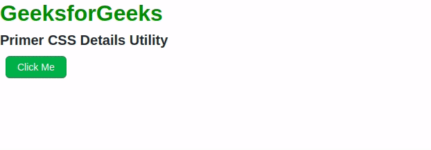
Primer CSS Detail Utility
Note: For more examples of other utilities you can visit those individual articles.
Reference: https://primer.style/css/utilities
Like Article
Suggest improvement
Share your thoughts in the comments
Please Login to comment...