Positioning the colorbar in Matplotlib
Last Updated :
02 Feb, 2021
Matplotlib is a plotting library in Python programming language and it’s by default numerical mathematics extension of NumPy library in python language. While programming in python language we use the matplotlib library package for graph and histogram visualizations. But while plotting histogram using matplotlib in python, it lacks division or space between adjacent bars. This makes histograms very tedious to work with and it becomes very difficult to interpret. In this article, we will see Positioning of the colorbar in Matplotlib.
The colorbar() function in pyplot module of matplotlib adds a colorbar to a plot indicating the color scale.
Syntax: matplotlib.pyplot.colorbar(mappable=None, cax=None, ax=None, **kwarg)
Parameters:
- ax: This parameter is an optional parameter and it contains Axes or list of Axes.
- **kwarg (keyword arguments): This parameter is an optional parameter and are of two kinds:
Returns: colorbar which is an instance of the class ‘matplotlib.colorbar.Colorbar’.
Approach:
- Import required module.
- Prepare data points for both coordinates.
- Plot the chart with pyplot.
- Position the colorbar with pyplot.colorbar using appropriate keywords with suitable values
- Display plot
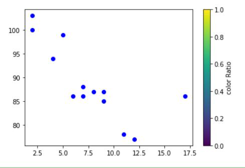
Example 1: Adding colorbar to the right of the plot.
In this example, we will plot a scatter plot with different data points and then use colorbar method to place a colorbar on the right side of the chart. By default the colorbar appears on the right itself.
Python3
import matplotlib.pyplot as plt
x = [5, 7, 8, 7, 2, 17, 2, 9,
4, 11, 12, 9, 6]
y = [99, 86, 87, 88, 100, 86,
103, 87, 94, 78, 77, 85, 86]
plt.scatter(x, y, c="blue")
plt.colorbar(label="Color Ratio")
plt.show()
|
Output:
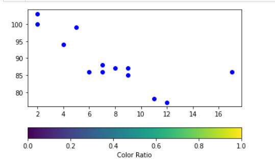
Example 2: Adding colorbar below the plot.
In this example, we will plot a scatter plot with different data points and then use colorbar method to place a colorbar on the below of the chart. To do this “horizontal” value needs to be given to its orientation keyword.
Python3
import matplotlib.pyplot as plt
x = [5, 7, 8, 7, 2, 17, 2, 9,
4, 11, 12, 9, 6]
y = [99, 86, 87, 88, 100, 86,
103, 87, 94, 78, 77, 85, 86]
plt.scatter(x, y, c="blue")
plt.colorbar(label="Color Ratio",
orientation="horizontal")
plt.show()
|
Output:
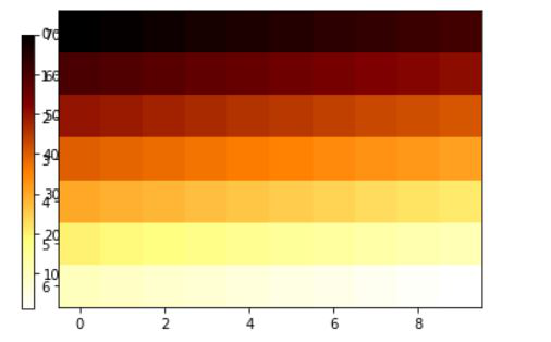
Example 3: Adding colorbar to the left
In this example, we will plot a with different data points and then use colorbar method with cax attributes to place a colorbar on the left side of the chart. Generally, cax is used for plotting a chart with Axes(coordinate) into which the colorbar will be drawn.
Python3
import matplotlib.pyplot as plt
import numpy as np
array = np.arange(70, 0, -1).reshape(7, 10)
fig, ax = plt.subplots()
cbaxes = fig.add_axes([0.09, 0.12, 0.02, 0.7])
im = ax.imshow(array, cmap='afmhot_r')
plt.colorbar(im, cax=cbaxes)
plt.show()
|
Output:
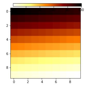
Example 4: Adding colorbar on top of the plot.
In this example, we will plot a plot with different data points and then use colorbar method with cax attributes to place a colorbar on the top of the chart. Generally, cax is used for plotting a chart with Axes(coordinate) into which the colorbar will be drawn.
Python
import numpy as np
import matplotlib.pyplot as plt
data = np.arange(100, 0, -1).reshape(10, 10)
fig, ax = plt.subplots()
cbaxes = fig.add_axes([0.28, 0.9, 0.49, 0.03])
im = ax.imshow(data, cmap='afmhot_r')
fig.colorbar(im, cax=cbaxes, orientation='horizontal')
plt.show()
|
Output:
Like Article
Suggest improvement
Share your thoughts in the comments
Please Login to comment...