Plotting multiple bar charts using Matplotlib in Python
Last Updated :
25 Feb, 2021
A multiple bar chart is also called a Grouped Bar chart. A Bar plot or a Bar Chart has many customizations such as Multiple bar plots, stacked bar plots, horizontal bar charts. Multiple bar charts are generally used for comparing different entities. In this article, plotting multiple bar charts are discussed.
Example 1: Simple multiple bar chart
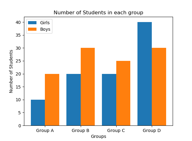
In this example we will see how to plot multiple bar charts using matplotlib, here we are plotting multiple bar charts to visualize the number of boys and girls in each Group.
Approach:
- Importing required libraries such as numpy for performing numerical calculations with arrays and matplotlib for visualization of data.
- The data for plotting multiple bar charts are taken into the list.
- The np.arange( ) function from numpy library is used to create a range of values. We are creating the X-axis values depending on the number of groups in our example.
- Plotting the multiple bars using plt.bar( ) function.
- To avoid overlapping of bars in each group, the bars are shifted -0.2 units and +0.2 units from the X-axis.
- The width of the bars of each group is taken as 0.4 units.
- Finally, the multiple bar charts for both boys and girls are plotted in each group.
Code:
Python3
import numpy as np
import matplotlib.pyplot as plt
X = ['Group A','Group B','Group C','Group D']
Ygirls = [10,20,20,40]
Zboys = [20,30,25,30]
X_axis = np.arange(len(X))
plt.bar(X_axis - 0.2, Ygirls, 0.4, label = 'Girls')
plt.bar(X_axis + 0.2, Zboys, 0.4, label = 'Boys')
plt.xticks(X_axis, X)
plt.xlabel("Groups")
plt.ylabel("Number of Students")
plt.title("Number of Students in each group")
plt.legend()
plt.show()
|
Output :

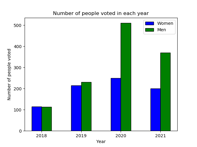
Example 2: Number of Men and Women voted from 2018-2021
Approach :
- Importing required libraries such as numpy for performing numerical calculations with arrays and matplotlib for visualization of data.
- The Men and Women data for multiple bar charts are taken into a list for easy plotting.
- The np.arange( ) function from numpy library is used to create a range of values.
- Plotting the multiple bars using plt.bar( ) function in matplotlib library.
- To avoid overlapping of bars in each group, the bars are shifted 0.25 units from the X-axis in this example.
- The width of the bars of each group is taken as 0.25 units.
- The X-axis labels(Years) and x-ticks are plotted as required in our visualization.
- Finally, the multiple bar chart for the number of men and women who voted every year is plotted.
Code:
Python3
import numpy as np
import matplotlib.pyplot as plt
Women = [115, 215, 250, 200]
Men = [114, 230, 510, 370]
n=4
r = np.arange(n)
width = 0.25
plt.bar(r, Women, color = 'b',
width = width, edgecolor = 'black',
label='Women')
plt.bar(r + width, Men, color = 'g',
width = width, edgecolor = 'black',
label='Men')
plt.xlabel("Year")
plt.ylabel("Number of people voted")
plt.title("Number of people voted in each year")
plt.xticks(r + width/2,['2018','2019','2020','2021'])
plt.legend()
plt.show()
|
Output :

Example3: Scores of different players on different dates
Approach:
- Importing required libraries such as numpy for performing numerical calculations with arrays and matplotlib for visualization of data.
- The np.arange( ) function from numpy library is used to create a range of values(Here, 3 values).
- Plotting the multiple bars using plt.bar( ) function in matplotlib library. In this Example, Dates are plotted on X-axis and Players Scores on Y-axis.
- To avoid overlapping of bars in each group, the bars are shifted 0.25 units from the previous bar.
- The width of the bars of each group is taken as 0.25 units with different colors.
- The X-axis labels and x-ticks are plotted as required in our visualization.
- Finally, the multiple bar chart for the Scores of different players on different dates is plotted.
Code:
Python3
import numpy as np
import matplotlib.pyplot as plt
N = 3
ind = np.arange(N)
width = 0.25
xvals = [8, 9, 2]
bar1 = plt.bar(ind, xvals, width, color = 'r')
yvals = [10, 20, 30]
bar2 = plt.bar(ind+width, yvals, width, color='g')
zvals = [11, 12, 13]
bar3 = plt.bar(ind+width*2, zvals, width, color = 'b')
plt.xlabel("Dates")
plt.ylabel('Scores')
plt.title("Players Score")
plt.xticks(ind+width,['2021Feb01', '2021Feb02', '2021Feb03'])
plt.legend( (bar1, bar2, bar3), ('Player1', 'Player2', 'Player3') )
plt.show()
|
Output:

Like Article
Suggest improvement
Share your thoughts in the comments
Please Login to comment...