Plotting graph using Seaborn | Python
Last Updated :
08 Jul, 2022
This article will introduce you to graphing in Python with Seaborn, which is the most popular statistical visualization library in Python.
Installation: The easiest way to install seaborn is to use pip. Type following command in terminal:
pip install seaborn
OR, you can download it from here and install it manually.
Plotting categorical scatter plots with Seaborn
Stripplot
Python3
import matplotlib.pyplot as plt
import seaborn as sns
x =['sun', 'mon', 'fri', 'sat', 'tue', 'wed', 'thu']
y =[5, 6.7, 4, 6, 2, 4.9, 1.8]
ax = sns.stripplot(x, y);
ax.set(xlabel ='Days', ylabel ='Amount_spend')
plt.title('My first graph');
plt.show()
|
Output:
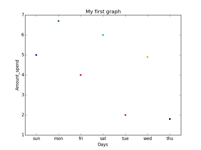
Explanation: This is the one kind of scatter plot of categorical data with the help of seaborn.
- Categorical data is represented on the x-axis and values correspond to them represented through the y-axis.
- .striplot() function is used to define the type of the plot and to plot them on canvas using.
- .set() function is used to set labels of x-axis and y-axis.
- .title() function is used to give a title to the graph.
- To view plot we use .show() function.
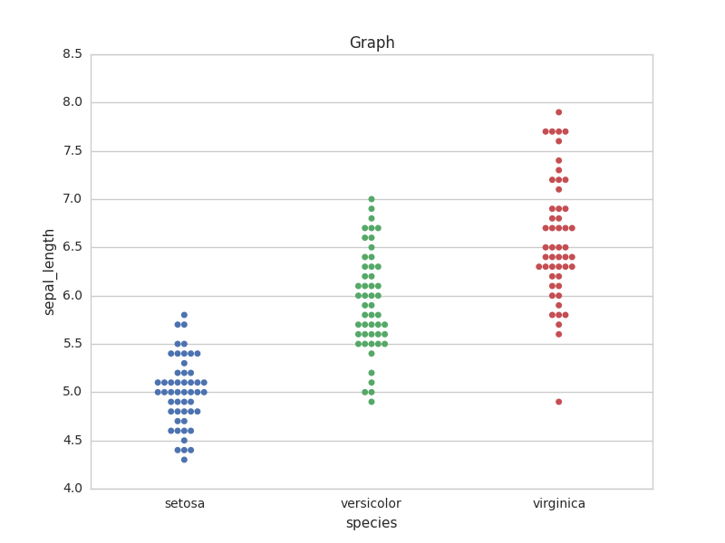
Stripplot using inbuilt data-set given in seaborn :
Python3
import matplotlib.pyplot as plt
import seaborn as sns
sns.set(style="whitegrid")
iris = sns.load_dataset('iris')
ax = sns.stripplot(x='species', y='sepal_length', data=iris)
plt.title('Graph')
plt.show()
|
Output:
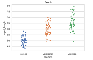
Explanation:
- iris is the dataset already present in seaborn module for use.
- We use .load_dataset() function in order to load the data.We can also load any other file by giving the path and name of the file in the argument.
- .set(style=”whitegrid”) function here is also use to define the background of plot.We can use “darkgrid”
instead of whitegrid if we want the dark-colored background.
- In .stripplot() function we have to define which attribute of the dataset to be on the x-axis and which attribute of the dataset should on y-axis.data = iris means attributes which we define earlier should be taken from the given data.
- We can also draw this plot with matplotlib but the problem with matplotlib is its default parameters. The reason why Seaborn is so great with DataFrames is, for example, labels from DataFrames are automatically propagated to plots or other data structures as you see in the above figure column name species comes on the x-axis and column name stepal_length comes on the y-axis, that is not possible with matplotlib. We have to explicitly define the labels of the x-axis and y-axis.
Swarmplot
Python3
import matplotlib.pyplot as plt
import seaborn as sns
sns.set(style="whitegrid")
iris = sns.load_dataset('iris')
ax = sns.swarmplot(x='species', y='sepal_length', data=iris)
plt.title('Graph')
plt.show()
|
Output:
Explanation:
This is very much similar to stripplot but the only difference is that it does not allow overlapping of markers. It causes jittering in the markers of the plot so that graph can easily be read without information loss as seen in the above plot.
- We use .swarmplot() function to plot swarm plot.
- Another difference that we can notice in Seaborn and Matplotlib is that working with DataFrames doesn’t go quite as smoothly with Matplotlib, which can be annoying if we doing exploratory analysis with Pandas. And that’s exactly what Seaborn does easily, the plotting functions operate on DataFrames and arrays that contain a whole dataset.
Note: If we want we can also change the representation of data on a particular axis.
Example :
Python3
import matplotlib.pyplot as plt
import seaborn as sns
sns.set(style="whitegrid")
iris = sns.load_dataset('iris')
ax = sns.swarmplot(x='sepal_length', y='species', data=iris)
plt.title('Graph')
plt.show()
|
Output:
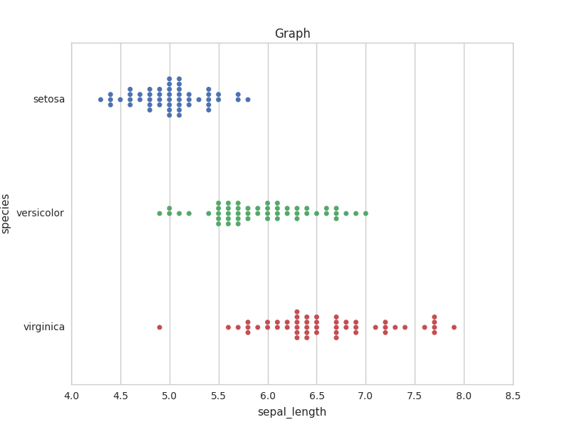
The same can be done in striplot. At last, we can say that Seaborn is an extended version of matplotlib which tries to make a well-defined set of hard things easy.
Barplot
A barplot is basically used to aggregate the categorical data according to some methods and by default it’s the mean. It can also be understood as a visualization of the group by action. To use this plot we choose a categorical column for the x-axis and a numerical column for the y-axis, and we see that it creates a plot taking a mean per categorical column.
Syntax:
barplot([x, y, hue, data, order, hue_order, …])
Python3
import seaborn as sns
df = sns.load_dataset('tips')
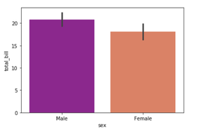
sns.barplot(x ='sex', y ='total_bill', data = df,
palette ='plasma')
|
Output:
Explanation:
Looking at the plot we can say that the average total_bill for the male is more than compared to the female.
- Palette is used to set the color of the plot
- The estimator is used as a statistical function for estimation within each categorical bin.
Countplot
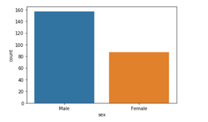
A countplot basically counts the categories and returns a count of their occurrences. It is one of the simplest plots provided by the seaborn library.
Syntax:
countplot([x, y, hue, data, order, …])
Python3
import seaborn as sns
df = sns.load_dataset('tips')
sns.countplot(x ='sex', data = df)
|
Output:
Explanation:
Looking at the plot we can say that the number of males is more than the number of females in the dataset. As it only returns the count based on a categorical column, we need to specify only the x parameter.
Boxplot
Box Plot is the visual representation of the depicting groups of numerical data through their quartiles. Boxplot is also used to detect the outlier in the data set.
Syntax:
boxplot([x, y, hue, data, order, hue_order, …])
Python3
import seaborn as sns
df = sns.load_dataset('tips')
sns.boxplot(x='day', y='total_bill', data=df, hue='smoker')
|
Output:
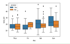
Explanation:
x takes the categorical column and y is a numerical column. Hence we can see the total bill spent each day.” hue” parameter is used to further add a categorical separation. By looking at the plot we can say that the people who do not smoke had a higher bill on Friday as compared to the people who smoked.
Violinplot
It is similar to the boxplot except that it provides a higher, more advanced visualization and uses the kernel density estimation to give a better description about the data distribution.
Syntax:
violinplot([x, y, hue, data, order, …])
Python3
import seaborn as sns
df = sns.load_dataset('tips')
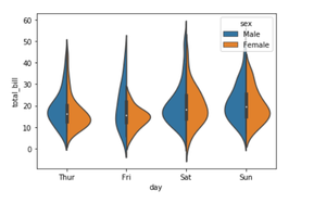
sns.violinplot(x='day', y='total_bill', data=df,
hue='sex', split=True)
|
Output:
Explanation:
- hue is used to separate the data further using the sex category
- setting split=True will draw half of a violin for each level. This can make it easier to directly compare the distributions.
Stripplot
It basically creates a scatter plot based on the category.
Syntax:
stripplot([x, y, hue, data, order, …])
Python3
import seaborn as sns
df = sns.load_dataset('tips')
sns.stripplot(x='day', y='total_bill', data=df,
jitter=True, hue='smoker', dodge=True)
|
Output:
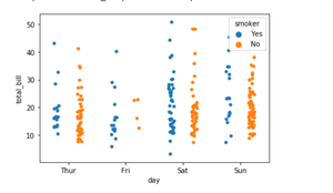
Explanation:
- One problem with strip plot is that you can’t really tell which points are stacked on top of each other and hence we use the jitter parameter to add some random noise.
- jitter parameter is used to add an amount of jitter (only along the categorical axis) which can be useful when you have many points and they overlap so that it is easier to see the distribution.
- hue is used to provide an additional categorical separation
- setting split=True is used to draw separate strip plots based on the category specified by the hue parameter.
Like Article
Suggest improvement
Share your thoughts in the comments
Please Login to comment...