Plotting Correlation Matrix using Python
Last Updated :
26 Aug, 2022
Correlation means an association, It is a measure of the extent to which two variables are related.
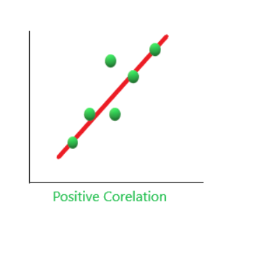
1. Positive Correlation: When two variables increase together and decrease together. They are positively correlated. ‘1’ is a perfect positive correlation. For example – demand and profit are positively correlated the more the demand for the product, the more profit hence positive correlation.
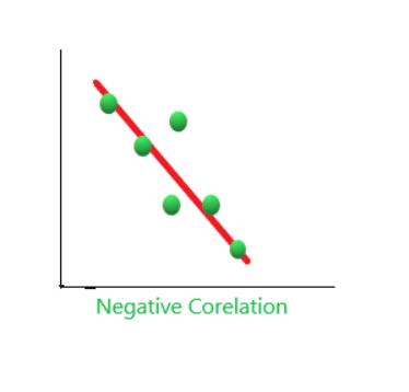
2. Negative Correlation: When one variable increases and the other variable decreases together and vice-versa. They are negatively correlated. For example, If the distance between magnet increases their attraction decreases, and vice-versa. Hence, a negative correlation. ‘-1’ is no correlation
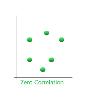
3. Zero Correlation( No Correlation): When two variables don’t seem to be linked at all. ‘0’ is a perfect negative correlation. For Example, the amount of tea you take and level of intelligence.
Plotting Correlation matrix using Python
Step 1: Importing the libraries.
Python3
import sklearn
import numpy as np
import matplotlib.pyplot as plt
import pandas as pd
|
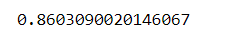
Step 2: Finding the Correlation between two variables.
Python3
y = pd.Series([1, 2, 3, 4, 3, 5, 4])
x = pd.Series([1, 2, 3, 4, 5, 6, 7])
correlation = y.corr(x)
correlation
|
Output:
Step 3: Plotting the graph. Here we are using scatter plots. A scatter plot is a diagram where each value in the data set is represented by a dot. Also, it shows a relationship between two variables.
Python3
plt.scatter(x, y)
plt.plot(np.unique(x), np.poly1d(np.polyfit(x, y, 1))
(np.unique(x)), color='red')
|
Output:
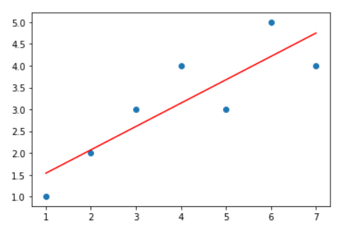
Remember the points that were explained above. Observe both the images you will find similarity Also, observe the value of the correlation is near to 1, hence the positive correlation is reflected.
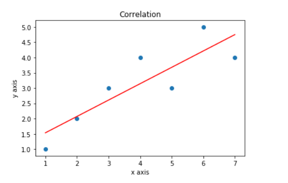
Adding title and labels in the graph
Python3
plt.title('Correlation')
plt.scatter(x, y)
plt.plot(np.unique(x),
np.poly1d(np.polyfit(x, y, 1))
(np.unique(x)), color='red')
plt.xlabel('x axis')
plt.ylabel('y axis')
|
Output:
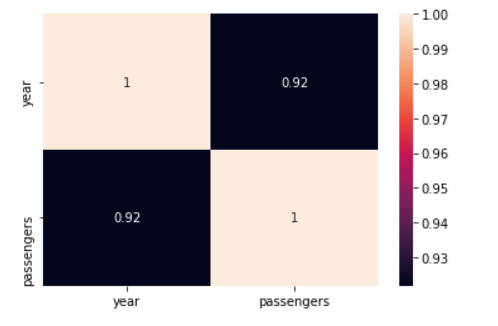
Plot using Heatmaps
There are many ways you can plot correlation matrices one efficient way is using the heatmap. It is very easy to understand the correlation using heatmaps it tells the correlation of one feature(variable) to every other feature(variable). In other words, A correlation matrix is a tabular data representing the ‘correlations’ between pairs of variables in a given data.
Python3
import seaborn as sns
flights = sns.load_dataset("flights")
ax = sns.heatmap(flights.corr(), annot=True)
|
Output:
Like Article
Suggest improvement
Share your thoughts in the comments
Please Login to comment...