Plotting a trend graph in Python
Last Updated :
21 Apr, 2021
Prerequisites: Matplotlib
A trend Graph is a graph that is used to show the trends data over a period of time. It describes a functional representation of two variables (x , y). In which the x is the time-dependent variable whereas y is the collected data. The graph can be in shown any form that can be via line chart, Histograms, scatter plot, bar chart, and pie-chart. In python, we can plot these trend graphs by using matplotlib.pyplot library. It is used for plotting a figure for the given data.
The task is simple and straightforward, for plotting any graph we must suffice the basic data requirement after this determine the values of x over the period of time and data collected for y. Plot the graphs for the above-given data.
Given below are various implementations to depict the same:
Example 1:
Python3
import numpy as np
import pandas as pd
import matplotlib.pyplot as plt
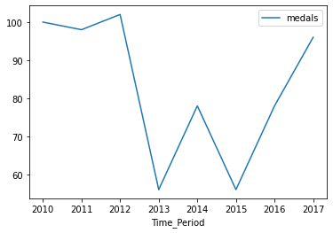
Sports = {
"medals": [100, 98, 102, 56, 78, 56, 78, 96],
"Time_Period": [2010, 2011, 2012, 2013, 2014, 2015, 2016, 2017]
}
df = pd.DataFrame(Sports)
print(df)
df.plot(x="Time_Period", y="medals", kind="line")
plt.show()
|
Output:
   medals  Time_Period
0     100         2010
1      98         2011
2     102         2012
3      56         2013
4      78         2014
5      56         2015
6      78         2016
7      96         2017
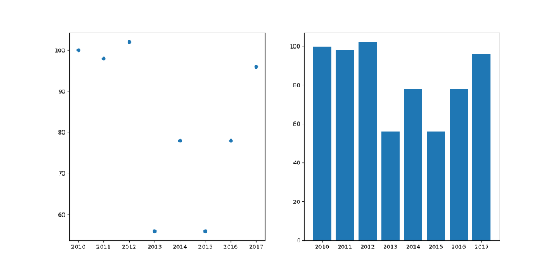
Example 2: Using the above data we would plot the scatter and bar graph.
Python3
import numpy as np
import pandas as pd
import matplotlib.pyplot as plt
Sports = {
"medals": [100, 98, 102, 56, 78, 56,
78, 96],
"Time_Period": [2010, 2011, 2012, 2013,
2014, 2015, 2016, 2017]
}
df = pd.DataFrame(Sports)
print(df)
df.plot(x="Time_Period", y="medals", kind="scatter")
plt.title("scatter chart")
plt.subplot(1, 1, 1)
df.plot(x="Time_Period", y="medals", kind="bar")
plt.title("bar")
plt.subplot(1, 1, 2)
plt.show()
|
Output:
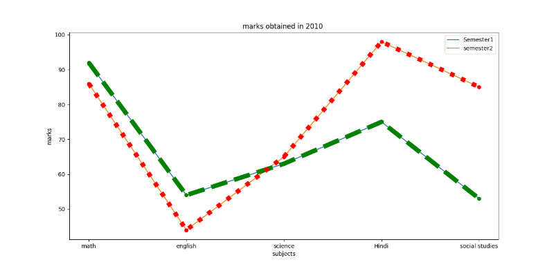
Example 3: student getting marks in 2010.
Python3
import matplotlib.pyplot as plt
x1 = ['math', 'english', 'science', 'Hindi', 'social studies']
y1 = [92, 54, 63, 75, 53]
y2 = [86, 44, 65, 98, 85]
plt.plot(x1, y1, label='Semester1')
plt.plot(x1, y2, label='semester2')
plt.xlabel('subjects')
plt.ylabel('marks')
plt.title("marks obtained in 2010")
plt.plot(y1, 'o:g', linestyle='--', linewidth='8')
plt.plot(y2, 'o:g', linestyle=':', linewidth='8')
plt.legend()
|
Output:
Like Article
Suggest improvement
Share your thoughts in the comments
Please Login to comment...