Plot Several Curve Segments on the Same Graph
Last Updated :
30 Jan, 2023
R is a programming language and software environment for statistical computing and graphics. It is widely used among statisticians and data scientists for developing statistical software and data analysis.
R Programming Language is known for its powerful and flexible data visualization capabilities. The base installation of R includes several libraries for creating basic plots and charts, such as the “base” graphics library and the “lattice” library. In addition, there are many other libraries available for R that provide additional visualization capabilities, such as the “ggplot2” library, which is particularly popular for creating complex and highly customizable visualizations.
Plotting a Parabola Function
R
library(ggplot2)
x <- 1:10
y <- x^2
ggplot(data = data.frame(x, y)) +
geom_line(aes(x = x, y = y)) +
ggtitle("Curve Plot") +
xlab("X values") +
ylab("Y values")
|
Output:
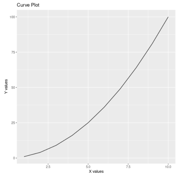
Parabola curve which is a single-curve segment
Curve Segment
A “curve segment” in R generally refers to a portion of a continuous function that is defined over a specific interval of x-values. It is a way of breaking down a curve or function into smaller, manageable parts, and can be useful for understanding how a curve behaves in different regions.
In R, xlim and ylim are used to set the limits of the x and y axis, respectively, when creating a plot. They can be used to zoom in on a specific part of a plot or to remove outliers that might skew the plot. xlim and ylim can be passed to the plot() function or to the coord_cartesian() function in ggplot2 library. The below output shows the formation of the circle using 2 different curves of different colors.
R
plot(0,0, xlim=c(-1.5,1.5), ylim=c(-1.5,1.5),
xlab="x", ylab="y", main="Circle")
r = 1
x1 = seq(-r,r,length.out=100)
y1 = sqrt(r^2-x1^2)
x2 = seq(-r,r,length.out=100)
y2 = -sqrt(r^2-x2^2)
lines(x1,y1, col="red")
lines(x2,y2, col="blue")
legend("topright", c("Top Half", "Bottom Half"),
lty=1, col=c("red", "blue"))
|
Output:
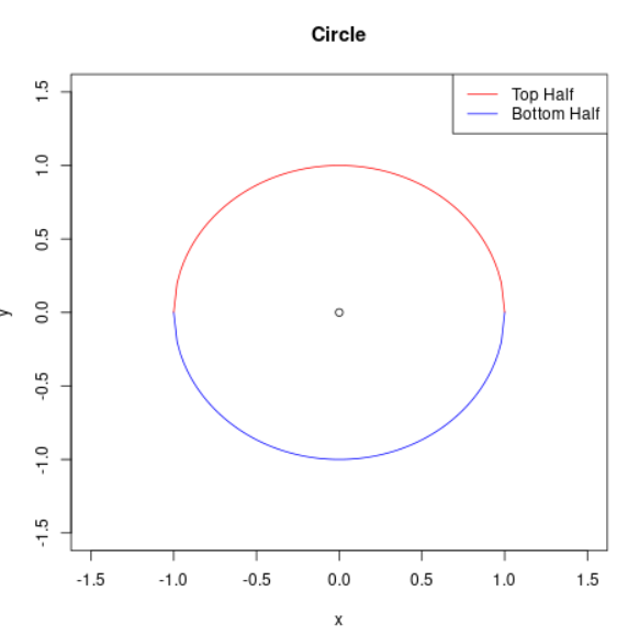
Formation of the circle using two different segments
Below is the output generated using the looping statement.
R
plot(1:10, type="n")
colors <- c("red", "orange", "yellow", "green",
"blue", "purple", "pink", "brown",
"gray", "black")
for (i in 1:10) {
curve(sin(x+i), add=TRUE, col=colors[i])
}
|
Output:
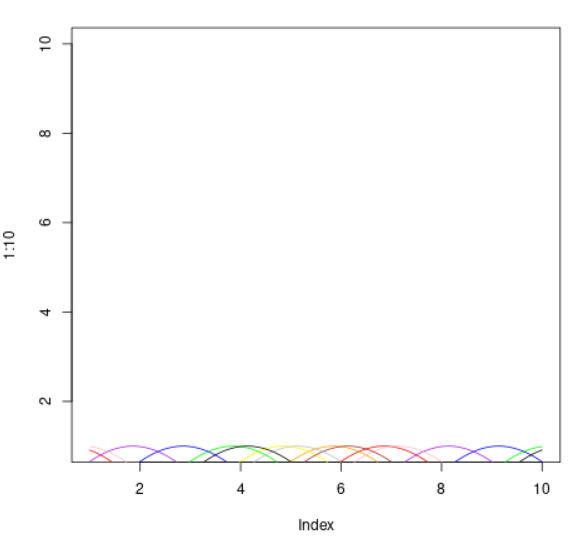
Multiple Sine curves on the same graph
Now let’s plot the graph for y = x2 and y = x3 for 1 to 10 and 11 to 20 respectively. In this way, we will be able to plot two curve segments in the same graph.
R
x1 <- 1:10
y1 <- x1^2
x2 <- 11:20
y2 <- x1^3
plot(x1, y1, type = "l", col = "blue",
lwd = 2, xlim = c(0, 20), ylim = c(0, 1000))
lines(x2, y2, col = "red", lwd = 2)
legend("topright", c("Curve 1", "Curve 2"),
col = c("blue", "red"), lty = 1, lwd = 2)
xlab("X-axis")
ylab("Y-axis")
|
Output:
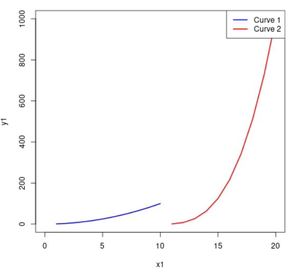
Two Curve Segments on the same Graphs
In R, seq() is a function that generates a sequence of numbers. It takes three arguments: the first and last numbers in the sequence, and the step size between numbers.
sin(), cos(), and tan() are trigonometric functions that are commonly used when working with curves. They are used to calculate the sine, cosine, and tangent of an angle, respectively. The angle can be specified in radians or degrees, depending on the context.
For example, you can use the seq() function to create a sequence of x-values and use the trigonometric functions to calculate the corresponding y-values to plot a curve.
R
x <- seq(0, 10, 0.1)
y1 <- sin(x)
y2 <- cos(x)
y3 <- tan(x)
y4 <- exp(x)
y5 <- log(x)
y6 <- sin(x) + cos(x)
y7 <- sin(x) + tan(x)
y8 <- cos(x) + tan(x)
y9 <- exp(x) + log(x)
y10 <- sin(x) + cos(x) + tan(x)
colors <- c("red", "orange", "yellow", "green",
"blue", "purple", "pink", "brown",
"gray", "black")
plot(x, y1, type="l", col=colors[1])
lines(x, y2, col=colors[2])
lines(x, y3, col=colors[3])
lines(x, y4, col=colors[4])
lines(x, y5, col=colors[5])
lines(x, y6, col=colors[6])
lines(x, y7, col=colors[7])
lines(x, y8, col=colors[8])
lines(x, y9, col=colors[9])
lines(x, y10, col=colors[10])
legend("topleft", c("Curve 1", "Curve 2", "Curve 3",
"Curve 4", "Curve 5", "Curve 6",
"Curve 7", "Curve 8", "Curve 9",
"Curve 10"),
col=colors, lty=1)
|
Output:
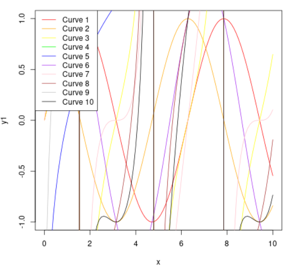
Multiple curve segments on the same graph
Like Article
Suggest improvement
Share your thoughts in the comments
Please Login to comment...