Plot 2D data on 3D plot in Python
Last Updated :
26 Oct, 2022
In this article, we will be learning about how to plot 2D data on 3D plot in Python. We will be demonstrating two methods in order to learn the concept. The first method will be using Matplotlib.pyplot.gca() function which is a pyplot module of the matplotlib library. But before that, we need to configure where are we going to create our project and learn the concept. We can either use google colab or we can also do it in our local machine using Sublime Text, Jupiter Notebook or various other code editors.
Below are various examples which depict how to plot 2D data on 3D plot in Python:
Example 1:
Using Matplotlib.pyplot.gca() function. The matplotlib.pyplot.gca() function helps us to get the current axis or create one if necessary. In the gca() function, we are defining the projection as a 3D projection.
Python3
import numpy as np
import matplotlib.pyplot as plt
fig = plt.figure()
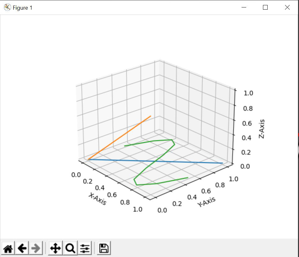
ax = fig.gca(projection='3d')
ax.set_xlabel('X-Axis')
ax.set_ylabel('Y-Axis')
ax.set_zlabel('Z-Axis')
x = np.linspace(0, 1, 10)
y = np.linspace(0, 1, 10)
z = np.sin(x * 2 * np.pi) / 2 + 0.5
ax.plot(x, y, zs=0, zdir='z')
ax.plot(x, y, zs=0, zdir='y')
ax.plot(x, z, zs=0, zdir='z')
plt.show()
|
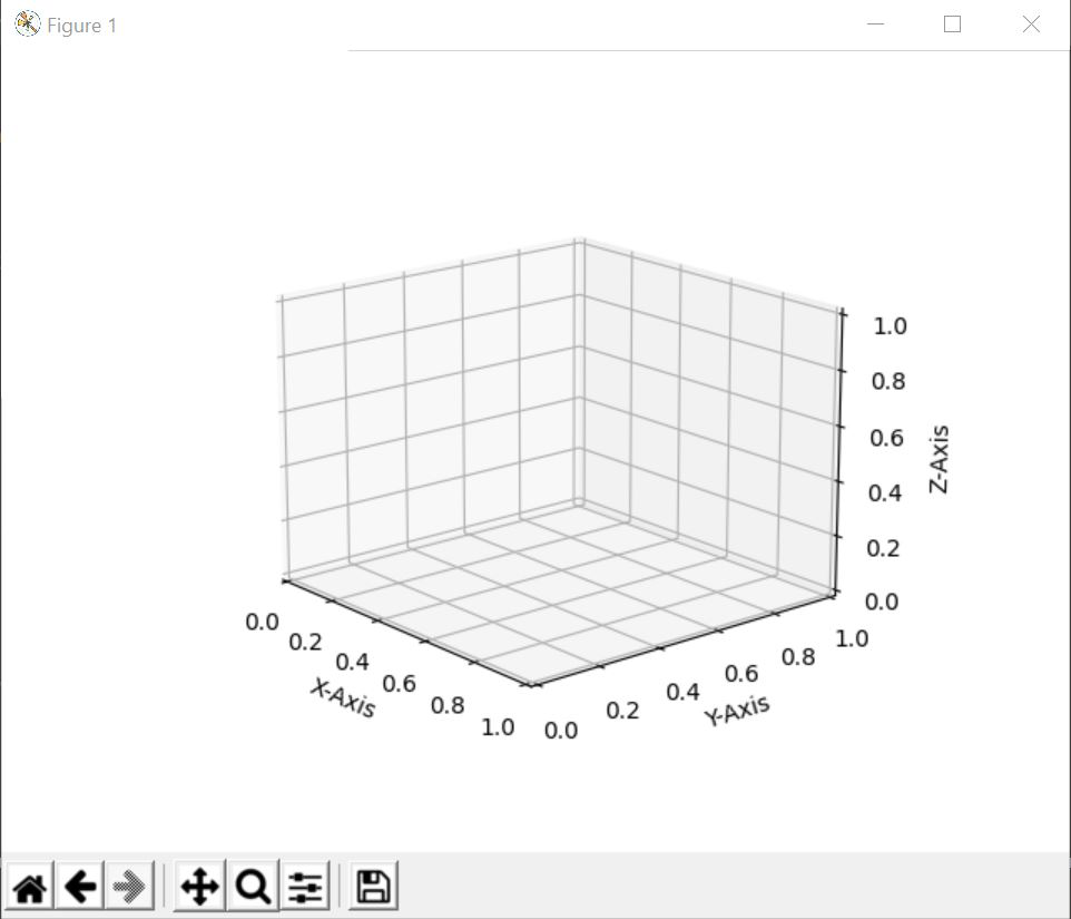
After creating an empty figure and defining the axes as a 3D projection, plt.show() will make the output look like this.
Explanation:
After labelling each of the axes, we are creating 3 different variables x,y and z where x and y contain 10 evenly spaced elements from 0 to 1 and z is a sine curve. With the help of ax.plot, we are plotting (x,y),(x,z)[2D Data] points on a different axis of the 3D plane. Finally, our output will look something like this:
Output:
Example 2:
In this example, we will not be using Matplotlib.pyplot.gca() function, but we will create a set of 2D data’s along with which we will be making a 2D plot in a 3D projection. The code of the above idea is given below:
Python3
import numpy as np
import matplotlib.pyplot as plt
fig = plt.figure()
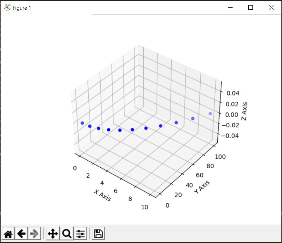
ax = fig.add_subplot(projection='3d')
ax.set_xlabel('X Axis')
ax.set_ylabel('Y Axis')
ax.set_zlabel('Z Axis')
x = np.arange(11)
y = x**2
ax.scatter(x, y, c='b')
plt.show()
|
Explanation:
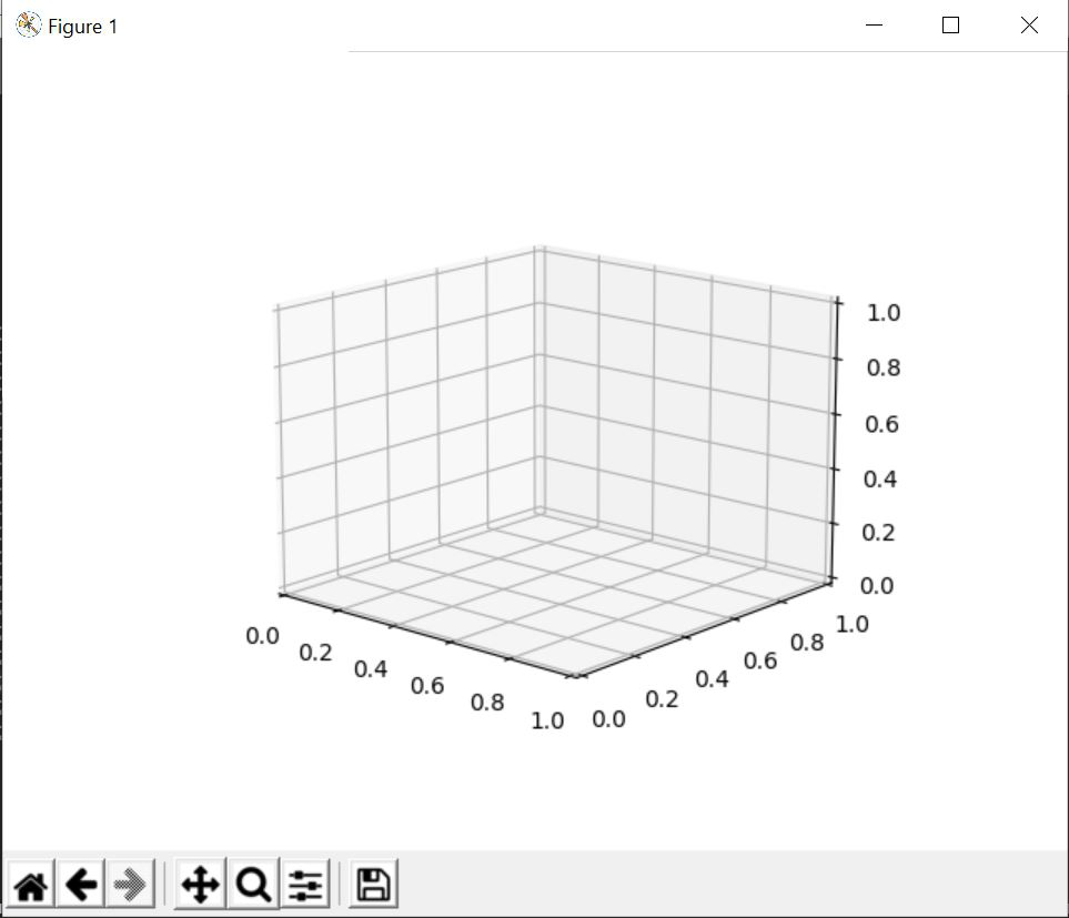
After importing the packages, we are creating an empty canvas or figure. Then, we are creating the axes of the figure by specifying that it will be 3D projection. If we show write ‘plt.show()’ now and build our code, then the result will be as follows:
After this, we are setting up the labels of the three-axis X, Y and Z. After that we are creating our set of points (x, y) where is a list of numbers created using np.arange() function and y contains the square of each of the numbers present in x. With all the 2D data, we are plotting a scatter plot in our 3D figure where the points (x, y) are denoted blue. After that, we are showing the above figure.
Output:
Like Article
Suggest improvement
Share your thoughts in the comments
Please Login to comment...