Pie chart in Pygal
Last Updated :
28 Jul, 2020
Pygal is a Python module that is mainly used to build SVG (Scalar Vector Graphics) graphs and charts. SVG is a vector-based graphics in the XML format that can be edited in any editor. Pygal can create graphs with minimal lines of code that can be easy to understand and write.
Pie Chart
A pie chart or a circle chart is a chart which is a circular arithmetical graphic, which is divided according to the values to demonstrate numerical proportion and percentage represented by each category is provided next to the corresponding slice of pie. Pie chart is good to represent data in many slices and is very effective while understanding.
A simple pie chart is a chart which represents the data series in one whole pie with a different percentage. Each slice of a pie is proportionally different from the sum of all the data present in a series. It can be created using the Pie() method of pygal module.
Syntax:
pie_chart = pygal.Pie()
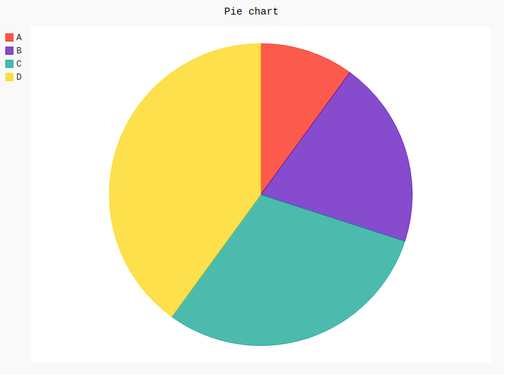
Example 1:
import pygal
pie_chart = pygal.Pie()
pie_chart.title = 'Pie chart'
pie_chart.add('A', 10)
pie_chart.add('B', 20)
pie_chart.add('C', 30)
pie_chart.add('D', 40)
pie_chart
|
Output:
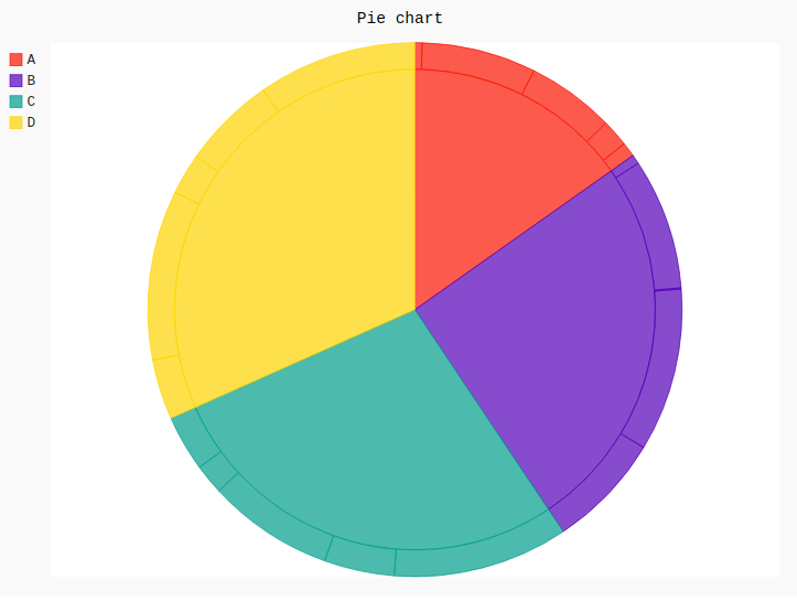
Example 2:
import pygal
import numpy
pie_chart = pygal.Pie()
pie_chart.title = 'Pie chart'
pie_chart.add('A', numpy.random.rand(5))
pie_chart.add('B', numpy.random.rand(5))
pie_chart.add('C', numpy.random.rand(5))
pie_chart.add('D', numpy.random.rand(5))
pie_chart
|
Output:
Like Article
Suggest improvement
Share your thoughts in the comments
Please Login to comment...