Parallel Coordinates Plot using Plotly in Python
Last Updated :
01 Oct, 2020
A Plotly is a Python library that is used to design graphs, especially interactive graphs. It can plot various graphs and charts like histogram, barplot, boxplot, spreadplot, and many more. It is mainly used in data analysis as well as financial analysis. Plotly is an interactive visualization library.
Parallel Coordinates Plot
Parallel coordinates plot is a common way of visualizing and analyzing high-dimensional datasets. A point in n-dimensional space is represented as a polyline with vertices on the parallel axes and the position of the vertex corresponds to the coordinate of the point.
Syntax: parallel_coordinates(data_frame=None, dimensions=None, labels={}, range_color=None)
Parameters:
data_frame: This argument needs to be passed for column names (and not keyword names) to be used.
dimensions: Either names of columns in data_frame, or pandas Series, or array_like objects Values from these columns are used for multidimensional visualization.
labels: By default, column names are used in the figure for axis titles, legend entries and hovers. This parameter allows this to be overridden. The keys of this dict should correspond to column names, and the values should correspond to the desired label to be displayed.
range_color: If provided, overrides auto-scaling on the continuous color scale.
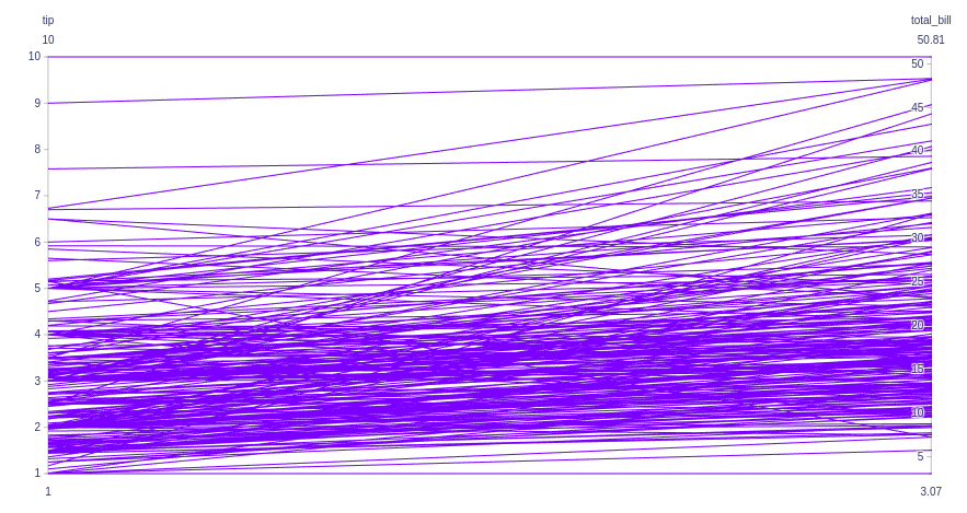
Example 1:
Python3
import plotly.express as px
df = px.data.tips()
fig = px.parallel_coordinates(
df, dimensions=['tip', 'total_bill', 'day','time'],)
fig.show()
|
Output:
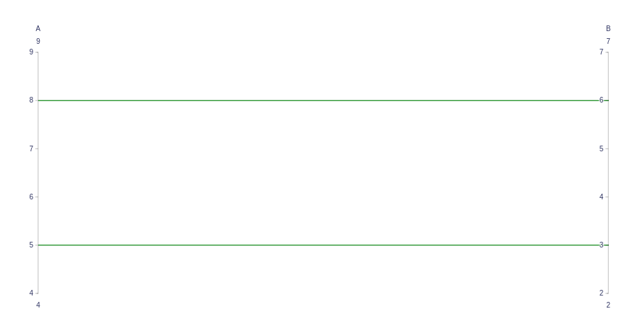
Example 2: Showing Parallel Coordinates Chart with go.Parcoords()
Python3
import plotly.graph_objects as go
fig = go.Figure(data=go.Parcoords(
line_color='green',
dimensions=list([
dict(range=[4, 9],
label='A', values=[5, 8]),
dict(range=[2, 7],
label='B', values=[3, 6]),
])
)
)
fig.show()
|
Output:
Example 3:
Python3
import plotly.graph_objects as go
import plotly.express as px
df = px.data.tips()
fig = go.Figure(data=go.Parcoords(
dimensions=list([
dict(range=[0, 8],
constraintrange=[4, 8],
label='Sepal Length', values=df['tip']),
dict(range=[0, 8],
label='Sepal Width', values=df['total_bill']),
])
)
)
fig.show()
|
Output:
Like Article
Suggest improvement
Share your thoughts in the comments
Please Login to comment...