Parallel coordinates chart with ggally in R
Last Updated :
24 Feb, 2022
To analyze and visualize high-dimensional data, one can use Parallel Coordinates. A background is drawn consisting of n parallel lines, often vertical and evenly spaced, to display a set of points in an n-dimensional space. A point in n-dimensional space is represented by a polyline with vertices on parallel axes; the ith coordinate of the point corresponds to the position of the vertex on the ith axis.
This representation is similar to time series visualization, except that it is used with data that does not have a natural order because the axes do not correlate to points in time. As a result, several axis layouts may be of interest.
In R programming Language, using the ggally packages, and the ggparcoord() function one can create the simplest basic parallel coordinates chart.
The input dataset must be a data frame containing multiple numeric variables, each of which will serve as a vertical axis on the chart. The function’s columns argument specifies the number of columns for these variables.
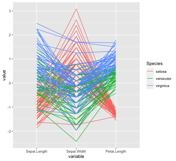
Plotting the Parallel Coordinate plot with IRIS Data
Here we are going to plot the parallel Coordinate plot with the iris dataset for this we will create dataframe from this dataset and then we will plot parallel Coordinate using ggparcoord() method.
Syntax: ggparcoord( data, columns, groupColumn)
Parameters:
- data: Dataset to plot
- columns: Vector of variables (either names or indices) to be axes in the plot
- groupColumn: Single variable to group (color) by
R
library(GGally)
data <- iris
head(data)
ggparcoord(data,
columns = 1:3,
groupColumn = 5)
|
Output:
  Sepal.Length Sepal.Width Petal.Length Petal.Width Species
1          5.1         3.5          1.4         0.2  setosa
2          4.9         3.0          1.4         0.2  setosa
3          4.7         3.2          1.3         0.2  setosa
4          4.6         3.1          1.5         0.2  setosa
5          5.0         3.6          1.4         0.2  setosa
6          5.4         3.9          1.7         0.4  setosa
Customising Theme and Color
For customizing the theme and color within the plot we will use viridis and hrbrthemes package for color palette and themes for axis and plot.
R
library(GGally)
library(viridis)
library(hrbrthemes)
data <- iris
head(data)
ggparcoord(data,
columns = 1:3,
alphaLines = .4,
groupColumn = 5, order = "anyClass",
showPoints = TRUE) +
theme(
plot.title = element_text(size=10)
)
|
Output:
  Sepal.Length Sepal.Width Petal.Length Petal.Width Species
1          5.1         3.5          1.4         0.2  setosa
2          4.9         3.0          1.4         0.2  setosa
3          4.7         3.2          1.3         0.2  setosa
4          4.6         3.1          1.5         0.2  setosa
5          5.0         3.6          1.4         0.2  setosa
6          5.4         3.9          1.7         0.4  setosa

Like Article
Suggest improvement
Share your thoughts in the comments
Please Login to comment...