Olympics Data Analysis Using Python
Last Updated :
13 May, 2022
In this article, we are going to see the Olympics analysis using Python. The modern Olympic Games or Olympics are leading international sports events featuring summer and winter sports competitions in which thousands of athletes from around the world participate in a variety of competitions. The Olympic Games are considered the world’s foremost sports competition with more than 200 nations participating.
The total number of events in the Olympics is 339 in 33 sports. And for every event there are winners. Therefore various data is generated. So, by using Python we will analyze this data.
Modules Used
- Pandas: It is used for analyzing the data,
- NumPy: NumPy is a general-purpose array-processing package.
- Matplotlib: It is a numerical mathematics extension NumPy
- seaborn: It is used for visualization statistical graphics plotting in Python
Model architecture :

Stepwise Implementation
Step 1: Importing libraries
Python3
import pandas as pd
import numpy as np
import matplotlib.pyplot as plt
import seaborn as sns
|
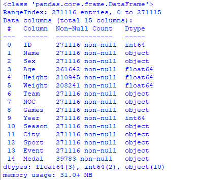
Step 2: Understanding database
When dealing with Olympic data, we have two CSV files. One containing outturn sports-related costs of the Olympic Games of all years. And other is containing the information about athletes of all years when they participated with information.
CSV data file can be download from here: Datasets
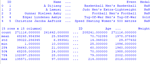
Step 3: Data cleaning and formatting
We imported both the datasets using the .read_csv() method into a dataframe using pandas and displayed the first 5 rows of each dataset.
Python3
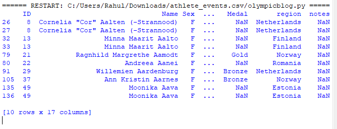
data = pd.read_csv('athlete_events.csv')
print(data.head(), data.describe(), data.info())
|
Output:
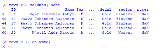
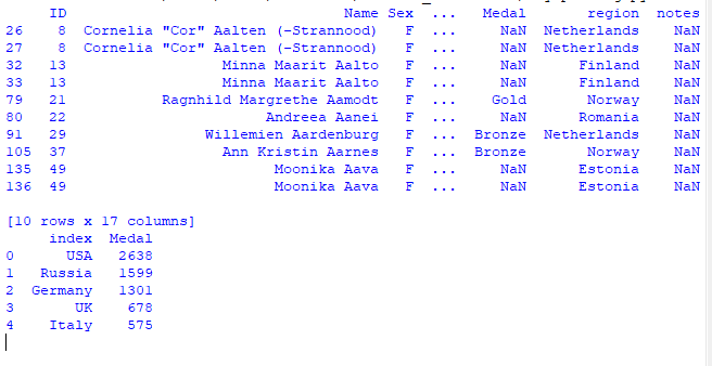
Step 4: Merging two DataFrame
Here we are going to merge two dataframe using pandas.merge() in python.
Python3
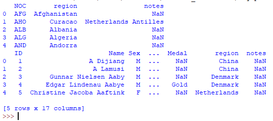
regions = pd.read_csv('datasets_31029_40943_noc_regions.csv')
print(regions.head())
merged = pd.merge(data, regions, on='NOC', how='left')
print(merged.head())
|
Output:
Data analysis of Olympics
Data is now available now using pandas and matplotlib lets see some examples
Data analysis of Gold medalists
Creating a new data frame including only gold medalists.
Python3
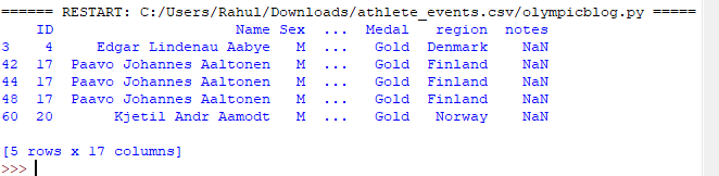
goldMedals = merged[(merged.Medal == 'Gold')]
print(goldMedals.head())
|
Output :
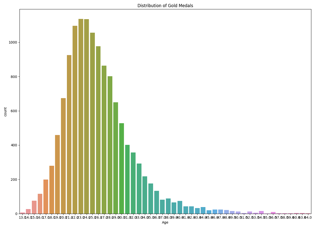
Gold medalist in respect of age:
Here we are going to create a graph of the number of gold medals with respect to age. For this, we will create countplot for graph representation which shows the X-axis as the age of the players and the Y-axis represent the number of medals.
Python3
plt.figure(figsize=(20, 10))
plt.title('Distribution of Gold Medals')
sns.countplot(goldMedals['Age'])
plt.show()
|
Output :
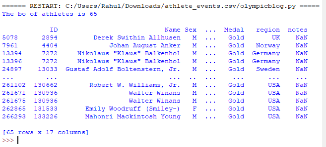
Print the number of athletes who are gold medalists and whose age is greater than 50 with their info.
Python3
goldMedals = merged[(merged.Medal == 'Gold')]
print('The no of athletes is',
goldMedals['ID'][goldMedals['Age'] > 50].count(), '\n')
print(goldMedals[goldMedals['Age'] > 50])
|
Output :
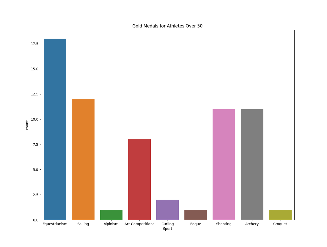
Create a new dataframe called masterDisciplines in which we will insert this new set of people and then create a visualization with it
Python3
masterDisciplines = goldMedals['Sport'][goldMedals['Age'] > 50]
plt.figure(figsize=(20, 10))
plt.tight_layout()
sns.countplot(masterDisciplines)
plt.title('Gold Medals for Athletes Over 50')
plt.show()
|
Output :
Women who can play in summer
Display all women athletes who have played in the summer season and it show the increase in women athletes after a long period via graphical representation.
Python3
womenInOlympics = merged[(merged.Sex == 'F') &
(merged.Season == 'Summer')]
print(womenInOlympics.head(10))
sns.set(style="darkgrid")
plt.figure(figsize=(20, 10))
sns.countplot(x='Year', data=womenInOlympics)
plt.title('Women medals per edition of the Games')
plt.show()
|
Output :
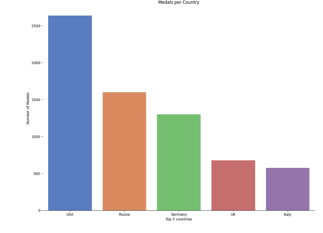
Top 5 countries who won the most medals
Here we are going to print the top 5 countries and show them in the graph with catplot.
Python3
print(goldMedals.region.value_counts().reset_index(name='Medal').head())
totalGoldMedals = goldMedals.region.value_counts()
.reset_index(name='Medal').head(5)
g = sns.catplot(x="index", y="Medal", data=totalGoldMedals,
height=6, kind="bar", palette="muted")
g.despine(left=True)
g.set_xlabels("Top 5 countries")
g.set_ylabels("Number of Medals")
plt.title('Medals per Country')
plt.show()
|
output:
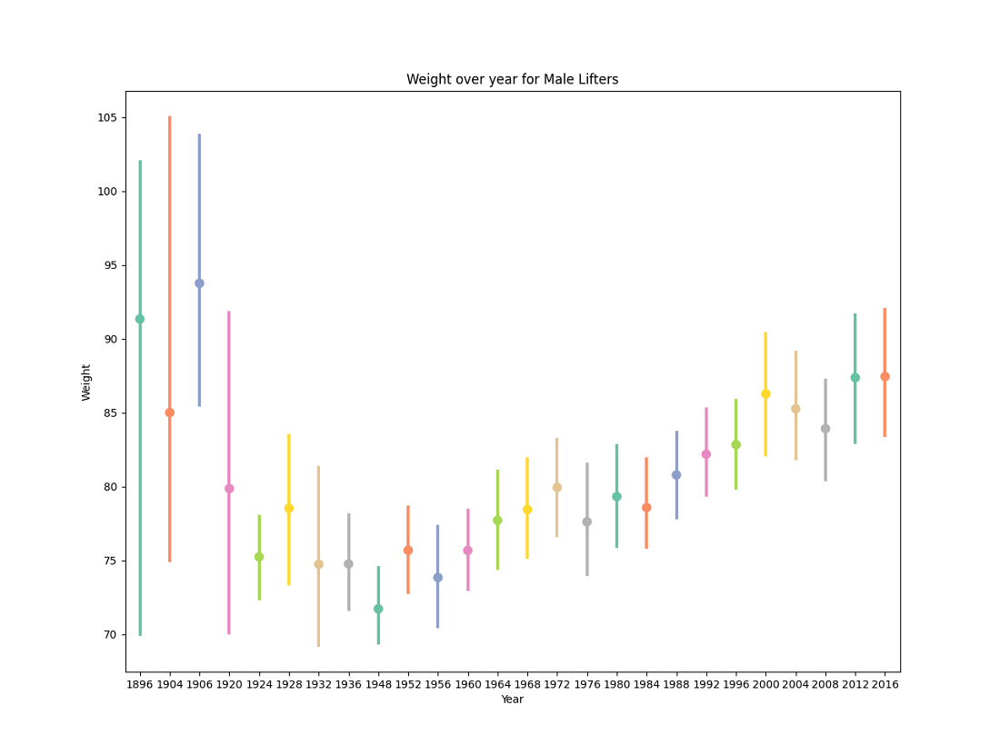
Players weight Analysis
Here we are going to see how weight over year for Male Lifters via graphical representation using pointplot.
Python3
MenOverTime = merged[(merged.Sex == 'M') &
(merged.Season == 'Summer')]
wlMenOverTime = MenOverTime.loc[MenOverTime['Sport'] == 'Weightlifting']
plt.figure(figsize=(20, 10))
sns.pointplot('Year', 'Weight', data=wlMenOverTime, palette='Set2')
plt.title('Weight over year for Male Lifters')
plt.show()
|
Output :
Like Article
Suggest improvement
Share your thoughts in the comments
Please Login to comment...