Normal Distribution Plot using Numpy and Matplotlib
Last Updated :
05 May, 2021
In this article, we will see how we can create a normal distribution plot in python with numpy and matplotlib module.
What is Normal Distribution?
Normal Distribution is a probability function used in statistics that tells about how the data values are distributed. It is the most important probability distribution function used in statistics because of its advantages in real case scenarios. For example, the height of the population, shoe size, IQ level, rolling a die, and many more.
It is generally observed that data distribution is normal when there is a random collection of data from independent sources. The graph produced after plotting the value of the variable on x-axis and count of the value on y-axis is bell-shaped curve graph. The graph signifies that the peak point is the mean of the data set and half of the values of data set lie on the left side of the mean and other half lies on the right part of the mean telling about the distribution of the values. The graph is symmetric distribution.
Modules Needed
Numpy is a general-purpose array-processing package. It provides a high-performance multidimensional array object, and tools for working with these arrays. It is the fundamental package for scientific computing with Python.
Besides its obvious scientific uses, Numpy can also be used as an efficient multi-dimensional container of generic data.
Matplotlib is a plotting library for creating static, animated, and interactive visualizations in Python. Matplotlib can be used in Python scripts, the Python and IPython shell, web application servers, and various graphical user interface toolkits like Tkinter, awxPython, etc.
Below are some program which create a Normal Distribution plot using Numpy and Matplotlib module:
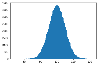
Example 1:
Python3
import numpy as np
import matplotlib.pyplot as plt
pos = 100
scale = 5
size = 100000
values = np.random.normal(pos, scale, size)
plt.hist(values, 100)
plt.show()
|
Output :
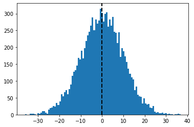
Example 2:
Python3
import numpy as np
import matplotlib.pyplot as plt
pos = 0
scale = 10
size = 10000
np.random.seed(10)
values = np.random.normal(pos, scale, size)
plt.hist(values, 100)
plt.axvline(values.mean(), color='k', linestyle='dashed', linewidth=2)
plt.show()
|
Output :
Like Article
Suggest improvement
Share your thoughts in the comments
Please Login to comment...