Nested Pie Chart in R
Last Updated :
15 Feb, 2023
In this article, we will discuss how to create a nested pie chart in the R Programming Language.
A Pie Chart is a circular plot that can display only one series of data. The area of slices of the pie represents the ratio of the parts of the data that are visualized by that slice. But sometimes we need to show two series of data simultaneously to analyze the data better. We can do this by creating a nested pie chart which is a pie chart nested inside a donut chart.
Method 1: Create Nested Pie chart using Plotly package
To create a Nested Pie chart in the R Language using the Plotly package we will first create a basic pie chart and a basic donut chart. Then combine those two layers to create a nested pie chart.
To install & import the plotly package in the R console, the syntax is given:
install.package('plotly')
library(plotly)
Create a Pie chart:
In the R Language, we can use the Plotly package with plot_ly() function to create a pie chart. The plot_ly() function takes a data frame as an argument that is to be visualized. Then we add the add_pie() function to create a pie chart.
Syntax:
plot_ly( df ) %>% add_pie( df, labels, value )
where,
- df: determines the dataframe which is to be visualized.
- labels: determines the variable that has labels.
- value: determines the variable with values that are to be presented in the pie chart.
Example:
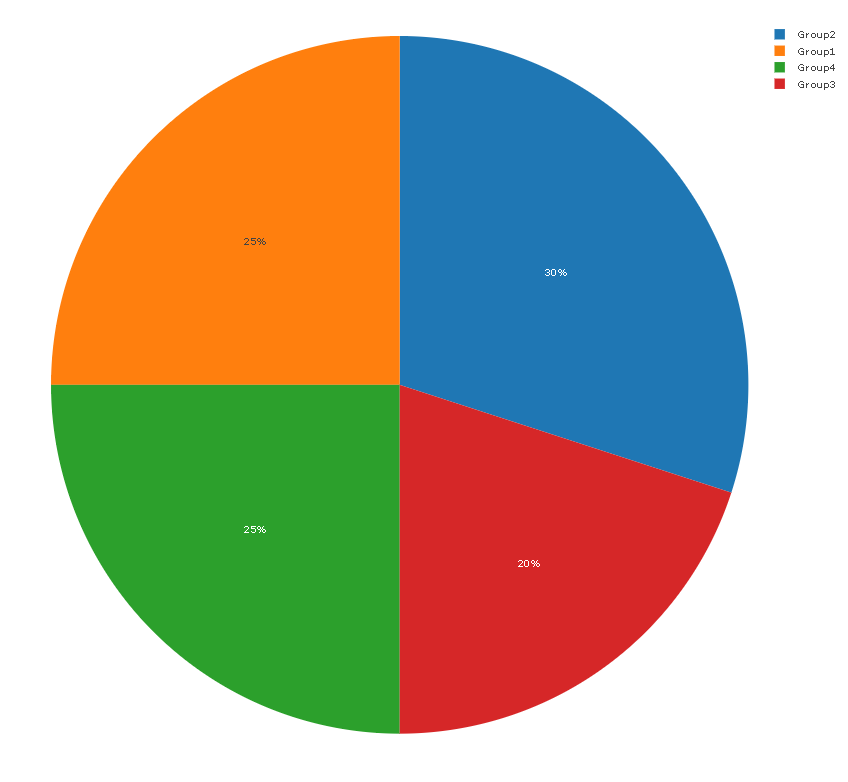
Here, is a basic pie chart made using the plot_ly() function.
R
library(plotly)
sample_data <- data.frame(group= c('Group1', 'Group2',
'Group3', 'Group4'),
value= c(25,30,20,25))
plot_ly(sample_data) %>%
add_pie(sample_data, labels = ~`group`, values = ~`value`)
|
Output:
Create a Donut chart:
In this method, to create a basic donut chart, we will be using plot_ly() function with the hole parameter.
Syntax:
plot_ly( df ) %>% add_pie( df, labels, value, hole )
where,
- df: determines the dataframe which is to be visualised.
- labels: determines the variable that has labels.
- value: determines the variable with values that are to be presented in the pie chart.
- hole: determines the size of hole in the donut chart.
Example:
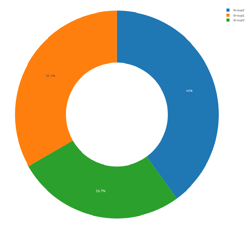
Here, is a basic donut chart made using the plot_ly() function with the hole parameter.
R
library(plotly)
sample_data <- data.frame(group= c('Group1', 'Group2',
'Group3'),
value= c(25,30,20))
plot_ly(sample_data) %>%
add_pie(sample_data, labels = ~`group`, values = ~`value`,
type = 'pie', hole = 0.5)
|
Output:
Create a Nested Pie chart:
To create a nested pie chart we first use the plot_ly() function to create a base. Then add a donut chart layer with the help of the add_pie() function. Then to convert it to a nested pie chart we add a new layer of the pie chart and adjust to it center of the donut chart by using domain argument.
Syntax:
plot_ly( df ) %>% add_pie( df, labels, value, hole ) %>% add_pie( df, labels, value, domain )
- where,
- df: determines the dataframe which is to be visualized.
- labels: determines the variable that has labels.
- value: determines the variable with values that are to be presented in the pie chart.
- hole: determines the size of the hole in the donut chart.
- domain: determines the vector that tells the position and size of the pie chart.
Example:
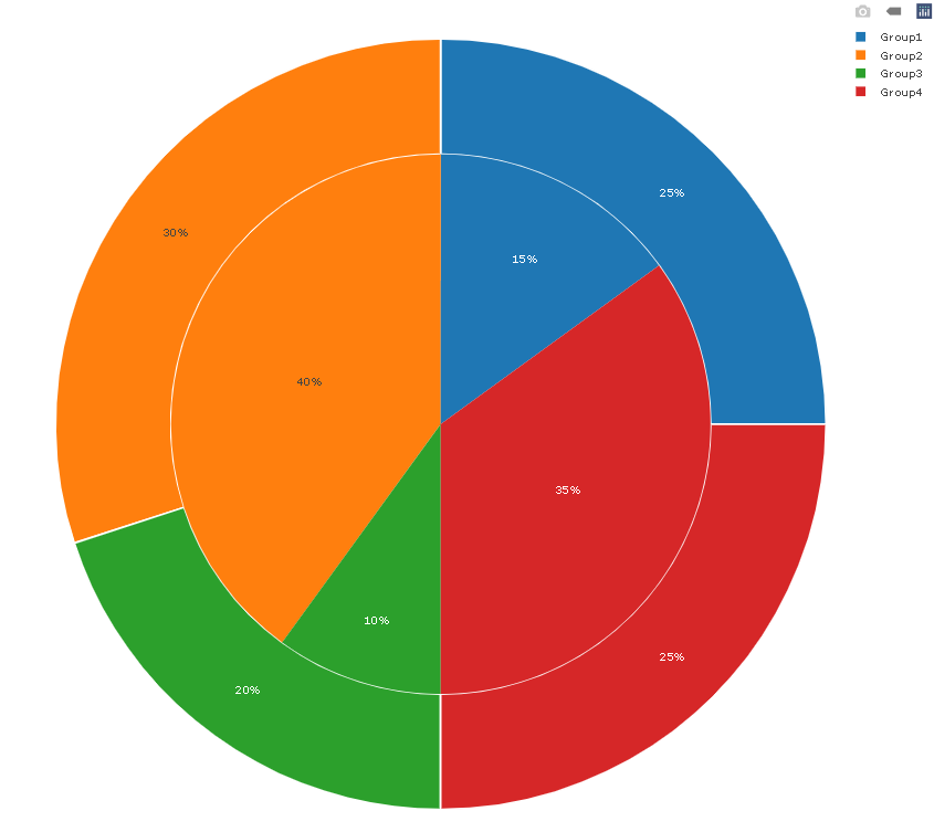
Here, is a basic nested pie chart made with the plot_ly() function.
R
library(plotly)
sample_data <- data.frame(group= c('Group1', 'Group2', 'Group3', 'Group4'),
value1= c(25,30,20,25),value2= c(15,40,10,35))
plot_ly(sample_data) %>%
add_pie(labels = ~`group`, values = ~`value1`,
type = 'pie', hole = 0.7, sort = F,
marker = list(line = list(width = 2))) %>%
add_pie(sample_data, labels = ~`group`, values = ~`value2`,
domain = list(
x = c(0.15, 0.85),
y = c(0.15, 0.85)),
sort = F)
|
Output:
Method 2: Create Nested Pie chart using ggplot2 package
To create a nested pie chart in the R Language using the ggplot2 package, we first create a rectangular plot and then use the coord_polar() function to turn it into a nested pie/donut chart. The coord_polar() function converts the cartesian coordinates system into a polar coordinate system in ggplot2.
To install & import the ggplot2 package in the R console, the syntax is given:
install.package('ggplot2')
library(ggplot2)
Syntax:
plot + coord_polar( theta, start, direction, clip )
where,
- theta: determines the angle
- start: determines the setting offset
- direction: determines the direction of transformation i.e. x or y
- clip: determines whether drawing should be clipped or not
Example:
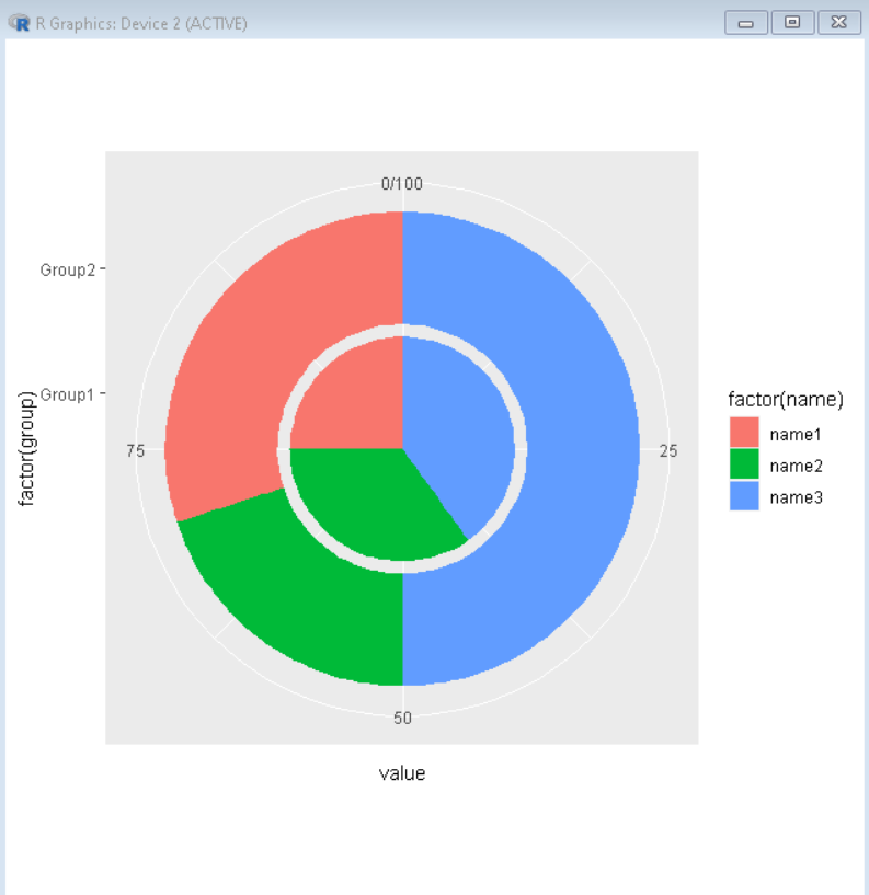
Here, is a nested pie chart made using the ggplot2 package.
R
library(ggplot2)
sample_data <- data.frame(group= c('Group1', 'Group2',
'Group1', 'Group2',
'Group1', 'Group2'),
name= c('name1', 'name1',
'name2', 'name2',
'name3', 'name3'),
value= c(25,30,35,20,40,50))
ggplot(sample_data, aes(x = factor(group), y = value, fill = factor(name))) +
geom_col() +
scale_x_discrete(limits = c("Group1", "Group2")) +
coord_polar("y")
|
Output:
Like Article
Suggest improvement
Share your thoughts in the comments
Please Login to comment...