Multiple Density Plots and Coloring by Variable with ggplot2 in R
Last Updated :
13 Jun, 2023
In this article, we will discuss how to make multiple density plots with coloring by variable in R Programming Language.
To make multiple density plots with coloring by variable in R with ggplot2, we first make a data frame with values and categories. Then we draw the ggplot2 density plot using the geom_desnity() function. To color them according to the variable we add the fill property as a category in ggplot() function.
Syntax: ggplot(dataFrame, aes( x, color, fill)) + geom_density()
Multiple Density Plots with Coloring by Variable
We get multiple density plots in the ggplot of two colors corresponding to two-level/values for the second categorical variable. If our categorical variable has n levels, then ggplot2 would make multiple density plots with n densities/colors.
R
set.seed(1234)
df <- data.frame( category=factor(rep(c("category1",
"category2"),
each=500)),
value=round(c(rnorm(500, mean=95, sd=5),
rnorm(500, mean=105, sd=7))))
library(ggplot2)
ggplot(df, aes(x=value, color=category)) +
geom_density()
|
Output:
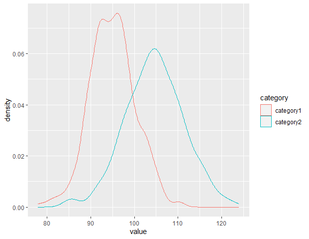
Density Plots in R
Color Customization
To add color beneath the density plot we use the fill property. We can also customize the transparency of the plot with the alpha property. We get multiple density plots in the ggplot filled with two colors corresponding to two-level/values for the second categorical variable. If our categorical variable has n levels, then ggplot2 would make multiple density plots with n densities/colors. The alpha value of 0.3 gives 30% transparency to the plot fill.
R
set.seed(1234)
df < - data.frame(
category=factor(rep(c("category1", "category2"), each=500)),
value=round(c(rnorm(500, mean=95, sd=5),
rnorm(500, mean=105, sd=7)))
)
library(ggplot2)
ggplot(df, aes(x=value, color=category, fill=category)) +
geom_density(alpha=0.3)
|
Output:

Density Plots in R
Add legend and increase color transparency:
R
library(ggplot2)
set.seed(1234)
df <- data.frame(category = factor(rep(c("category1", "category2"), each = 500)),
value = round(c(rnorm(500, mean = 95, sd = 5),
rnorm(500, mean = 105, sd = 7))))
ggplot(df, aes(x = value, fill = category)) +
geom_density(alpha = 0.5, color = "black", size = 1) +
scale_fill_manual(values = c("category1" = "red", "category2" = "blue")) +
labs(x = "Value", y = "Density", title = "Density Plot by Category") +
theme_minimal()
|
Output:
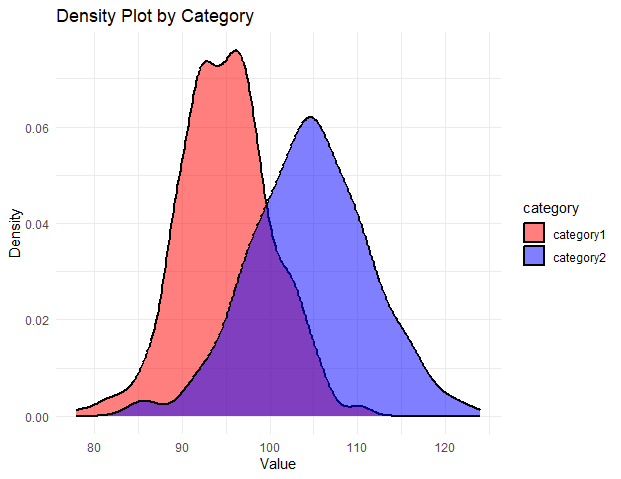
Density Plots in R
Log scale customization
When x or y-axis data is very large, we can draw plots with a log scale. In ggplot2, we can transform x-axis values to log scale using the scale_x_log10() function.
Syntax: plot+ scale_x_log10()
Now our density plot is drawn in Log scale. This becomes more effective when our dataset is skew. It helps to correct the skewness of the plot.
R
set.seed(1234)
df <- data.frame(
category=factor(rep(c("category1", "category2"),
each=5000)),
value=round(c(rnorm(5000, mean=90005, sd=50000),
rnorm(5000, mean=70005, sd=70000))))
library(ggplot2)
ggplot(df, aes(x=value, color=category)) +
geom_density()+
scale_x_log10()
|
Output:
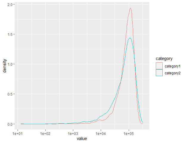
Density Plots in R
Share your thoughts in the comments
Please Login to comment...