Multidimensional data analysis in Python
Last Updated :
24 Jan, 2022
Multi-dimensional data analysis is an informative analysis of data which takes many relationships into account. Let’s shed light on some basic techniques used for analysing multidimensional/multivariate data using open source libraries written in Python.
Find the link for data used for illustration from here.
Following code is used to read 2D tabular data from zoo_data.csv.
Python3
import pandas as pd
zoo_data = pd.read_csv("zoo_data.csv", encoding = 'utf-8',
index_col = ["animal_name"])
print(zoo_data.head())
|
Output:
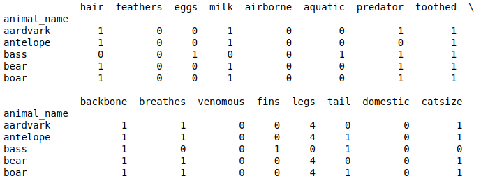
Note: The type of data we have here is typically categorical. The techniques used in this case study for categorical data analysis are very basic ones which are simple to understand, interpret and implement. These include cluster analysis, correlation analysis, PCA(Principal component analysis) and EDA(Exploratory Data Analysis) analysis.
Cluster Analysis:
As the data we have is based on the characteristics of different types of animals, we can classify animals into different groups(clusters) or subgroups using some well known clustering techniques namely KMeans clustering, DBscan, Hierarchical clustering & KNN(K-Nearest Neighbours) clustering. For sake of simplicity, KMeans clustering ought to be a better option in this case. Clustering data using Kmeans clustering technique can be achieved using KMeans module of cluster class of sklearn library as follows:
Python3
clusters = 7
kmeans = KMeans(n_clusters = clusters)
kmeans.fit(zoo_data)
print(kmeans.labels_)
|
Output:

Here, overall cluster inertia comes out to be 119.70392382759556. This value is stored in kmeans.inertia_ variable.
EDA Analysis:
To perform EDA analysis, we need to reduce dimensionality of multivariate data we have to trivariate/bivariate(2D/3D) data. We can achieve this task using PCA(Principal Component Analysis).
For more information refer to https://www.geeksforgeeks.org/dimensionality-reduction/
PCA can be carried out using PCA module of class decomposition of library sklearn as follows:
Python3
pca = PCA(3)
pca.fit(zoo_data)
pca_data = pd.DataFrame(pca.transform(zoo_data))
print(pca_data.head())
|
Output:
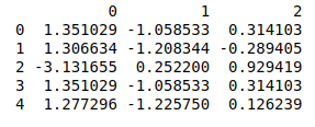
Data output above represents reduced trivariate(3D) data on which we can perform EDA analysis.
Note: Reduced Data produced by PCA can be used indirectly for performing various analysis but is not directly human interpretable.
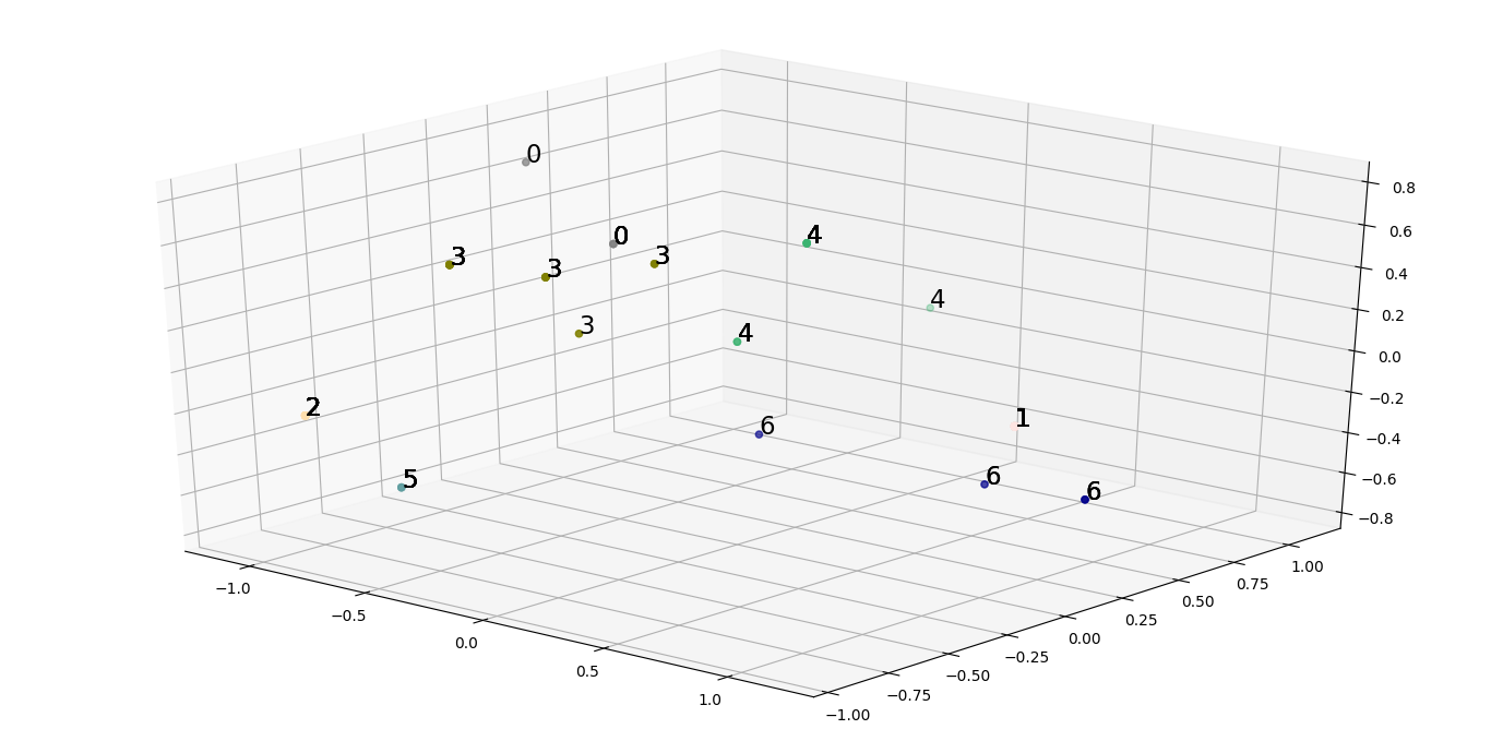
Scatter plot is a 2D/3D plot which is helpful in analysis of various clusters in 2D/3D data.
Scatter plot of 3D reduced data we produced earlier can be plotted as follows:
The code below is a Pythonic code which generates an array of colors(where number of colors are approximately equal to number of clusters) sorted in order of their hue, value and saturation values. Here each color is associated with a single cluster and will be used to denote an animal as a 3D point while plotting it in a 3D plot/space(Scatter Plot in this case).
Python3
from matplotlib import colors as mcolors
import math
colors = list(zip(*sorted((
tuple(mcolors.rgb_to_hsv(
mcolors.to_rgba(color)[:3])), name)
for name, color in dict(
mcolors.BASE_COLORS, **mcolors.CSS4_COLORS
).items())))[1]
skips = math.floor(len(colors[5 : -5])/clusters)
cluster_colors = colors[5 : -5 : skips]
|
The code below is a pythonic code which generates a 3D scatter plot where each data point has a color related to its corresponding cluster.
Python3
from mpl_toolkits.mplot3d import Axes3D
import matplotlib.pyplot as plt
fig = plt.figure()
ax = fig.add_subplot(111, projection = '3d')
ax.scatter(pca_data[0], pca_data[1], pca_data[2],
c = list(map(lambda label : cluster_colors[label],
kmeans.labels_)))
str_labels = list(map(lambda label:'% s' % label, kmeans.labels_))
list(map(lambda data1, data2, data3, str_label:
ax.text(data1, data2, data3, s = str_label, size = 16.5,
zorder = 20, color = 'k'), pca_data[0], pca_data[1],
pca_data[2], str_labels))
plt.show()
|
Output:
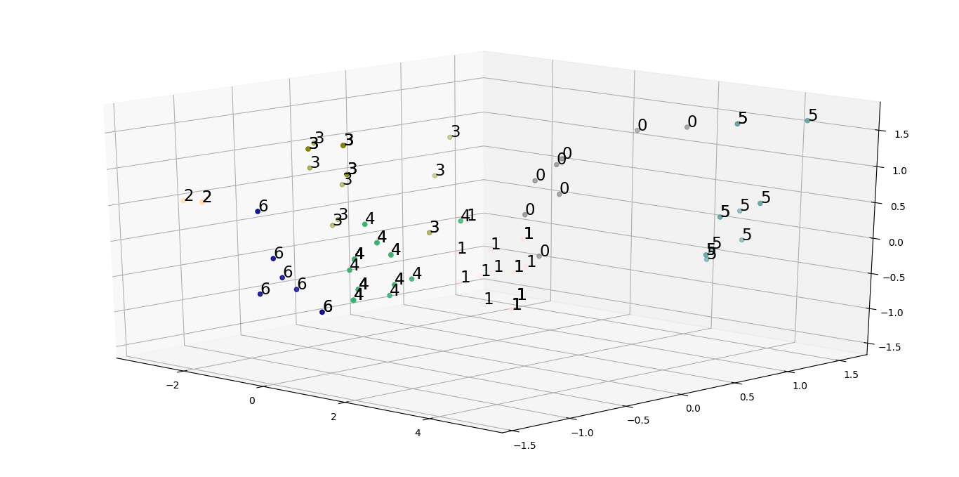
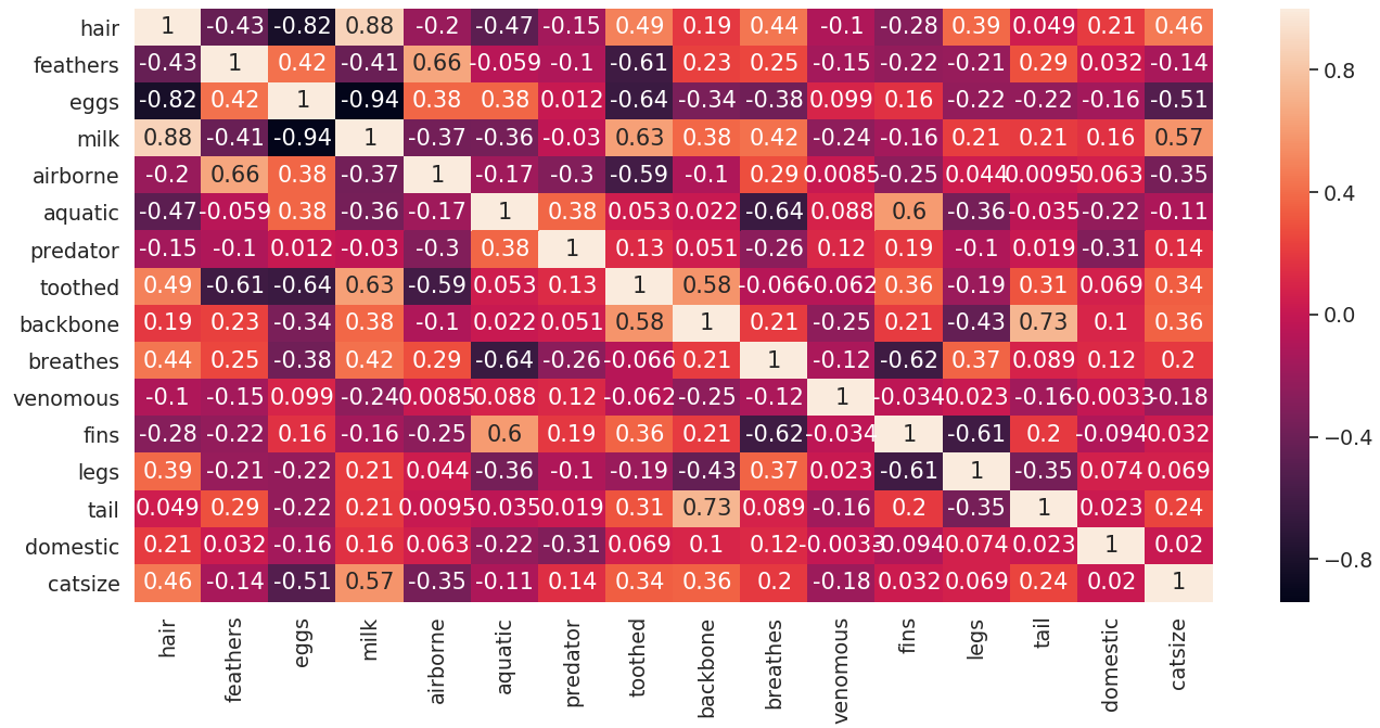
Closely analysing the scatter plot can lead to hypothesis that the clusters formed using the initial data doesn’t have good enough explanatory power. To solve this issue, we need to bring down our set of features to a more useful set of features using which we can generate useful clusters. One way of producing such a set of features is to carry out correlation analysis. This can be done by plotting heatmaps and trisurface plots as follows:
Python3
import seaborn as sns
sns.heatmap(zoo_data.corr(), annot = True)
plt.show()
|
Output:
Following code is used to generate a trisurface plot of correlation matrix by making a list of tuples where a tuple contains coordinates and correlation value in order of animal names.
Pseudocode for above explanation:
# PseudoCode
tuple -> (position_in_dataframe(feature1),
          position_in_dataframe(feature2),
          correlation(feature1, feature2))
Code for generating trisurface plot for correlation matrix:
Python3
from matplotlib import cm
df = zoo_data.corr()
df.index = range(0, len(df))
df.rename(columns = dict(zip(df.columns, df.index)), inplace = True)
df = df.astype(object)
for i in range(0, len(df)):
for j in range(0, len(df)):
if i != j:
df.iloc[i, j] = (i, j, df.iloc[i, j])
else :
df.iloc[i, j] = (i, j, 0)
df_list = []
for sub_list in df.values:
df_list.extend(sub_list)
plot_df = pd.DataFrame(df_list)
fig = plt.figure()
ax = Axes3D(fig)
ax.plot_trisurf(plot_df[0], plot_df[1], plot_df[2],
cmap = cm.jet, linewidth = 0.2)
plt.show()
|
Output:
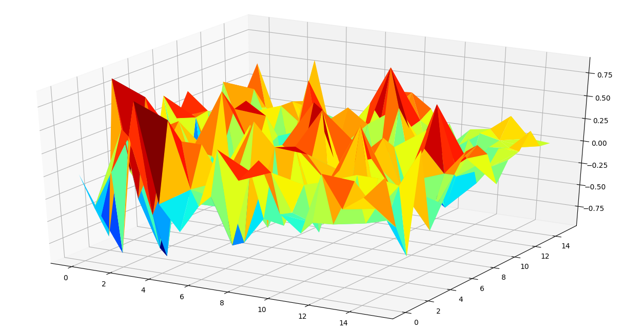
Using heatmap and trisurface plot, we can make some inferences on how to select a smaller set of features used for performing cluster analysis. Generally, feature pairs with extreme correlation values carry high explanatory power and can be used for further analysis.
In this case, looking at both the plots, we arrive at a rational list of 7 features:[“milk”, “eggs”, “hair”, “toothed”, “feathers”, “breathes”, “aquatic”]
Running cluster analysis again on the subsetted feature set, we can generate a scatter plot with better inference on how to spread different animals among various groups.
We observe a reduced overall inertia of 14.479670329670329, which is indeed a lot less from the initial inertia.
Like Article
Suggest improvement
Share your thoughts in the comments
Please Login to comment...