Movie Web Application with ReactJS
Last Updated :
02 Nov, 2023
React Movie APP is a movie web application project that involves creating components to display a list of movies and details about each movie along with a search functionality.
Preview Image of Final Output:

Approach for React Movie App
To create the movie web application in React we will be using an API that provides data according to the query in the search box. Use axios to fetch teh data and display using an array map in the results component. Also the details component shows the complete details of that particular movie when clicked on it.
Steps to Create Movie Web Application App:
We will be following the below steps for creating our application:
Step 1: Initialize the project named movie-app using the npm command in the terminal
npx create-react-app movie-app
Step 2: Change your directory and enter your main folder charting as
cd movie-app
Step 3: Install axios:
npm i axios
Project Structure of Movie Web App
We will then delete all the files that are not necessary. The file structure after deleting the files is given below:
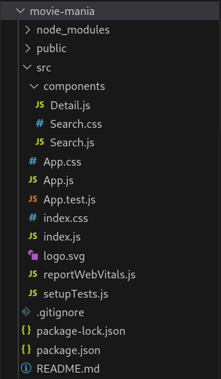
Project structure for React Movie App
dependencies list after installing external libraries:
"dependencies": {
        "@testing-library/jest-dom": "^5.17.0",
        "@testing-library/react": "^13.4.0",
        "@testing-library/user-event": "^13.5.0",
        "axios": "^1.5.1",
        "react": "^18.2.0",
        "react-dom": "^18.2.0",
        "react-scripts": "5.0.1",
        "web-vitals": "^2.1.4"
}
Example: The example on searching a name gives the list of matching movies title and Display the details when clicked on an item in the list.
Javascript
import React, { useState } from "react";
import axios from "axios";
import Search from "./components/Search";
import Detail from "./components/Detail";
import "./App.css";
function App() {
const [state, setState] = useState({
s: "sherlock",
results: [],
selected: {},
});
const apiurl =
const searchInput = (e) => {
let s = e.target.value;
setState((prevState) => {
return { ...prevState, s: s };
});
};
const search = (e) => {
if (e.key === "Enter") {
axios(apiurl + "&s=" + state.s).then(
({ data }) => {
let results = data.Search;
console.log(results);
setState((prevState) => {
return {
...prevState,
results: results,
};
});
}
);
}
};
const openDetail = (id) => {
axios(apiurl + "&i=" + id).then(({ data }) => {
let result = data;
setState((prevState) => {
return { ...prevState, selected: result };
});
});
};
const closeDetail = () => {
setState((prevState) => {
return { ...prevState, selected: {} };
});
};
return (
<div className="App">
<header className="App-header">
<h1>Movie Mania</h1>
</header>
<main>
<Search
searchInput={searchInput}
search={search}
/>
<div className="container">
{state.results.map((e) => (
<div
className="item"
onClick={() =>
openDetail(e.imdbID)
}
>
<img
style={{ width: "200px" }}
src={e.Poster}
/>
<h3 style={{ color: "white" }}>
{e.Title}
</h3>
</div>
))}
</div>
{typeof state.selected.Title !=
"undefined" ? (
<Detail
selected={state.selected}
closeDetail={closeDetail}
/>
) : (
false
)}
</main>
</div>
);
}
export default App;
|
Javascript
import React from "react";
function Detail({ selected, closeDetail }) {
return (
<section className="detail">
<div className="content">
<h2>{selected.Title}</h2>
<span>{selected.Year}</span>
<p className="rating">
Rating: {selected.imdbRating}
</p>
<div className="about">
<img src={selected.Poster} alt="" />
<p>{selected.Plot}</p>
</div>
<button
className="close"
onClick={closeDetail}
>
Close
</button>
</div>
</section>
);
}
export default Detail;
|
Javascript
import React from "react";
import "./Search.css";
function Search({ searchInput, search }) {
return (
<div className="search-bar">
<input
type="text"
placeholder="Search for a Movie..."
className="search"
onChange={searchInput}
onKeyPress={search}
/>
</div>
);
}
export default Search;
|
CSS
* {
margin: 0;
padding: 0;
box-sizing: border-box;
}
body {
font-family: "montserrat", sans-serif;
background: linear-gradient(to right, #000428, #004e92);
}
header {
width: 100%;
padding-top: 2rem;
padding-bottom: 1rem;
}
header h1 {
color: #ffffff;
font-size: 4rem;
font-weight: 700;
text-align: center;
}
main {
width: 100%;
max-width: 90%;
margin: 0 auto;
}
.container {
display: flex;
flex-direction: row;
flex-wrap: wrap;
justify-content: center;
}
.item {
width: 20rem;
text-align: left;
}
.results {
display: flex;
flex-wrap: wrap;
justify-content: center;
align-items: center;
}
.results .result {
width: 20%;
min-width: 250px;
background: #000000;
max-height: 500px;
margin: 20px 25px;
display: flex;
flex-direction: column;
cursor: pointer;
}
.results .not-found {
display: flex;
flex-direction: column;
justify-content: center;
align-items: center;
text-align: center;
margin: 2rem 0.5rem;
}
.results .not-found h2 {
color: #ffffff;
}
.results .result img {
width: 100%;
padding: 10px 2px;
margin: 0 auto;
height: 350px;
width: 230px;
}
.results .result h3 {
color: #fff;
font-size: 20px;
font-weight: 600;
width: 100%;
text-align: center;
padding: 1rem;
background: #272829;
flex: 1 100%;
transition: 0.4s ease-out;
}
.result:hover {
box-shadow: 0 0 8px 3px #eaf0f7;
}
.results .result h3:hover {
background: #fff;
color: #223343;
box-shadow: 0 0 8px 3px #4484c4;
}
.detail {
margin: 3rem 5rem;
overflow-y: scroll;
}
.detail .content .rating {
margin-left: 2rem;
font-size: 1.5rem;
margin-bottom: 0;
margin-top: 1rem;
padding-bottom: 0;
}
.detail .content {
display: block;
width: 100%;
height: 100%;
position: fixed;
top: 0;
left: 0;
max-width: 15000px;
padding: 25px;
background: #000000;
color: #fff;
overflow-y: scroll;
}
.detail .content h2 {
font-size: 3rem;
padding: 2rem;
padding-top: 0;
padding-bottom: 0.5rem;
font-weight: 600;
}
.detail .content span {
font-size: 1.4rem;
margin-left: 2rem;
margin-bottom: 3rem;
font-weight: 300;
color: #ffffff;
}
.detail .content .rating {
margin-bottom: 30px;
}
.detail .content .about {
display: flex;
flex-wrap: wrap;
margin: 0 -15px 30px;
}
.detail .content .about img {
flex: 1 1 50%;
max-width: 300px;
opacity: none;
padding: 0 15px;
margin-left: 2rem;
margin-top: 1rem;
}
.detail .content .about p {
flex: 1 50%;
padding: 15px 25px;
margin-top: 3rem;
font-size: 1.5rem;
}
.detail .content .close {
padding: 15px 30px;
font-size: 18px;
font-weight: 700;
background: #223343;
color: #fff;
border: none;
outline: none;
appearance: none;
cursor: pointer;
transition: 0.4s ease-out;
width: 100%;
display: flex;
margin: auto;
margin-top: 5rem;
justify-content: center;
align-items: center;
border-radius: 5px;
}
.detail .content button:hover {
background: #4484c4;
}
.detail .content .about .close:hover {
background: #223343;
}
@media screen and (max-width: 1015px) {
.results {
justify-content: center;
align-items: center;
}
.detail .content .close {
width: 100%;
display: flex;
margin: auto;
justify-content: center;
align-items: center;
border-radius: 5px;
}
}
@media screen and (max-width: 683px) {
.results {
justify-content: center;
align-items: center;
}
.results .result {
margin: 10px;
justify-content: center;
align-items: center;
}
}
@media screen and (max-width: 643px) {
.results .result {
margin: 15px;
}
}
@media screen and (max-width: 638px) {
.results .result {
margin: 8px;
}
}
@media screen and (max-width: 410px) {
header h1 {
font-size: 2.9rem;
}
.results {
display: flex;
flex-direction: column;
justify-content: center;
align-items: center;
}
.detail {
overflow-y: scroll;
}
.detail .content .close {
width: 100%;
display: flex;
margin: auto;
justify-content: center;
align-items: center;
border-radius: 5px;
}
.detail .content span {
margin-left: 0.5rem;
font-style: italic;
font-weight: bold;
}
.detail .content h2 {
padding-left: 0.5rem;
font-size: 2.1rem;
margin-bottom: 0.5rem;
font-weight: 100;
}
.detail .content .rating {
margin-left: 0.5rem;
font-weight: bold;
}
.detail .content .about img {
margin-left: 0.5rem;
}
}
|
CSS
.search-bar {
display: flex;
justify-content: center;
align-items: center;
margin: 1rem 0;
}
.search {
width: 60%;
display: block;
padding: 15px;
border: none;
outline: none;
background: none;
background-color: #fff;
border-radius: 8px;
color: dimgrey;
font-size: 20px;
font-weight: 300;
transition: 0.4s ease-out;
}
.search:focus {
box-shadow: 0 0 8px 3px #4484c4;
}
@media screen and (max-width: 685px) {
.search {
width: 75%;
}
}
@media screen and (max-width: 410px) {
.search {
width: 85%;
}
}
|
Steps to Run the application: We can run this application by using the following command. This will start React’s development server that can be used for debugging our application.
npm run start
Output: You will see the following output on your browser screen on http://localhost:3000/.

Like Article
Suggest improvement
Share your thoughts in the comments
Please Login to comment...