Modify axis, legend, and plot labels using ggplot2 in R
Last Updated :
05 Jul, 2021
In this article, we are going to see how to modify the axis labels, legend, and plot labels using ggplot2 bar plot in R programming language.
For creating a simple bar plot we will use the function geom_bar( ).
Syntax: geom_bar(stat, fill, color, width)
Parameters :
stat : Set the stat parameter to identify the mode.
fill : Represents color inside the bars.
color : Represents color of outlines of the bars.
width : Represents width of the bars.
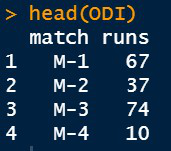
Dataset in use:
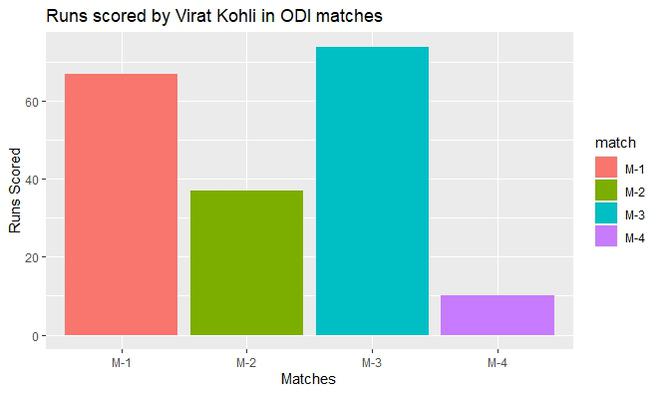
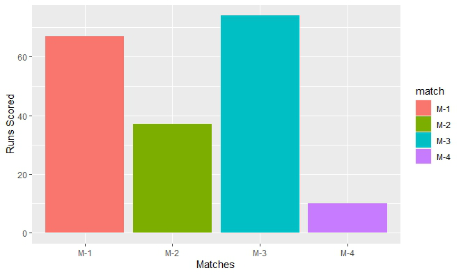
Let us first visualize the graph as it is so that the changes are apparent.
Example:
R
ODI <- data.frame(match=c("M-1","M-2","M-3","M-4"),
runs=c(67,37,74,10))
head(ODI)
library(ggplot2)
perf <-ggplot(data=ODI, aes(x=match, y=runs,fill=match))+
geom_bar(stat="identity")
perf
|
Output:

Adding axis labels and main title in the plot
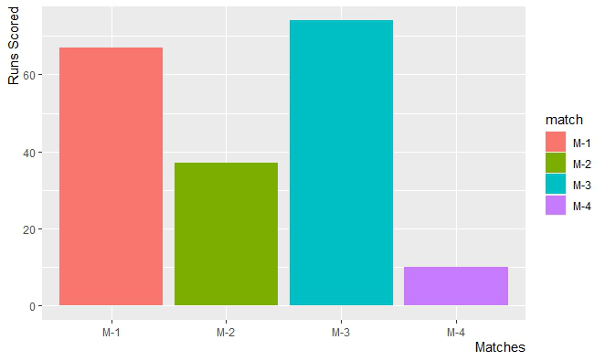
By default, R will use the variables provided in the Data Frame as the labels of the axis. We can modify them and change their appearance easily. The functions which are used to change axis labels are :
- xlab( ) : For the horizontal axis.
- ylab( ) : For the vertical axis.
- labs( ) : For both the axes simultaneously.
- element_text( ) : The arguments of this function are :
Syntax:
element_text( family, face, color, size, hjust, vjust, angle, margin)
- element_blank( ): To make the labels NULL and remove them from the plot.
The argument hjust (Horizontal Adjust) or vjust (Vertical Adjust) is used to move the axis labels. They take numbers in range [0,1] where :
hjust = 0 // Depicts left most corner of the axis
hjust = 0.5 // Depicts middle of the axis
hjust = 1 // Depicts right most corner of the axis
The keywords used are :
- title : To add plot label.
- subtitle : To add subtitle in the plot.
- caption : To add caption in the plot.
- axis.title.x : For horizontal axis.
- axis.title.y : For vertical axis.
Example:
R
library(ggplot2)
ODI <- data.frame(match=c("M-1","M-2","M-3","M-4"),
runs=c(67,37,74,10))
perf <-ggplot(data=ODI, aes(x=match, y=runs,fill=match))+
geom_bar(stat="identity")
perf
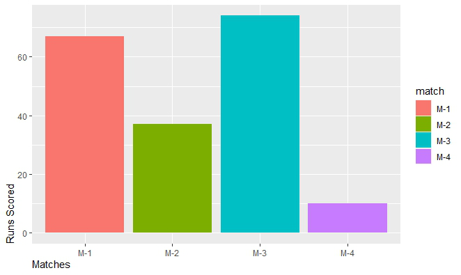
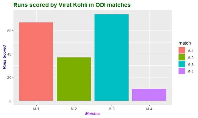
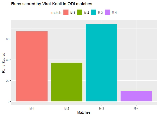
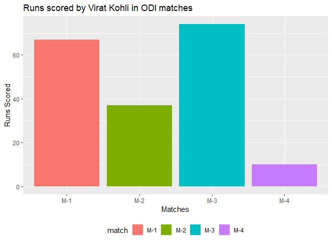
ggp<-perf+labs(x="Matches",y="Runs Scored",
title="Runs scored by Virat Kohli in ODI matches")
ggp
|
Output:
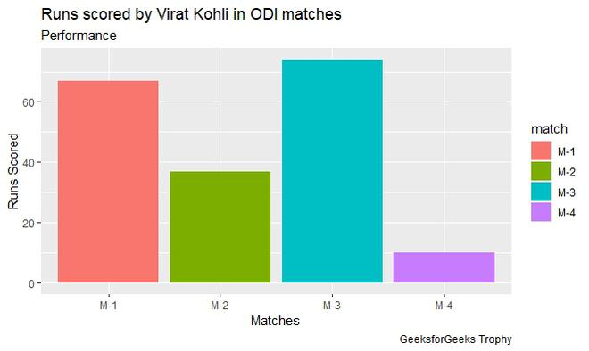
A subtitle can also be included with the main title using labs() function and passing subtitle argument with the required subtitle.
Example:
R
library(ggplot2)
ODI <- data.frame(match=c("M-1","M-2","M-3","M-4"),
runs=c(67,37,74,10))
perf <-ggplot(data=ODI, aes(x=match, y=runs,fill=match))+
geom_bar(stat="identity")
perf
ggp<-perf+labs(x="Matches",y="Runs Scored",
title="Runs scored by Virat Kohli in ODI matches")
ggp
ggp+labs(subtitle="Performance",caption="GeeksforGeeks Trophy")
|
Output:
To move axis labels hjust argument is set according to the requirement.
Example:
R
library(ggplot2)
ODI <- data.frame(match=c("M-1","M-2","M-3","M-4"),
runs=c(67,37,74,10))
perf <-ggplot(data=ODI, aes(x=match, y=runs,fill=match))+
geom_bar(stat="identity")
perf
ggp<-perf+labs(x="Matches",y="Runs Scored",
title="Runs scored by Virat Kohli in ODI matches")
ggp
ggp + theme(
axis.title.x = element_text(hjust=0),
axis.title.y = element_text(hjust=0)
)
ggp + theme(
axis.title.x = element_text(hjust=0.5),
axis.title.y = element_text(hjust=0.5)
)
ggp + theme(
axis.title.x = element_text(hjust=1),
axis.title.y = element_text(hjust=1)
)
|
Output:
Formatting appearance of axis labels and main title of the plot
Axis labels and main titles can be changed to reflect the desired appearance. For this element_text() function is passed with the required attributes.
Example:
R
library(ggplot2)
ODI <- data.frame(match=c("M-1","M-2","M-3","M-4"),
runs=c(67,37,74,10))
perf <-ggplot(data=ODI, aes(x=match, y=runs,fill=match))+
geom_bar(stat="identity")
perf
ggp<-perf+labs(x="Matches",y="Runs Scored",
title="Runs scored by Virat Kohli in ODI matches")
ggp + theme(plot.title = element_text(
colour="#006000", size=14,face="bold"),
axis.title.x = element_text(
colour="Purple",size=10,face="bold.italic"),
axis.title.y = element_text(
colour="DarkBlue",size=10,face="bold.italic")
)
|
Output:
Removing the axis labels and plot the title
For this theme() function is called with reference to which part of the plot has to be modified. To these references, pass element_blank() without any argument.
Example:
R
library(ggplot2)
ODI <- data.frame(match=c("M-1","M-2","M-3","M-4"),
runs=c(67,37,74,10))
perf <-ggplot(data=ODI, aes(x=match, y=runs,fill=match))+
geom_bar(stat="identity")
perf
ggp<-perf+labs(x="Matches",y="Runs Scored",
title="Runs scored by Virat Kohli in ODI matches")
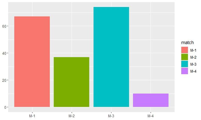
ggp + theme(plot.title = element_blank(),
axis.title.x = element_blank(),
axis.title.y = element_blank()
)
|
Output:
Changing the Position of the legends
To change the position of the legend theme() function is called with legend.position as argument and to this argument, a required position is passed.
Syntax:
theme( legend.position = “Pos”)
Parameter:
Pos : Left, Right, Top, Bottom.
Example:
R
library(ggplot2)
ODI <- data.frame(match=c("M-1","M-2","M-3","M-4"),
runs=c(67,37,74,10))
perf <-ggplot(data=ODI, aes(x=match, y=runs,fill=match))+
geom_bar(stat="identity")
perf
ggp<-perf+labs(x="Matches",y="Runs Scored",
title="Runs scored by Virat Kohli in ODI matches")
ggp + theme(legend.position="top")
|
Output:
Example:
R
library(ggplot2)
ODI <- data.frame(match=c("M-1","M-2","M-3","M-4"),
runs=c(67,37,74,10))
perf <-ggplot(data=ODI, aes(x=match, y=runs,fill=match))+
geom_bar(stat="identity")
perf
ggp<-perf+labs(x="Matches",y="Runs Scored",
title="Runs scored by Virat Kohli in ODI matches")
ggp + theme(legend.position="bottom")
|
Output:
Like Article
Suggest improvement
Share your thoughts in the comments
Please Login to comment...