ML | Implementation of KNN classifier using Sklearn
Last Updated :
28 Nov, 2019
Prerequisite: K-Nearest Neighbours Algorithm
K-Nearest Neighbors is one of the most basic yet essential classification algorithms in Machine Learning. It belongs to the supervised learning domain and finds intense application in pattern recognition, data mining and intrusion detection. It is widely disposable in real-life scenarios since it is non-parametric, meaning, it does not make any underlying assumptions about the distribution of data (as opposed to other algorithms such as GMM, which assume a Gaussian distribution of the given data).
This article will demonstrate how to implement the K-Nearest neighbors classifier algorithm using Sklearn library of Python.
Step 1: Importing the required Libraries
import numpy as np
import pandas as pd
from sklearn.model_selection import train_test_split
from sklearn.neighbors import KNeighborsClassifier
import matplotlib.pyplot as plt
import seaborn as sns
|
Step 2: Reading the Dataset
cd C:\Users\Dev\Desktop\Kaggle\Breast_Cancer
df = pd.read_csv('data.csv')
y = df['diagnosis']
X = df.drop('diagnosis', axis = 1)
X = X.drop('Unnamed: 32', axis = 1)
X = X.drop('id', axis = 1)
X_train, X_test, y_train, y_test = train_test_split(
X, y, test_size = 0.3, random_state = 0)
|
Step 3: Training the model
K = []
training = []
test = []
scores = {}
for k in range(2, 21):
clf = KNeighborsClassifier(n_neighbors = k)
clf.fit(X_train, y_train)
training_score = clf.score(X_train, y_train)
test_score = clf.score(X_test, y_test)
K.append(k)
training.append(training_score)
test.append(test_score)
scores[k] = [training_score, test_score]
|
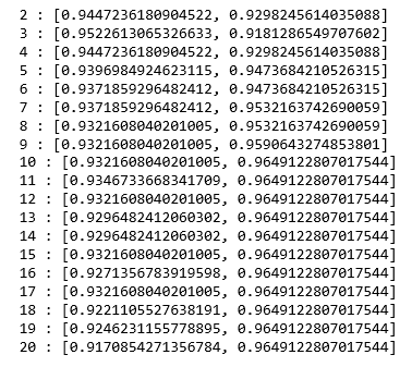
Step 4: Evaluating the model
for keys, values in scores.items():
print(keys, ':', values)
|
We now try to find the optimum value for ‘k’ ie the number of nearest neighbors.
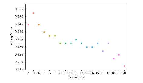
Step 5: Plotting the training and test scores graph
ax = sns.stripplot(K, training);
ax.set(xlabel ='values of k', ylabel ='Training Score')
plt.show()
|
ax = sns.stripplot(K, test);
ax.set(xlabel ='values of k', ylabel ='Test Score')
plt.show()
|

plt.scatter(K, training, color ='k')
plt.scatter(K, test, color ='g')
plt.show()
|
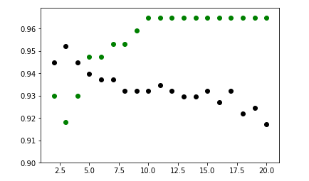
From the above scatter plot, we can come to the conclusion that the optimum value of k will be around 5.
Like Article
Suggest improvement
Share your thoughts in the comments
Please Login to comment...