Microsoft Azure – Customizing Charts on Azure Dashboard
Last Updated :
30 Mar, 2023
in this article, we will look into how to customize and pin charts to your Azure dashboard. There are so many ways that we could customize a dashboard inside my Azure portal. Not only can we drag resources around, but we can actually pin charts onto the dashboard itself.
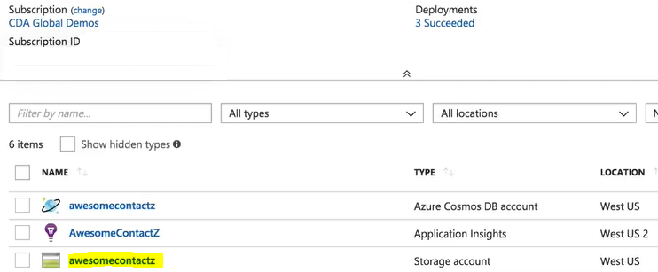
So, we are going to go into one of our resource groups, and we are going to select the below-shown applications:
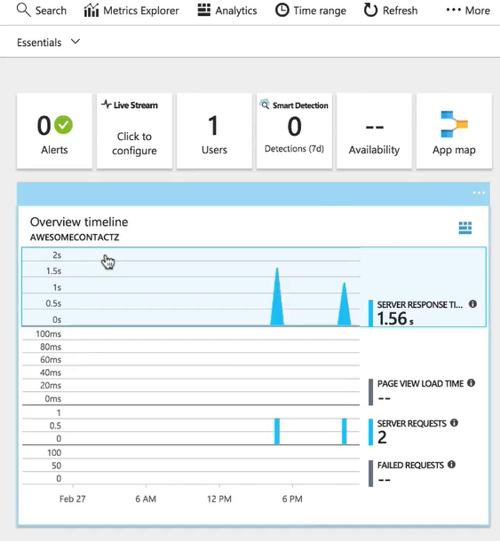
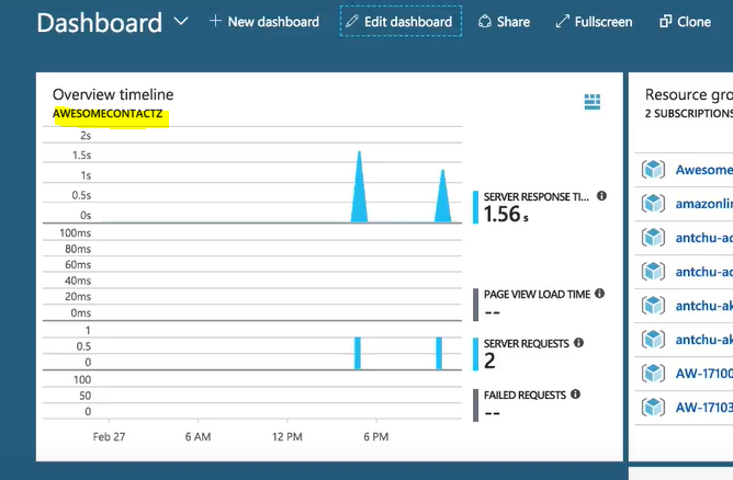
It has some charts in it which are really important to us. It has the overview timeline chart that is showing us some server responses and page load times.
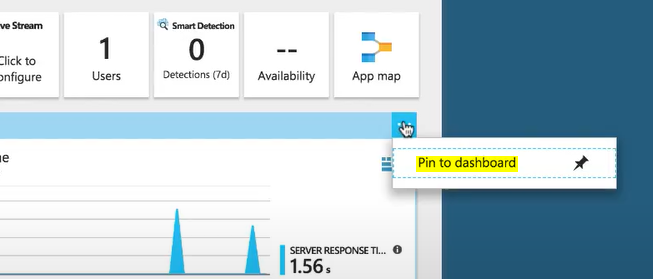
Now, let’s say we want to see this chart every time we come into the portal. We want to click on this icon shown below on the right, and then we are going to hit “Pin to dashboard”.
Now, our chart has been pinned to the dashboard. We are going to hit “G + D”, our shortcut key to go back to the dashboard. Now, you see our overview timeline is here in front.
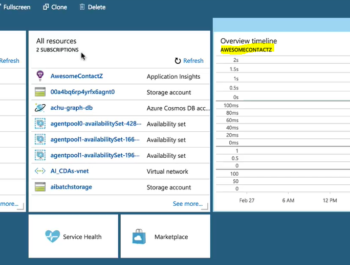
Now, we want to drag this over because we want this to be front and center. So, we are going to have this be like the first thing that we see when we come into my dashboard.
Now, every time we log into the portal, this information is going to be the first thing we see, so we can monitor and know what’s actually happening with our application.
Like Article
Suggest improvement
Share your thoughts in the comments
Please Login to comment...