Matplotlib.pyplot.xlim() in Python
Last Updated :
13 Mar, 2024
Matplotlib is a library in Python and it is numerical – mathematical extension for NumPy library. Pyplot is a state-based interface to a Matplotlib module which provides a MATLAB-like interface. There are various plots which can be used in Pyplot are Line Plot, Contour, Histogram, Scatter, 3D Plot, etc.
#Sample Code
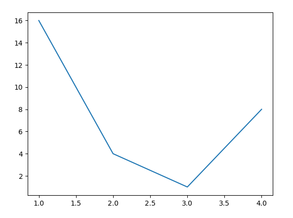
import matplotlib.pyplot as plt
plt.plot([1, 2, 3, 4], [16, 4, 1, 8])
plt.show()
|
Output:
matplotlib.pyplot.xlim() Function
The xlim() function in pyplot module of matplotlib library is used to get or set the x-limits of the current axes.
Syntax:
matplotlib.pyplot.xlim(*args, **kwargs)
Parameters: This method accept the following parameters that are described below:
- left: This parameter is used to set the xlim to left.
- right: This parameter is used to set the xlim to right.
- **kwargs: The **kwargs parameter in Python functions stands for “keyword arguments”. It allows you to pass a variable number of keyword arguments to a function.
Returns: This returns the following:
- left, right: This returns the tuple of the new x-axis limits.
Below examples illustrate the matplotlib.pyplot.ylim() function in matplotlib.pyplot:
Example-1:
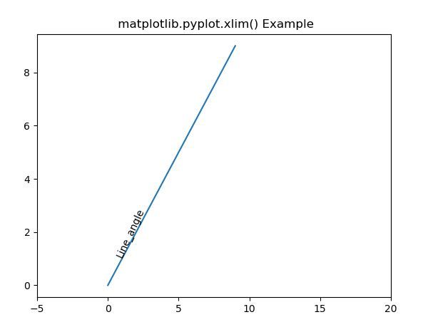
import matplotlib.pyplot as plt
import numpy as np
h = plt.plot(np.arange(0, 10), np.arange(0, 10))
plt.xlim([-5, 20])
l1 = np.array((1, 1))
angle = 65
th1 = plt.text(l1[0], l1[1], 'Line_angle',
fontsize = 10, rotation = angle,
rotation_mode ='anchor')
plt.title(" matplotlib.pyplot.xlim() Example")
plt.show()
|
Output:
Example-2:
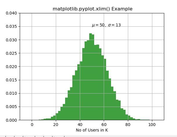
import matplotlib.pyplot as plt
import numpy as np
np.random.seed(9680801)
mu, sigma = 50, 13
x = mu + sigma * np.random.randn(10000)
n, bins, patches = plt.hist(x, 50,
density = True,
facecolor ='g',
alpha = 0.75)
plt.xlabel('No of Users in K')
plt.title('Histogram of IQ')
plt.text(50, .035, r'$\mu = 50, \
\ \sigma = 13$')
plt.xlim(-10, 110)
plt.ylim(0, 0.04)
plt.grid(True)
plt.title(" matplotlib.pyplot.xlim() Example")
plt.show()
|
Output:
Like Article
Suggest improvement
Share your thoughts in the comments
Please Login to comment...