Matplotlib.pyplot.plot_date() function in Python
Last Updated :
09 Jan, 2024
Matplotlib is a module package or library in Python which is used for data visualization. Pyplot is an interface to a Matplotlib module that provides a MATLAB-like interface. The matplotlib.pyplot.plot_date() function is like the regular plot() function, but it’s tailored for showing data over dates. Think of it as a handy tool for visualizing events or values that happen over time, making your time-related charts look sharp and clear.
Matplotlib.pyplot.plot_date() function Syntax
This function is used to add dates to the plot. Below is the syntax by which we can plot datetime on the x-axis Matplotlib.
Syntax: matplotlib.pyplot.plot_date(x, y, fmt=’o’, tz=None, xdate=True, ydate=False, data=None, **kwargs)
Parameters:
- x, y: x and y both are the coordinates of the data i.e. x-axis horizontally and y-axis vertically.
- fmt: It is a optional string parameter that contains the corresponding plot details like color, style etc.
- tz: tz stands for timezone used to label dates, default(UTC).
- xdate: xdate parameter contains boolean value. If xdate is true then x-axis is interpreted as date in matplotlib. By default xdate is true.
- ydate: If ydate is true then y-axis is interpreted as date in matplotlib. By default ydate is false.
- data: The data which is going to be used in plot.
The last parameter **kwargs is the Keyword arguments control the Line2D properties like animation, dash_ joint-style, colors, linewidth, linestyle, marker, etc.
Matplotlib.pyplot.plot_date() function Examples
Below are the examples by which we can see how to plot datetime on x axis matplotlib in Python:
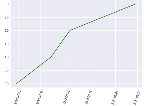
Plotting a Date Series Using Matplotlib
In this example, dates are plotted against a numeric sequence using the matplotlib.pyplot.plot_date() function, with green markers, and the x-axis date labels are rotated for better visibility.
Python3
import matplotlib.pyplot as plt
from datetime import datetime
dates = [
datetime(2020, 6, 30),
datetime(2020, 7, 22),
datetime(2020, 8, 3),
datetime(2020, 9, 14)
]
x = [0, 1, 2, 3]
plt.plot_date(dates, x, 'g')
plt.xticks(rotation=70)
plt.show()
|
Output:
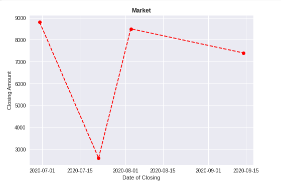
Creating a Plot Using Dataset
In this example, a Pandas DataFrame is used to store and plot market closing prices against dates. The plotted graph showcases closing amounts with red dashed lines.
Python3
import pandas as pd
import matplotlib.pyplot as plt
from datetime import datetime
data = pd.DataFrame({'Date': [datetime(2020, 6, 30),
datetime(2020, 7, 22),
datetime(2020, 8, 3),
datetime(2020, 9, 14)],
'Close': [8800, 2600, 8500, 7400]})
price_date = data['Date']
price_close = data['Close']
plt.plot_date(price_date, price_close, linestyle='--', color='r')
plt.title('Market', fontweight="bold")
plt.xlabel('Date of Closing')
plt.ylabel('Closing Amount')
plt.show()
|
Output:
Customizing Date Formatting in a Market Closing Price Plot
In this example, after plotting market closing prices against dates, the date format is customized using the dateformatter class to display dates in the format ‘DD-MM-YYYY’.
Python3
import pandas as pd
import matplotlib.pyplot as plt
from datetime import datetime
data = pd.DataFrame({'Date': [datetime(2020, 6, 30),
datetime(2020, 7, 22),
datetime(2020, 8, 3),
datetime(2020, 9, 14)],
'Close': [8800, 2600, 8500, 7400]})
price_date = data['Date']
price_close = data['Close']
plt.plot_date(price_date, price_close, linestyle='--', color='r')
plt.title('Market', fontweight="bold")
plt.xlabel('Date of Closing')
plt.ylabel('Closing Amount')
format_date = mpl_dates.DateFormatter('%d-%m-%Y')
plt.gca().xaxis.set_major_formatter(format_date)
plt.show()
|
Output:
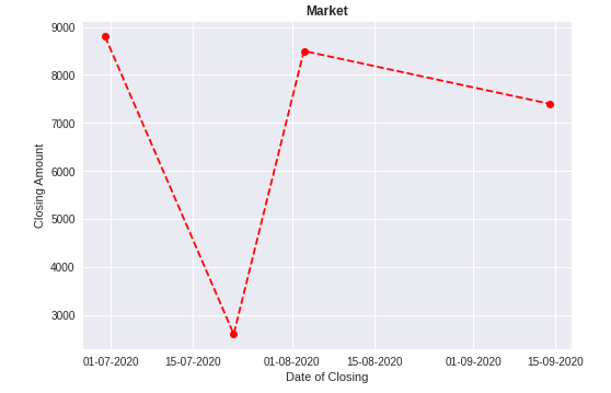
The format of the date changed to dd-mm-yyyy. To know more about dataformatter and gca() click here.
Like Article
Suggest improvement
Share your thoughts in the comments
Please Login to comment...