Matplotlib.pyplot.pcolor() function in Python
Last Updated :
25 Nov, 2020
Matplotlib is the well-known Python package used in data visualization. Numpy is the numerical mathematics extension of Matplotlib. Matplotlib is capable of producing high-quality graphs, charts, and figures. Matplotlib produces object-oriented API for embedding plots into projects using GUI toolkits like Tkinter, wxPython, or Qt. John D. Hunter was the original developer of Matplotlib and it is distributed under a BSD-style license.
matplotlib.pyplot.pcolor()
Matplotlib contains a wide range of functions that help in performing different tasks, one of them is matplotlib.pyplot.pcolor() function. The pcolor() function in the pyplot module of the Matplotlib library helps to create a pseudo-color plot with a non-regular rectangular grid.
Syntax: matplotlib.pyplot.pcolor(*args, alpha=None, norm=None, cmap=None, vmin=None, vmax=None, data=None, **kwargs)
Call Signature: pcolor([X, Y,] C, **kwargs)
Parameters:
C: Denotes a scaler 2-D array
X, Y: array_like, optional, coordinates of quadrilateral corners
cmap: str or Colormap, optional
norm: Normalize, optional
vmin, vmax: scaler, optional
edgecolors: {‘none’, None, ‘face’, color sequence}, optional
alpha: scaler, optional
snap: bool, optional
Other Parameters:
antialiaseds: bool, optional
**kwargs
Returns: The function returns a collection i.e matplotlib.collections.Collection
Note: In case of larger arrays, matplotlib.pyplot.pcolor() works very slow.
Below examples demonstrate the working of matplotlib.pyplot.pcolor() function:
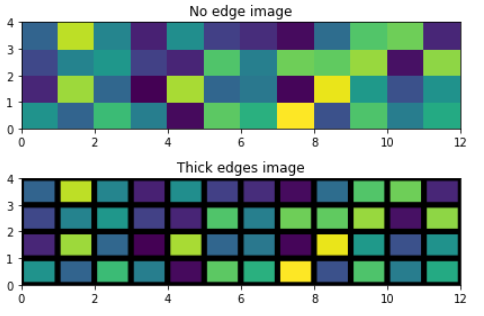
Example 1: Generating images using pcolor() function
With the help of pcolor() function, we can generate 2-D image-style plots, as shown below
Python3
import matplotlib.pyplot as plt
import numpy as np
from matplotlib.colors import LogNorm
Z = np.random.rand(4, 12)
fig, (ax0, ax1) = plt.subplots(2, 1)
c = ax0.pcolor(Z)
ax0.set_title('No edge image')
c = ax1.pcolor(Z, edgecolors='k', linewidths=5)
ax1.set_title('Thick edges image')
fig.tight_layout()
plt.show()
|
Output:
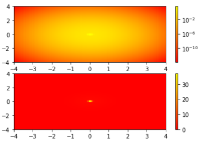
Example 2: Working of pcolor() with Log scale
Python3
import matplotlib.pyplot as plt
import numpy as np
from matplotlib.colors import LogNorm
N = 100
X, Y = np.mgrid[-4:4:complex(0, N), -4:4:complex(0, N)]
Z1 = np.exp(-(X)**2 - (Y)**2)
Z2 = np.exp(-(X * 10)**2 - (Y * 10)**2)
Z = Z1 + 50 * Z2
fig, (ax0, ax1) = plt.subplots(2, 1)
c = ax0.pcolor(X, Y, Z,norm=LogNorm(vmin=Z.min(), vmax=Z.max()), cmap=plt.cm.autumn)
fig.colorbar(c, ax=ax0)
c = ax1.pcolor(X, Y, Z, cmap=plt.cm.autumn)
fig.colorbar(c, ax=ax1)
plt.show()
|
Output:
Like Article
Suggest improvement
Share your thoughts in the comments
Please Login to comment...