Matplotlib.pyplot.colors() in Python
Last Updated :
09 Jan, 2024
In Python, we can plot graphs for visualization using the Matplotlib library. For integrating plots into applications, Matplotlib provides an API. Matplotlib has a module named pyplot which provides a MATLAB-like interface.
Matplotlib Add Color
This function is used to specify the color. It is a do-nothing function.
| ‘b’ |
Blue |
| ‘r’ |
Red |
| ‘g’ |
Green |
| ‘c’ |
Cyan |
| ‘m’ |
Magenta |
| ‘y’ |
Yellow |
| ‘k’ |
Black |
| ‘w’ |
White |
We can use this function for various data visualizations and obtain insights from them.
Matplotlib.pyplot.colors() Examples
Below are some examples by which we can add color in Matplotlib.
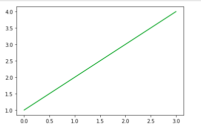
Examples 1: Plotting a Simple Line with Matplotlib Colors
In this example, a line plot is created using Matplotlib, with data points [1, 2, 3, 4]. The line color is specified as ‘green’.
Python3
import matplotlib.pyplot as plt
color = 'green'
plt.plot([1, 2, 3, 4], color=color)
plt.show()
|
Output:
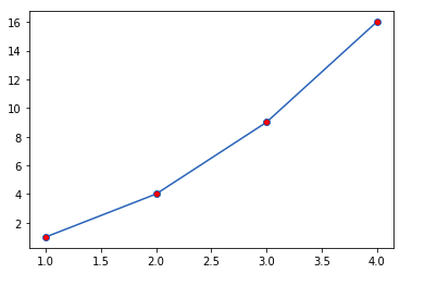
Example 2: Plotting Data Points with Red Circular Markers
In this example, a line plot is generated using Matplotlib with data points at coordinates [1, 1], [2, 4], [3, 9], [4, 16]. The points are marked with red circular markers (marker='o'). Here, marker=’o’ represents circle while markerfacecolor is used for specifying color of the point marker.
Note: This function has been deprecated since version 2.1.
Python3
import matplotlib.pyplot as plt
x = [1, 2, 3, 4]
y = [1, 4, 9, 16]
plt.plot(x, y, marker='o', markerfacecolor='r')
plt.show()
|
Output:
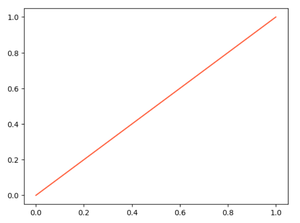
Example 3: Plotting a Line with a Hexadecimal Color
In this example, a line plot is created in Matplotlib, extending from (0, 0) to (1, 1). The line color is defined using the hexadecimal code '#FF5733', representing a shade of orange-red.
Python3
import matplotlib.pyplot as plt
plt.plot([0, 1], [0, 1], color='#FF5733')
plt.show()
|
Output:
Example 4: Plotting a Line with an RGBA Color
In this example, a line plot is rendered using Matplotlib, spanning from (0, 0) to (1, 1). The line color is set using RGBA values (0.1, 0.2, 0.5, 0.5), producing a semi-transparent bluish hue for the line.
Python3
import matplotlib.pyplot as plt
plt.plot([0, 1], [0, 1], color=(0.1, 0.2, 0.5, 0.5))
plt.show()
|
Output:

Like Article
Suggest improvement
Share your thoughts in the comments
Please Login to comment...