Matplotlib.dates.DateFormatter class in Python
Last Updated :
21 Apr, 2020
Matplotlib is an amazing visualization library in Python for 2D plots of arrays. Matplotlib is a multi-platform data visualization library built on NumPy arrays and designed to work with the broader SciPy stack.
Matplotlib.dates.DateFormatter
The matplotlib.dates.DateFormatter class is used to format a tick (in seconds since the epoch) with a string of strftime format. Its base class is matplotlib.ticker.Formatter.
Syntax: class matplotlib.dates.DateFormatter(fmt, tz=None)
Parameters:
- fmt: It accepts a strftime format string for formatting and is a required argument.
- tz: It holds information regarding the timezone. If set to none it ignores the timezone information while formatting of the date string.
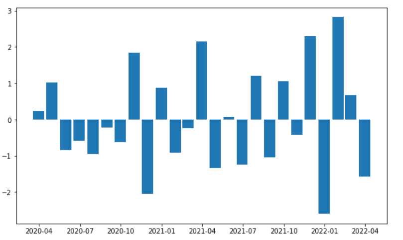
Example 1:
import numpy
import matplotlib.pyplot as plt
import matplotlib.dates as mdates
import pandas
total_bars = 25
numpy.random.seed(total_bars)
dates = pandas.date_range('3/4/2020',
periods=total_bars,
freq='m')
diff = pandas.DataFrame(
data=numpy.random.randn(total_bars),
index=dates,
columns=['A']
)
figure, axes = plt.subplots(figsize=(10, 6))
axes.xaxis.set_major_formatter(mdates.DateFormatter('%Y-%m'))
axes.bar(diff.index,
diff['A'],
width=25,
align='center')
|
Output:
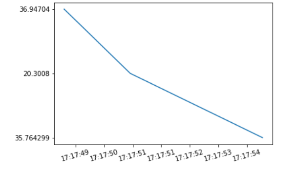
Example 2:
import matplotlib
import matplotlib.pyplot as plt
from datetime import datetime
origin = ['2020-02-05 17:17:55',
'2020-02-05 17:17:51',
'2020-02-05 17:17:49']
a = [datetime.strptime(d, '%Y-%m-%d %H:%M:%S') for d in origin]
b = ['35.764299', '20.3008', '36.94704']
x = matplotlib.dates.date2num(a)
formatter = matplotlib.dates.DateFormatter('%H:%M:%S')
figure = plt.figure()
axes = figure.add_subplot(1, 1, 1)
axes.xaxis.set_major_formatter(formatter)
plt.setp(axes.get_xticklabels(), rotation = 15)
axes.plot(x, b)
plt.show()
|
Output:
Share your thoughts in the comments
Please Login to comment...