Matplotlib – Axes Class
Last Updated :
27 May, 2020
Matplotlib is one of the Python packages which is used for data visualization. You can use the NumPy library to convert data into an array and numerical mathematics extension of Python. Matplotlib library is used for making 2D plots from data in arrays.
Axes class
Axes is the most basic and flexible unit for creating sub-plots. Axes allow placement of plots at any location in the figure. A given figure can contain many axes, but a given axes object can only be in one figure. The axes contain two axis objects 2D as well as, three-axis objects in the case of 3D. Let’s look at some basic functions of this class.
axes() function
axes() function creates axes object with argument, where argument is a list of 4 elements [left, bottom, width, height]. Let us now take a brief look to understand the axes() function.
Syntax :
axes([left, bottom, width, height])
Example:
import matplotlib.pyplot as plt
fig = plt.figure()
ax = plt.axes([0.1, 0.1, 0.8, 0.8])
|
Output:
Here in axes([0.1, 0.1, 0.8, 0.8]), the first ‘0.1’ refers to the distance between the left side axis and border of the figure window is 10%, of the total width of the figure window. The second ‘0.1’ refers to the distance between the bottom side axis and the border of the figure window is 10%, of the total height of the figure window. The first ‘0.8’ means the axes width from left to right is 80% and the latter ‘0.8’ means the axes height from the bottom to the top is 80%.
add_axes() function
Alternatively, you can also add the axes object to the figure by calling the add_axes() method. It returns the axes object and adds axes at position [left, bottom, width, height] where all quantities are in fractions of figure width and height.
Syntax :
add_axes([left, bottom, width, height])
Example :
import matplotlib.pyplot as plt
fig = plt.figure()
ax = fig.add_axes([0, 0, 1, 1])
|
Output:
ax.legend() function
Adding legend to the plot figure can be done by calling the legend() function of the axes class. It consists of three arguments.
Syntax :
ax.legend(handles, labels, loc)
Where labels refers to a sequence of string and handles, a sequence of Line2D or Patch instances, loc can be a string or an integer specifying the location of legend.
Example :
import matplotlib.pyplot as plt
fig = plt.figure()
ax = plt.axes([0.1, 0.1, 0.8, 0.8])
ax.legend(labels = ('label1', 'label2'),
loc = 'upper left')
|
Output:
ax.plot() function
plot() function of the axes class plots the values of one array versus another as line or marker.
Syntax : plt.plot(X, Y, ‘CLM’)
Parameters:
X is x-axis.
Y is y-axis.
‘CLM’ stands for Color, Line and Marker.
Note: Line can be of different styles such as dotted line (':'), dashed line ('—'), solid line ('-') and many more.
Marker codes
| Characters |
Description |
| ‘.’ |
Point Marker |
| ‘o’ |
Circle Marker |
| ‘+’ |
Plus Marker |
| ‘s’ |
Square Marker |
| ‘D’ |
Diamond Marker |
| ‘H’ |
Hexagon Marker |
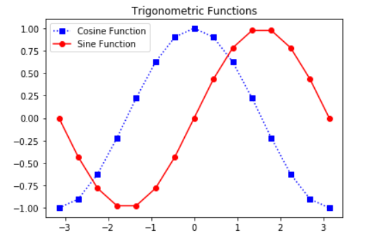
Example: The following example shows the graph of sine and cosine functions.
import matplotlib.pyplot as plt
import numpy as np
X = np.linspace(-np.pi, np.pi, 15)
C = np.cos(X)
S = np.sin(X)
ax = plt.axes([0.1, 0.1, 0.8, 0.8])
ax1 = ax.plot(X, C, 'bs:')
ax2 = ax.plot(X, S, 'ro-')
ax.legend(labels = ('Cosine Function',
'Sine Function'),
loc = 'upper left')
ax.set_title("Trigonometric Functions")
plt.show()
|
Output:
Like Article
Suggest improvement
Share your thoughts in the comments
Please Login to comment...