Matplotlib.axes.Axes.plot() in Python
Last Updated :
12 Apr, 2020
Matplotlib is a library in Python and it is numerical – mathematical extension for NumPy library.
The Axes Class contains most of the figure elements: Axis, Tick, Line2D, Text, Polygon, etc., and sets the coordinate system. And the instances of Axes supports callbacks through a callbacks attribute.
Example:
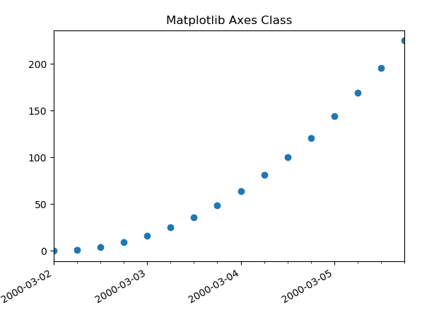
import datetime
import matplotlib.pyplot as plt
from matplotlib.dates import DayLocator, HourLocator, DateFormatter, drange
import numpy as np
date1 = datetime.datetime(2000, 3, 2)
date2 = datetime.datetime(2000, 3, 6)
delta = datetime.timedelta(hours = 6)
dates = drange(date1, date2, delta)
y = np.arange(len(dates))
fig, ax = plt.subplots()
ax.plot_date(dates, y ** 2)
ax.set_xlim(dates[0], dates[-1])
ax.xaxis.set_major_locator(DayLocator())
ax.xaxis.set_minor_locator(HourLocator(range(0, 25, 6)))
ax.xaxis.set_major_formatter(DateFormatter('% Y-% m-% d'))
ax.fmt_xdata = DateFormatter('% Y-% m-% d % H:% M:% S')
fig.autofmt_xdate()
plt.title("Matplotlib Axes Class Example")
plt.show()
|
Output:
matplotlib.axes.Axes.plot() Function
The Axes.plot() function in axes module of matplotlib library is used to plot y versus x as lines and/or markers.
Syntax: Axes.plot(self, *args, scalex=True, scaley=True, data=None, **kwargs)
Parameters: This method accept the following parameters that are described below:
- x, y: These parameter are the horizontal and vertical coordinates of the data points. x values are optional.
- fmt: This parameter is an optional parameter and it contains the string value.
- data: This parameter is an optional parameter and it is an object with labelled data.
Returns: This returns the following:
- lines:This returns the list of Line2D objects representing the plotted data.
Below examples illustrate the matplotlib.axes.Axes.plot() function in matplotlib.axes:
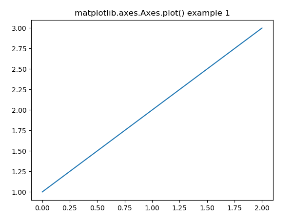
Example #1:
import matplotlib.pyplot as plt
import numpy as np
fig, ax = plt.subplots()
ax.plot([1, 2, 3])
ax.set_title('matplotlib.axes.Axes.plot() example 1')
fig.canvas.draw()
plt.show()
|
Output:
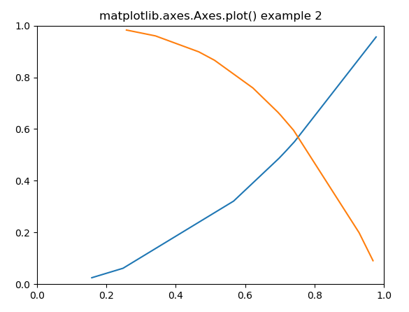
Example #2:
import matplotlib.pyplot as plt
import numpy as np
np.random.seed(19680801)
xdata = np.random.random([2, 10])
xdata1 = xdata[0, :]
xdata2 = xdata[1, :]
xdata1.sort()
xdata2.sort()
ydata1 = xdata1 ** 2
ydata2 = 1 - xdata2 ** 3
fig = plt.figure()
ax = fig.add_subplot(1, 1, 1)
ax.plot(xdata1, ydata1, color ='tab:blue')
ax.plot(xdata2, ydata2, color ='tab:orange')
ax.set_xlim([0, 1])
ax.set_ylim([0, 1])
ax.set_title('matplotlib.axes.Axes.plot() example 2')
plt.show()
|
Output:
Like Article
Suggest improvement
Share your thoughts in the comments
Please Login to comment...