<mat-slider> in Angular Material
Last Updated :
01 Feb, 2021
Angular Material is a UI component library that is developed by the Angular team to build design components for desktop and mobile web applications. In order to install it, we need to have angular installed in our project, once you have it you can enter the below command and can download it. <mat-slider> tag is used whenever there is a need for a slider in our projects.
Installation syntax:
ng add @angular/material
Approach:
- First, install the angular material using the above-mentioned command.
- After completing the installation, Import ‘MatSliderModule’ from ‘@angular/material/slider’ in the app.module.ts file.
- Then use the mat-slider tag to display the slider.
- They are many properties in <mat-slider> which helps us in using it in different scenarios.
- Some important properties are explained in below table.
- If we want to change the theme then we can change it by using the color property. In angular we have 3 themes, they are primary, accent, and warn.
- By default, the accent theme is set.
- Once done with the above steps then serve or start the project.
| Property Name |
Significance |
| invert |
In order to display the slider in an inverted direction. |
| vertical |
In order to display the slider in a vertical direction. |
| disabled |
In order to disable the slider |
Code Implementation:
app.module.ts:
Javascript
import { NgModule } from '@angular/core';
import { BrowserModule } from '@angular/platform-browser';
import { FormsModule } from '@angular/forms';
import { AppComponent } from './app.component';
import { MatSliderModule } from '@angular/material/slider';
@NgModule({
imports:
[ BrowserModule,
FormsModule,
MatSliderModule],
declarations: [ AppComponent ],
bootstrap: [ AppComponent ]
})
export class AppModule { }
|
app.component.html:
HTML
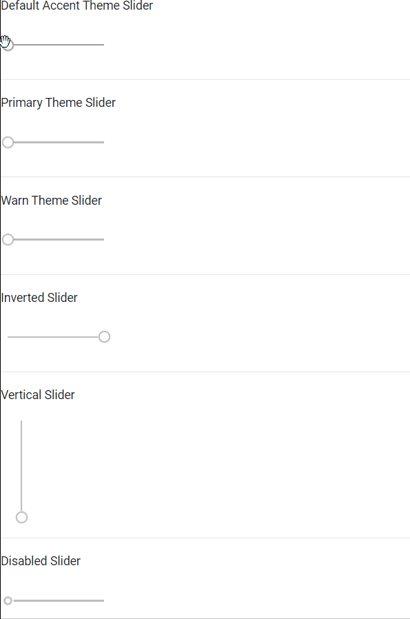
<p>Default Accent Theme Slider</p>
<mat-slider></mat-slider>
<hr>
<p>Primary Theme Slider</p>
<mat-slider color="primary"></mat-slider>
<hr>
<p>Warn Theme Slider</p>
<mat-slider color="warn"></mat-slider>
<hr>
<p>Inverted Slider</p>
<mat-slider invert="true"></mat-slider>
<hr>
<p>Vertical Slider</p>
<mat-slider vertical="true"></mat-slider>
<hr>
<p>Disabled Slider</p>
<mat-slider disabled="true"></mat-slider>
<hr>
|
Output:
Like Article
Suggest improvement
Share your thoughts in the comments
Please Login to comment...