<mat-radio-button> in Angular Material
Last Updated :
06 Oct, 2021
Angular Material is a UI component library that is developed by the Angular team to build design components for desktop and mobile web applications. In order to install it, we need to have angular installed in our project, once you have it you can enter the below command and can download it. <mat-radio-button> is used to select one option when we have multiple options.
Installation syntax:
ng add @angular/material
Approach:
- First, install the angular material using the above-mentioned command.
- After completing the installation, Import ‘MatRadioModule’ from ‘@angular/material/radio’ in the app.module.ts file.
- Then we need to use the <mat-radio-button> tag for displaying the radio button.
- We can also disable the radio button by using the disabled input property.
- If we want to change the theme then we can change it by using the color property. In angular we have 3 themes, they are primary, accent, and warn.
- Once done with the above steps then serve or start the project.
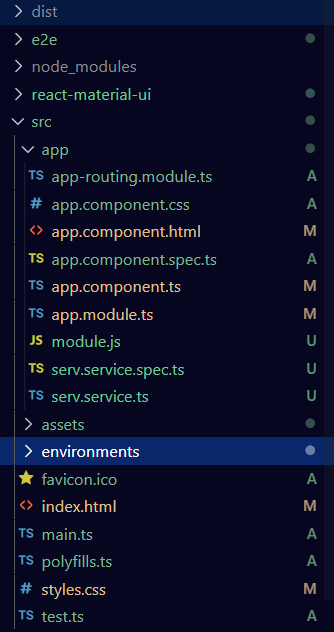
Project Structure: It will look like the following:
Filename: app.module.ts
Javascript
import { NgModule } from '@angular/core';
import { BrowserModule } from '@angular/platform-browser';
import { FormsModule } from '@angular/forms';
import { MatRadioModule } from '@angular/material/radio';
import { AppComponent } from './app.component';
import { BrowserAnimationsModule } from '@angular/platform-browser/animations';
@NgModule({
imports:
[
BrowserModule,
FormsModule,
MatRadioModule,
BrowserAnimationsModule
],
declarations: [ AppComponent ],
bootstrap: [ AppComponent ]
})
export class AppModule { }
|
Filename: app.component.html
HTML
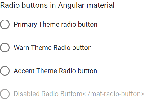
<h3> Radio buttons in Angular material </h3>
<mat-radio-button value="1" color="primary">
Primary Theme radio button
</mat-radio-button><br><br>
<mat-radio-button value="2" color="warn">
Warn Theme Radio button
</mat-radio-button><br><br>
<mat-radio-button value="3" color="accent">
Accent Theme Radio button
</mat-radio-button>
<br>
<br>
<mat-radio-button value="4" color="accent" disabled>
Disabled Radio Button
</mat-radio-button>
|
Output:
Like Article
Suggest improvement
Share your thoughts in the comments
Please Login to comment...