Introduction to Visual Formatting Model
Last Updated :
03 Aug, 2022
In this article, we will see Visual Formatting Model, i.e. knowing how the document tree is processed by the user agent & get rendered & visualize to the various media. We will understand the topic through the illustrations.
The Visual Formatting Model illustrates the how the document tree is taken by the user agent that is being processed & rendered the processed document tree to the various visual media. In other words, it checks whether everything on the webpage is placed correctly or not, that ensures the layout of the page must be displayed correctly. To render the page, the browser uses this model. This works on the algorithm which calculates and uses a bunch of stuff like the box model, floats, and positioning to render the page most suitably. The visual media can be continuous media or paged media that is utilized to display the required data to the particular medium. Each element generates either zero or more boxes in the document, according to the Box Model. The work of the Visual Formatting Model starts when the browser already parses the HTML and CSS and we have the render tree. The layout of these boxes depends on the following:
- Box dimensions and type
- Positioning scheme (normal flow, float, and absolute positioning)
- Relationships between elements in the document tree
- External information (e.g., viewport size, intrinsic dimensions of images, etc.)
Viewport: It defines the visible area for the particular Browser window in the continuous media, i.e., the viewing area will vary with change of the device-layout & accordingly, the viewport of the page will also changes. The change in viewport includes the resizing the window, or change the orientation of a mobile device. If the size of document is larger than the viewport then the user may get the scrollbar to the browser, that will displays the remaining part of the document. The scrollbar may be included either vertically in a horizontal, or from top-to-bottom.
Box Generation: It indicates the part of the visual formatting model that helps to generate the boxes of different types for the elements in the document, which affects the visual formatting & it depends upon CSS display property‘s value. A CSS source document is rendered onto a canvas using the intermediary structure, called the box tree, which represents the formatting structure of the rendered document. This Box tree, in turn, represents the corresponding element(or pseudo-element) on the canvas, while each text runs indicates the content of their respective text nodes.
The Box Generation comparises of the following categories:
- Principal box: It is the one of the box generated by an element, which contains its descendant boxes in the box tree & also the box involved in a positioning scheme. In addition to the principal box, some elements may generate an additional boxes(such as display: list-item,which generate principal block box & a child marker box.
- Anonymous box: When there is no HTML element that can be used for the box then the Anonymous box will be generated. It generally happens when, for instance, we declare display:flex property on a parent element, & directly inside, that element, there is a run of text not contained in another element. To fix the issue, an anonymous box will be created, surrounding that run of text, which is then behaves similar to the flex item. Although, there is no element to target, that is targeted & styled similar to a regular box.
- Line box: It indicates the box that wrap each line of text.
Positioning schemes of an element: There are 3 positioning schemes that box offers in CSS, i.e., normal flow, floats, or absolute positioning.
- Normal flow: It includes the block-level formatting of block boxes, inline-level formatting of inline boxes, along with having the relative and sticky positioning of block-level and inline-level boxes.
- Floats: In this type of model, the box is initially aligned according to the normal flow, then removed from it & positioned, typically left-to-right, along with their contents.
- Absolute positioning: The Absolute positioning model( & fixed positioning) removes the box from the normal flow entirely & assigns it a position within a containing block.
Example 1: Suppose you designed the below webpage, all the layout-related stuff like box-sizing, box positioning, viewport, etc. are determined by the Visual Formatting Model.
HTML
<!DOCTYPE html>
<html lang="en">
<head>
<meta charset="UTF-8" />
<title>Visual Formatting Model</title>
<link rel="preconnect" href=
<link href=
rel="stylesheet" />
<style>
body {
font-family: 'Open Sans', sans-serif;
margin: 0;
background-color: rgb(0, 0, 0);
}
a {
text-decoration: none;
}
#main-header {
height: 5rem;
display: flex;
justify-content: space-between;
align-items: center;
background-color: rgb(255, 254, 253);
padding: 0 5%;
}
#logo {
font-size: 1.5rem;
font-weight: bold;
color: rgb(40, 149, 23);
}
main h1 {
text-align: center;
color: rgb(40, 149, 23);
font-size: 3rem;
}
#latest-products {
width: 80%;
margin: 2rem auto;
}
#latest-products ul {
list-style: none;
margin: 0;
padding: 0;
display: grid;
grid-template-columns: 1fr 1fr;
gap: 1rem;
}
.item {
background-color: rgb(228, 206, 182);
border-radius: 6px;
overflow: hidden;
}
.item img {
height: 22rem;
width: 100%;
object-fit: cover;
}
.item-content {
padding: 1rem;
text-align: center;
}
.item h2 {
margin: 0 0 1rem 0;
}
@media (max-width: 48rem) {
#latest-products ul {
grid-template-columns: 100%;
}
main h1 {
font-size: 1.5rem;
}
}
</style>
</head>
<body>
<header id="main-header">
<a href="index.html" id="logo">
GeeksforGeeks
</a>
</header>
<main>
<h1>GeeksforGeeks Article</h1>
<section id="latest-products">
<ul>
<li class="item">
<article>
<img src=
<div class="item-content">
<h2>GeeksforGeeks</h2>
</div>
</article>
</li>
<li class="item">
<article>
<img src=
<div class="item-content">
<h2>GeeksforGeeks</h2>
</div>
</article>
</li>
</ul>
</section>
</main>
</body>
</html>
|
Output:
Example 2: The browser considers the elements of the webpage as boxes and places them accordingly, that is liistrated through the below example.
HTML
<!DOCTYPE html>
<html lang="en">
<head>
<meta charset="UTF-8" />
<title>Visual Formatting Model</title>
<style>
* {
margin: 0;
box-sizing: border-box;
}
body {
height: 100vh;
width: 100vw;
display: flex;
justify-content: space-evenly;
align-items: center;
}
h1 {
color: green;
position: fixed;
top: 0;
left: 0;
padding: 22px;
}
.box {
border: 2px solid rgb(0, 0, 0);
padding: 50px;
}
.parent-box {
width: 500px;
height: 600px;
display: flex;
flex-direction: column;
justify-content: space-evenly;
border: 2px solid rgb(0, 0, 0);
padding: 50px;
}
#big-box {
height: 400px;
width: 400px;
background-color: rgb(140, 68, 68);
}
#div-1 {
position: relative;
left: 250px;
height: 150px;
width: 150px;
background-color: black;
}
#div-2 {
position: relative;
left: 125px;
height: 150px;
width: 150px;
background-color: rgb(51, 141, 10);
}
#div-3 {
height: 150px;
width: 150px;
background-color: rgb(255, 0, 0);
}
</style>
</head>
<body>
<h1>GeeksforGeeks</h1>
<div class="box">
<div id="big-box"></div>
</div>
<div class="parent-box">
<div id="div-1"></div>
<div id="div-2"></div>
<div id="div-3"></div>
</div>
</body>
</html>
|
Output:
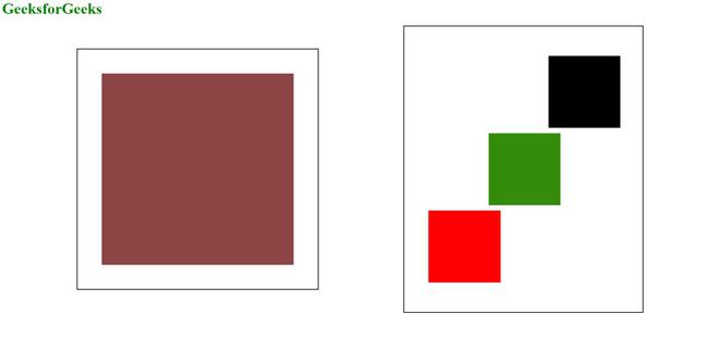
WebPage
We can only give instructions and values in any unit, but ultimately browser will going to decide the correct place to insert the content according to the algorithm which calculates a bunch of stuff like the box model, floats, and positioning to render the page most suitably.
Like Article
Suggest improvement
Share your thoughts in the comments
Please Login to comment...