Introduction to Graphs | Class 8 Maths
Last Updated :
08 Mar, 2021
A graph is a mathematical representation of networks. The purpose of the graph is to show mathematical relations in visual form so that it can be easily understood. There are many types of graph:
- Bar graph
- Pie graph
- Line graph
Bar Graph
Bar graph, also known as bar chart which is a visual tool and is used to compare the data among categories. Bar graph may be horizontal or vertical.
e.g. Below is a bar graph which shows pollution level of each city.
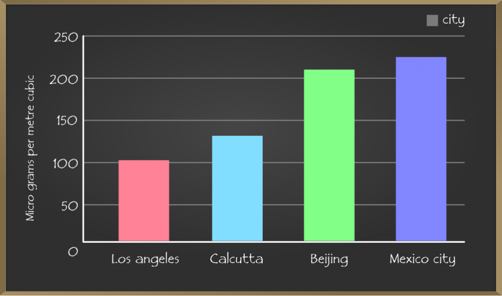
Bar graph represents a discrete value on one axis and category on another axis and the motive is to show the relation between two axes.
The bar graph is an easy way to make a comparison between the set of data.
Pie Chart
A pie chart is a circular chart in which each data is represented in a portion of circle. As the chart is divided into wedge-like sectors the total value of pie chart is always 100%.
e.g. The pie chart below is used to represent people’s choice of Laptop’s brands. The circle as a whole here is represented by all the people who took part in the survey. Since it is a whole, the sum of all percentages represented in a pie graph must add up to 100%.
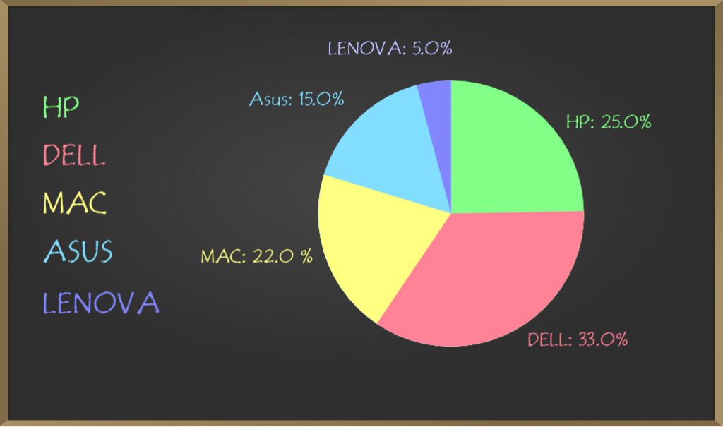
Steps for Creating a Pie Chart
Step 1: Decide the topic of your chart.
Step 2: Having all the information or data and divide it into a number of items, and the value of each item adding together should have a sum equal to 100%.
When comparing parts of a whole, pie-chart is the ideal method.
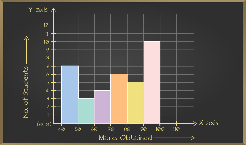
Histograms
Both histogram and bar graph are similar but there is a difference between the two that histogram is used to collect numbers into a particular range of number. The histogram is defined as the chart that is used to represent the continuous data.
e.g. Consider the case of the data given below in the table that shows the data obtained in a class test of 35 students as:
| Marks obtained |
40-50 |
50-60 |
60-70 |
70-80 |
80-90 |
90-100 |
| Number of Students |
7 |
3 |
4 |
6 |
5 |
10 |
The histogram drawn for this case is drawn as:
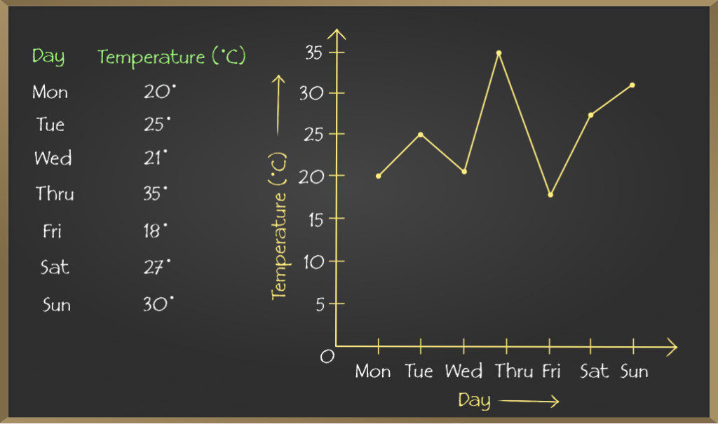
Line Graph
A line graph is also known as a line chart. It is used to visualize the value of something over time. The line graph has a horizontal x-axis and a vertical y-axis. The point where axes intersect is called origin i.e. (0,0). Each axis having its own data type. For e.g. x-axis could have months, days, weeks and the y-axis may have a growth increase in shares and revenue.
All data value is represented in points and later they connected by line from one to other i.e. in “dot-to-dot” fashion.
e.g.
Cartesian Planes and Coordinate Axes
Cartesian Planes
A Cartesian plane is defined by the two perpendicular lines i.e. the x-axis(horizontal) and y-axis(vertical). With the help of these axes we can mark any point in the Cartesian plane.
The Cartesian plane is infinite however to shows this in book they put arrow in the end of the line. The Cartesian plane is divided into four quadrants.
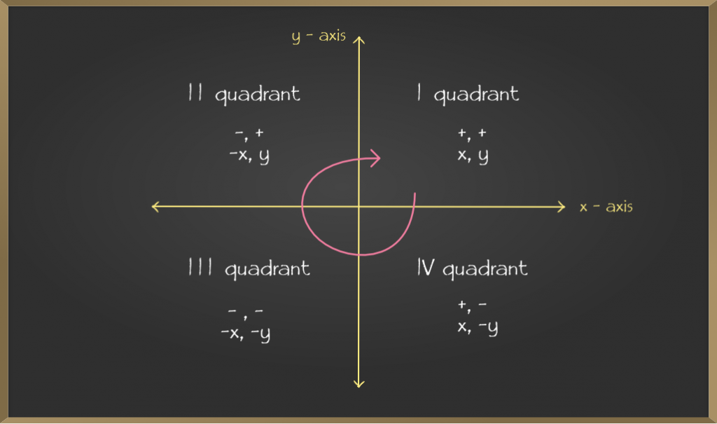
Coordinate Axes
It is x and y-axis if we label x and y-axis as in above diagram this framework is known as coordinate axis and the point of intersection of coordinate axes is known as origin.
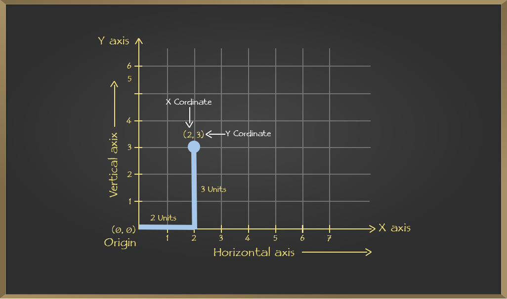
Representation of a point on the Cartesian Plane
In order to plot or represent a point on the cartesian plane first, the point must be in the form of (x,y) where the value of x is the coordinate of the given point on the x-axis while the value of y is the coordinate of the given point on the y-axis.
Thus, it is noted that the coordinates x and y helps to understand how far the given point is away from the origin with respect to both x and y-axes respectively.
e.g. Plot any point like (2,3) on the cartesian plane. For that consider 2 on x-axis and 3 on y-axis and plot as follows:
Like Article
Suggest improvement
Share your thoughts in the comments
Please Login to comment...